
We’re a small and ambitious practice with a critical approach to brand identity design.
Humantics
Year
2025
Category
Professional Services
Service
Logo Design, Identity System, Guidelines, Strategy
Humantics came to BrandCraft with an ambitious idea: to show that worker wellbeing and business resilience don’t have to be competing priorities. Working closely with its founders, we helped turn that conviction into a clear brand strategy and identity, one capable of speaking to global businesses while remaining grounded in the realities of workers and supply chains across Asia.
“Thank you so much. We’re already using the brand templates, and we’re absolutely blown away by the design language you’ve created.
Everything is incredibly intuitive, cohesive, and works seamlessly together.
It’s been such a pleasure collaborating with you on this, and your delivery exceeded (our already high) expectations!”
— Amelia Smith, Partner
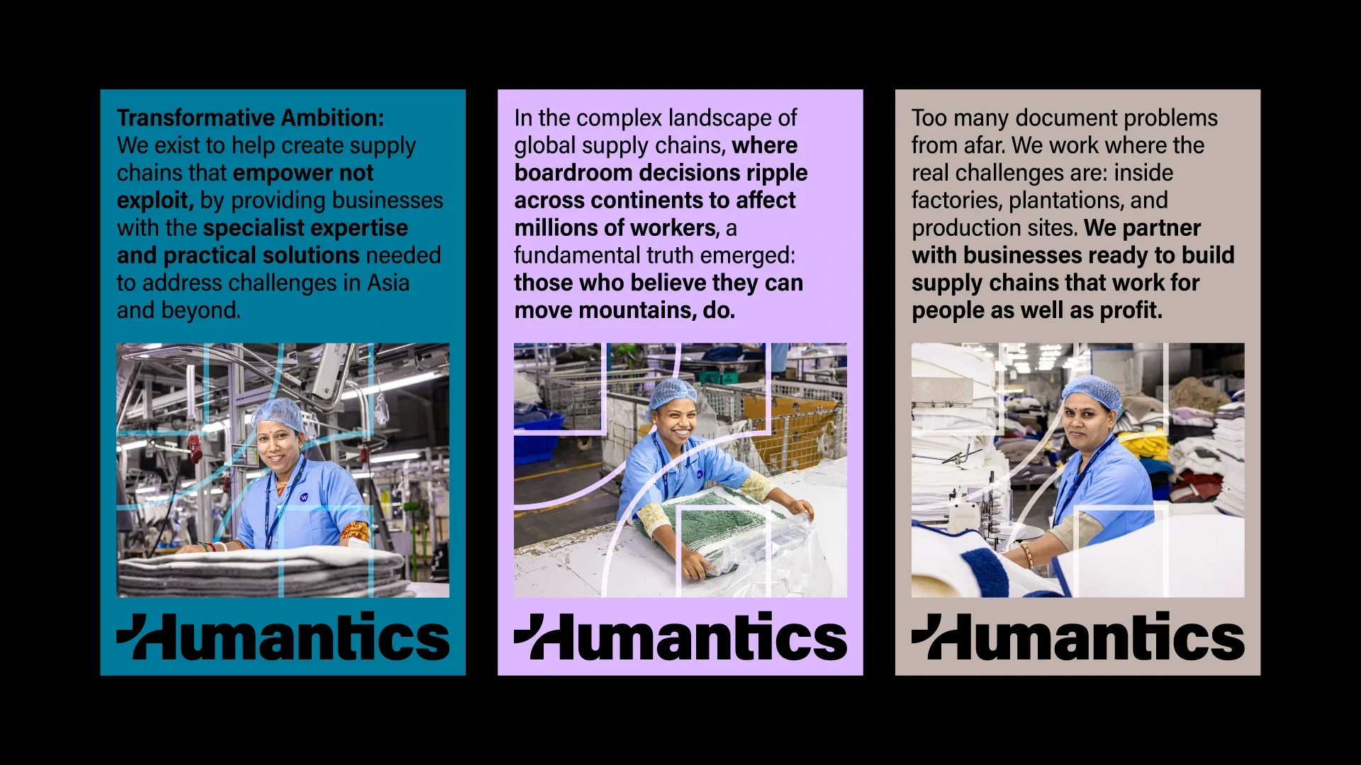
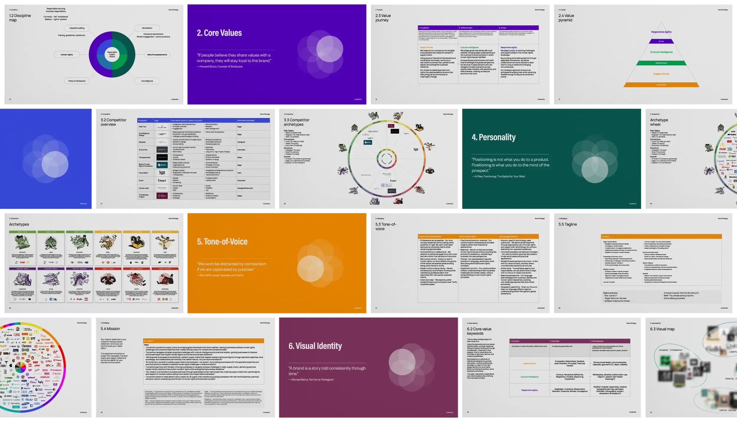
Together, we built Humantics from the foundations up, defining its purpose, values and positioning before translating them into a distinctive visual identity and flexible communications system.
From the brand mark and visual language to reports, presentations, and digital communications, the result provides a growing consultancy with a coherent platform to express complex ideas with clarity, humanity, and confidence.
JaneClare
Year
2025
Category
Fashion & Beauty
Service
Logo Design, Identity System, Illustration, Guidelines, Naming, Packaging, Strategy
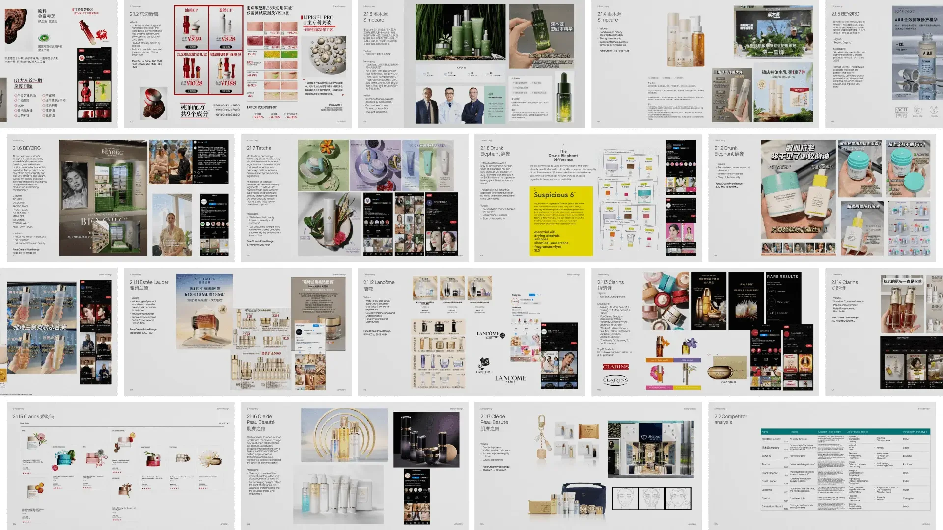
JaneClare approached BrandCraft to redefine its brand ahead of the launch of its flagship retail store in Hong Kong. The challenge was to evolve an established identity into one that reflected the sophistication of the products while supporting the company’s next stage of growth.
“As part of our ambitious market expansion strategy, which included the development of our three-story flagship store on Canton Road, we knew our brand needed to evolve. Engaging with Adam and Shirley for our rebranding proved to be an excellent decision.
The new logo design and packaging system they created have been exceptionally well-received by our clients. Their thoughtful approach to balancing our natural ethos with sophisticated design elements perfectly captured JaneClare's essence while elevating our market presence.
The rebrand has been instrumental in supporting our growth as we continue to expand our premium natural skincare offerings in new markets.”
— Angela Lee, Founder
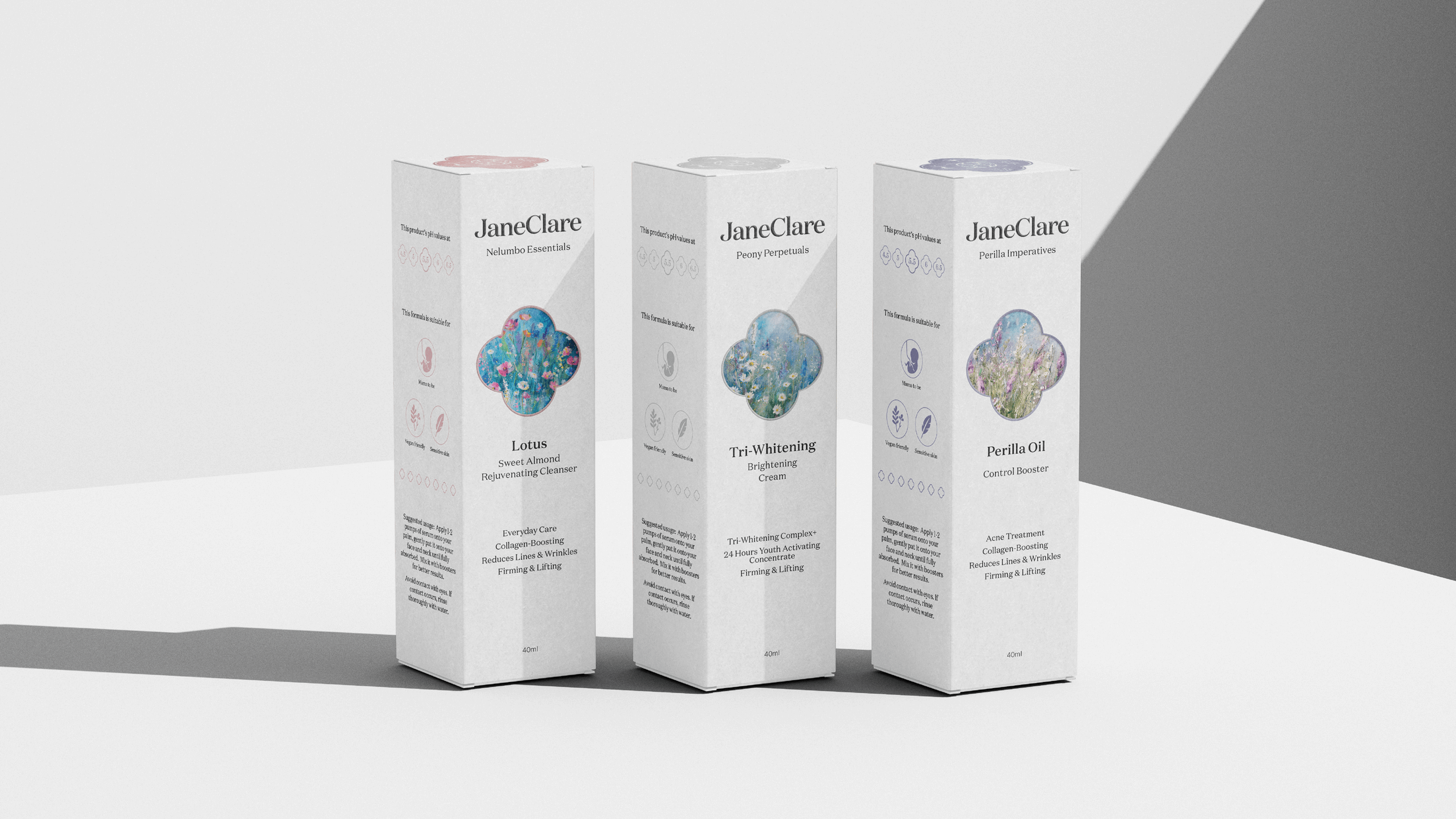
Working closely with the leadership team, we developed a refined visual identity, packaging system, and supporting brand applications that balanced JaneClare’s natural ethos with a more contemporary, premium expression.
The result was an identity designed to strengthen recognition, elevate the customer experience and provide a coherent foundation for future expansion.
MS Group
Year
2025
Category
MANUFACTURING
Service
Logo Design, Identity System, Guidelines, Strategy
MS Group had spent decades building world-class manufacturing expertise, helping global consumer brands turn complex product ideas into reality. But its identity still presented the business as a traditional manufacturer, rather than the strategic, highly skilled partner it had become. We worked with its leadership to reposition the company around the value it truly delivers: precision, partnership, and the ability to solve complex challenges.
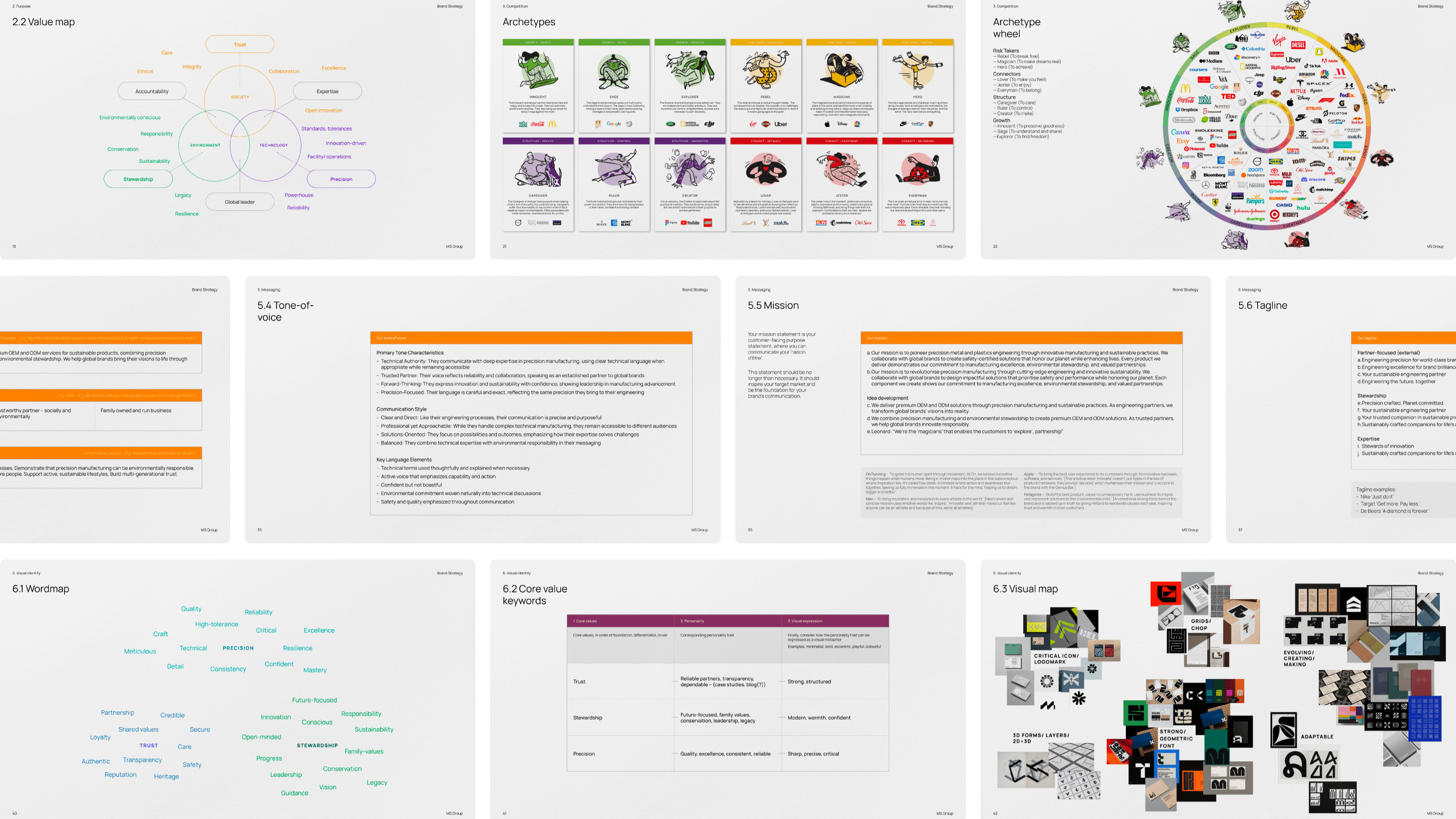
“When we set out to find an agency for our rebrand, we learned quickly that brand identity means something very different from one studio to the next. For some, it’s just a service value-add. For us it had to be the foundation, and that is exactly how BrandCraft treated it.
Adam took the time to understand MS Group’s history and where we came from, then translated our core principles of precision and safety into a sharp visual identity. He used mechanical drawings and lines as the foundation, so the design speaks the same language as the work we do on the factory floor. The result feels engineered rather than decorated, which is exactly right for who we are.
That is the BrandCraft difference. They captured who we are as a manufacturing partner to world-class brands, and it gives us an identity built to carry the company forward.”
— Leonard Cheung, Executive Director
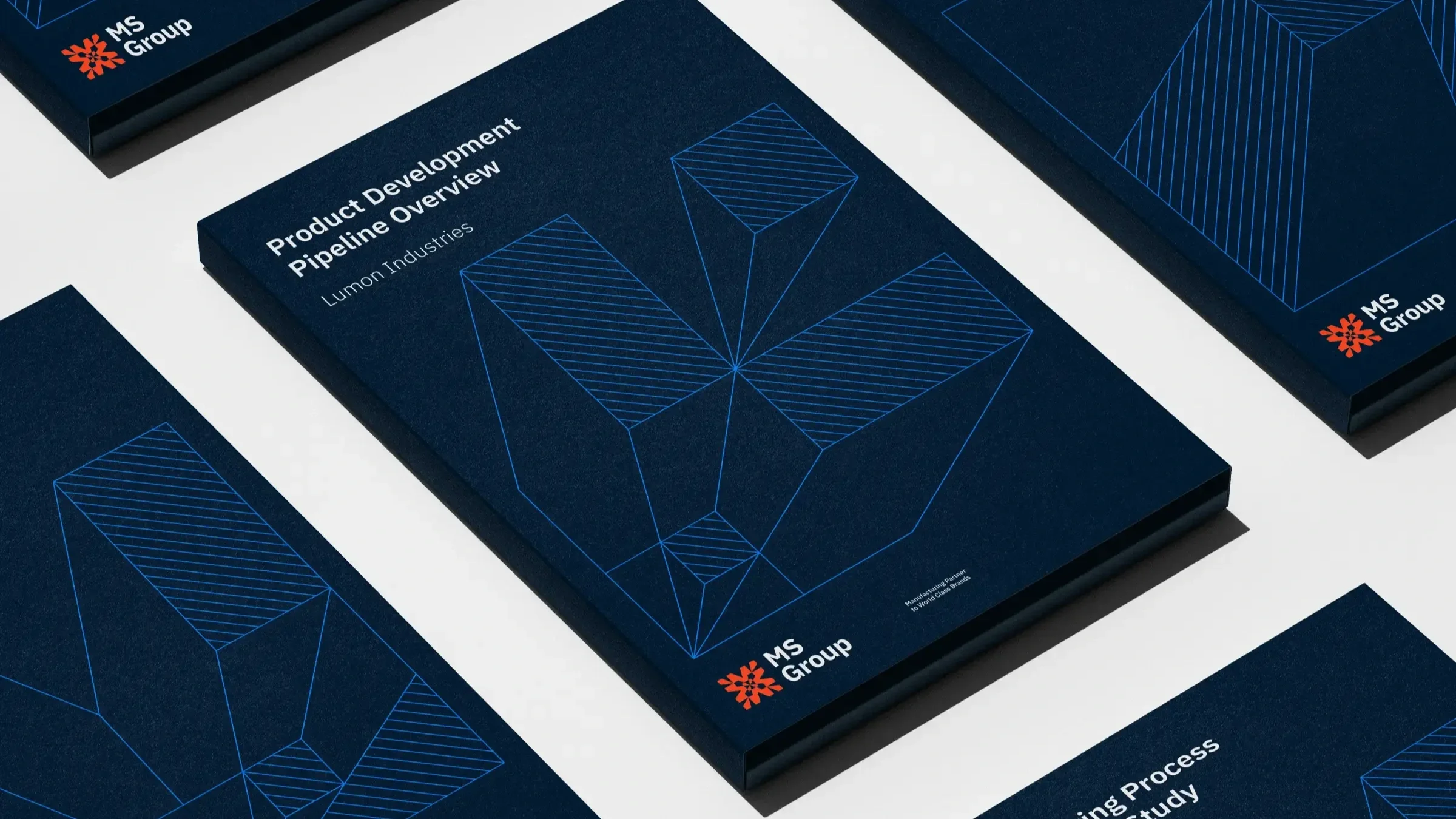
We transformed that positioning into an identity rooted in MS Group’s own world of engineering and production. Inspired by metal extrusion and mechanical drawings, the new mark became the foundation for a broader visual system spanning communications, reports, digital applications and the company’s website.
We gave MS Group a distinctive identity that reflects both where the business came from and the company it is becoming
Raw Lily
Year
2024
Category
Retail
Service
Logo Design, Identity System, Illustration, Guidelines, Packaging, Strategy, Website
Launching into Hong Kong’s emerging wellness market, Raw Lily wanted to offer an alternative to an industry crowded with trends, competing claims and endless choice. We worked with founder Tina Shum to sharpen what the business stood for and create a brand that could earn trust by being refreshingly straightforward about the products it sells.
“It was a pleasure to collaborate with Adam and Shirley from BrandCraft. They were incredibly responsive and helpful throughout the entire process.
They are passionate, kind individuals with a lot of energy which made the experience enjoyable. Their professionalism and dedication shone through, and we truly valued their hard work and commitment.”
— Tina Shum, Founder
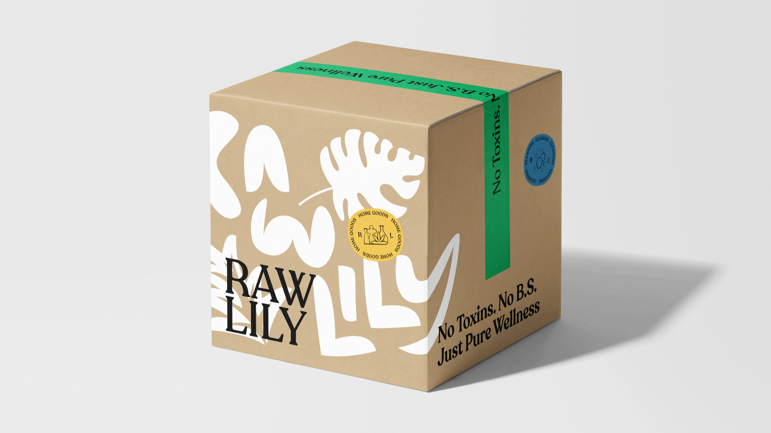
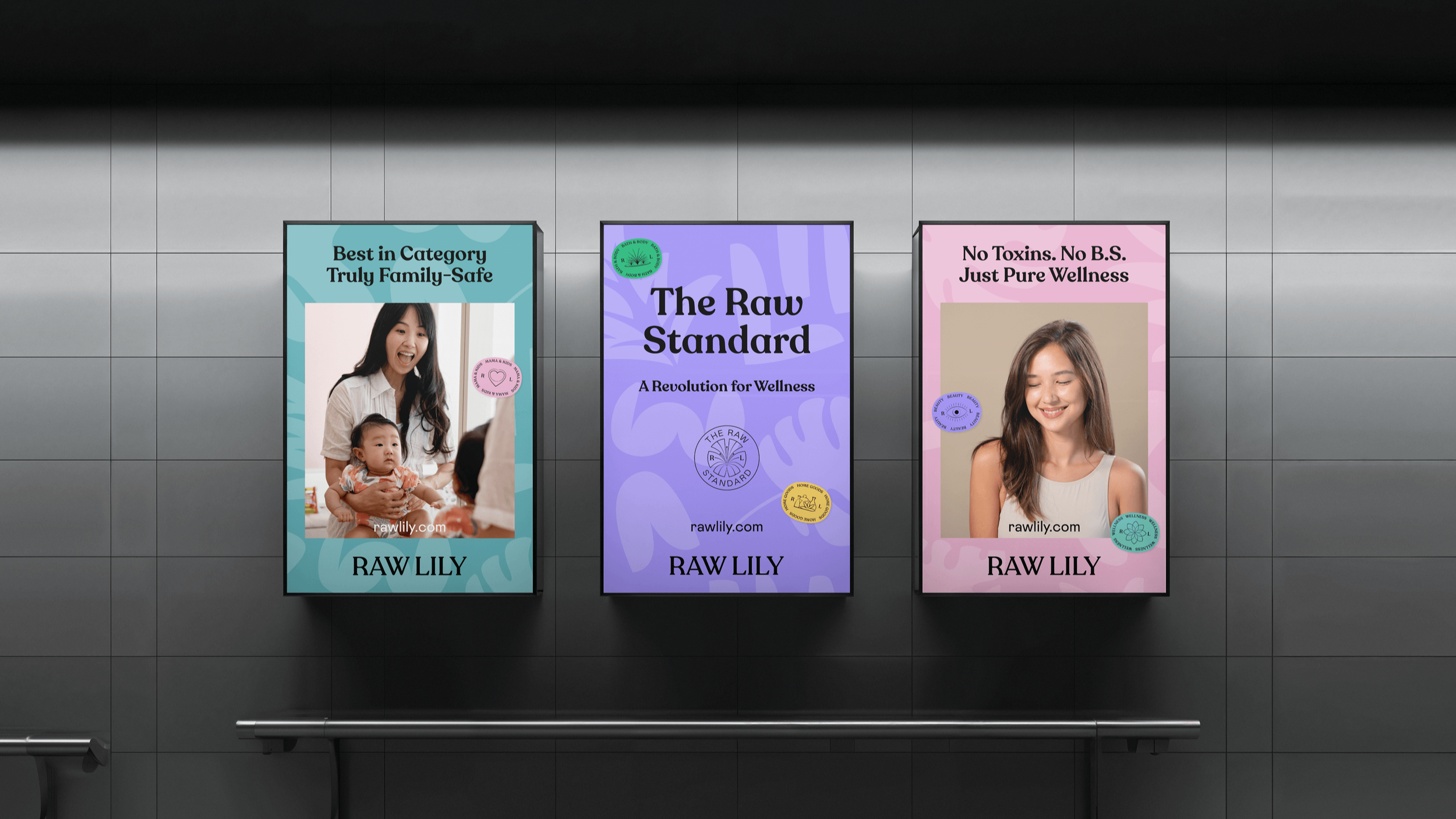
At the heart of the new brand is a simple idea: make better choices easier. We developed a confident identity and voice around Raw Lily’s commitment to conscious curation, using clear messaging, distinctive product standards and a vibrant visual language to make wellness feel more transparent and accessible.
The resulting system is consistent across packaging and e-commerce, social content, and campaigns, giving Raw Lily a recognisable platform from which to grow.
RBJL
Year
2023
Category
PROFESSIONAL SERVICES
Service
Logo Design, Identity System, Guidelines, Strategy, Motion, Website
Approaching its 40th anniversary, Hong Kong law firm Robin Bridge & John Liu partnered with BrandCraft to refresh an identity that had served the practice for many years. Working directly with the firm’s partners, we set out to retain the recognition and heritage of the existing brand while creating a more contemporary expression for its next chapter.
“I was a bit overwhelmed when I read the case study of our re-branding journey.
BrandCraft injected new life into our brand. Adam and Shirley have a Western perspective but also fully understand the Hong Kong culture, which we needed for our brand refresh.
It's been a wonderful journey and we have received numerous positive feedbacks from our friends and clients. Thank you, Adam”
— Anthony Tong, Managing Partner
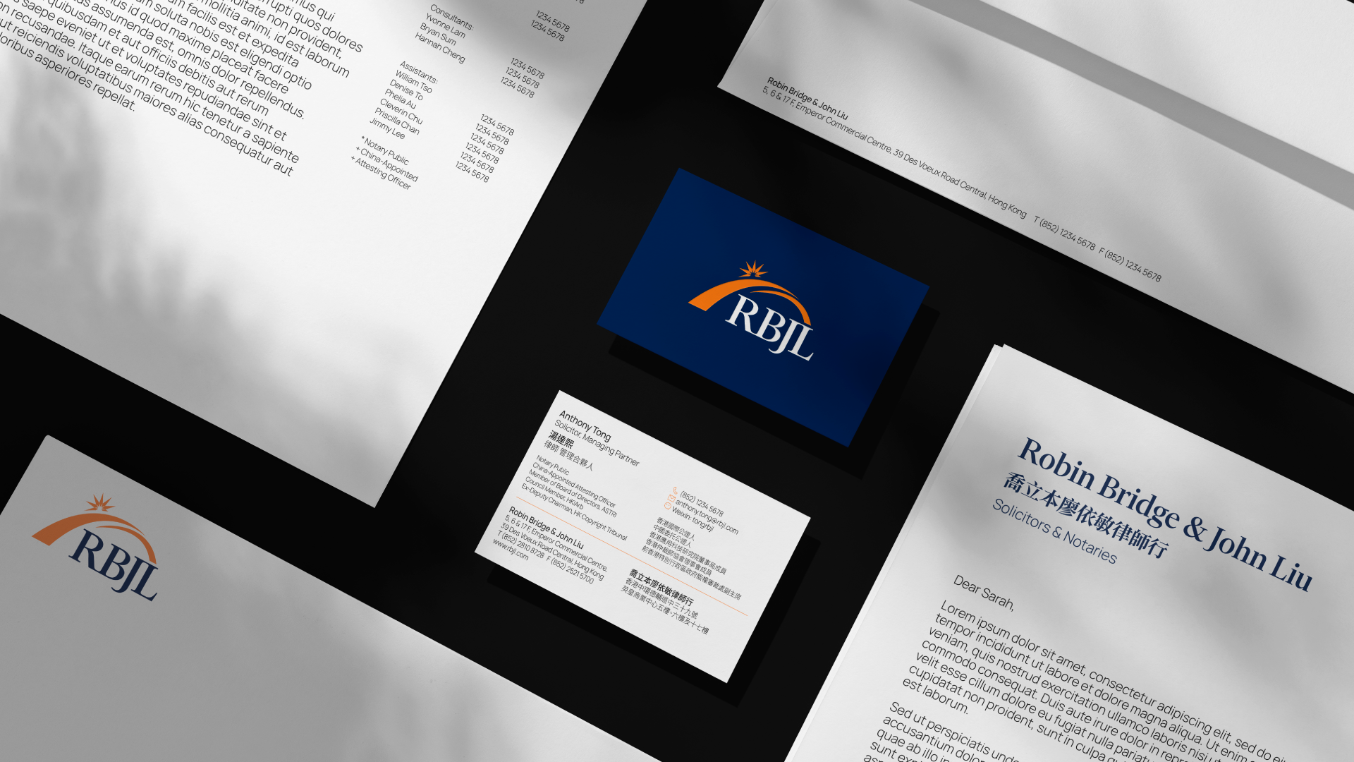
Together, we transformed RBJL’s identity across every major touchpoint, from a sensitively refreshed logo and visual system to communications, digital applications and a completely redesigned website.
The result brings greater clarity, consistency and energy to the brand while remaining recognisably RBJL, giving the firm a more confident platform for the future.
Hack Chinese
Year
2022
Category
Education
Service
Logo Design
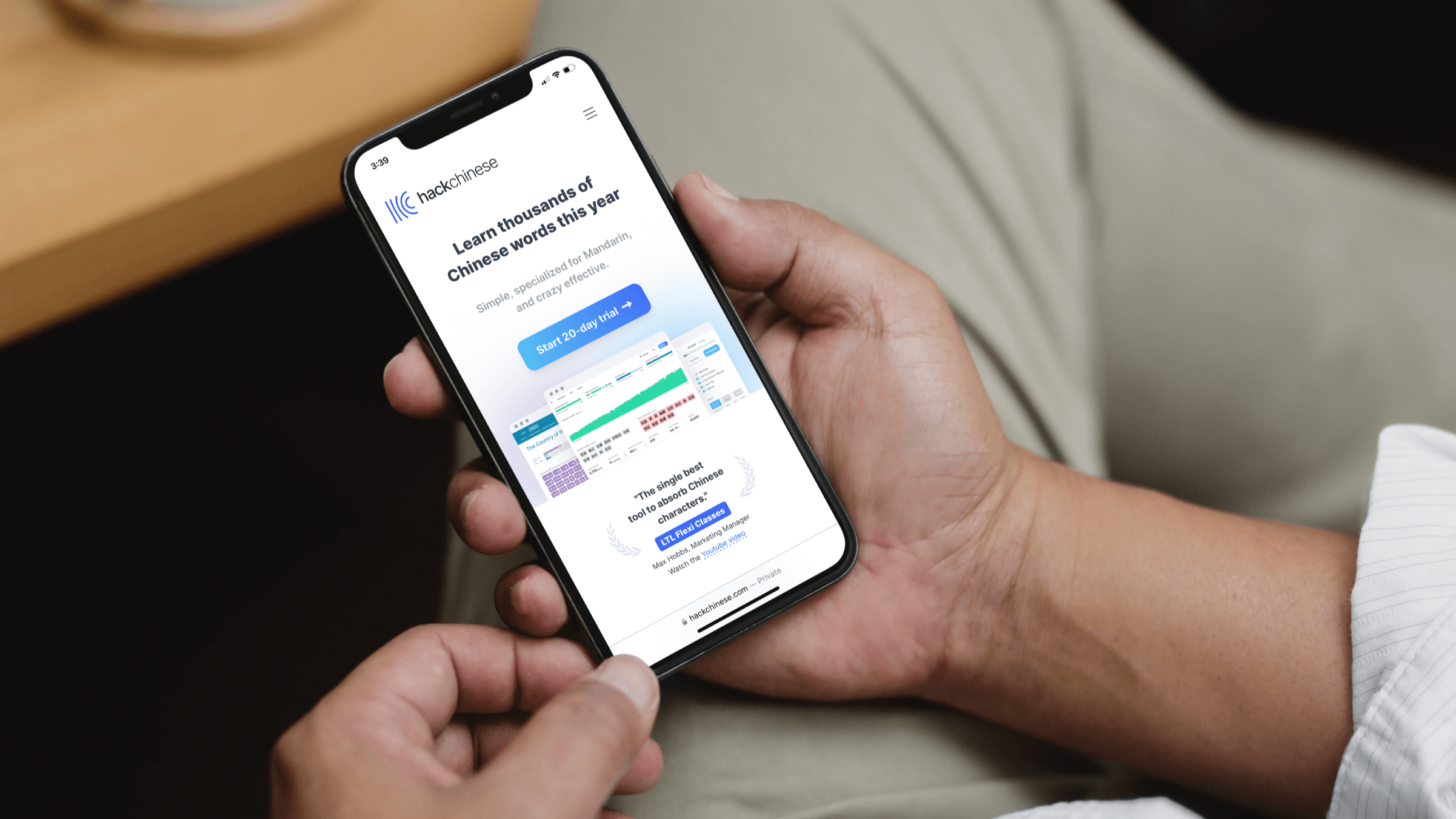
What began as a website refresh quickly revealed a bigger opportunity for Hack Chinese. The online learning platform had developed a powerful approach to learning Mandarin, but its brand wasn’t yet communicating what made the product distinctive. Through workshops with the founders, we uncovered the ideas at the heart of the business: spaced repetition, personal development and communication, and used them to shape a more human and compelling expression of the brand.
“We are thrilled we took the opportunity to work with BrandCraft. The project began as a website refresh but ended up as a complete rebrand and professionalisation of the ‘Hack Chinese’ brand and business.
BrandCraft helped us tell our story in a concise, long-lasting way that our colleagues and customers can equally get behind and champion as we grow. The team pushed us to be critical of our brand and ambitious in our vision, and we enjoyed the process. They’ve been a fantastic partner from start to end, unified in our project’s success.”
— Daniel Nalesnik, Founder
The refreshed identity brought those ideas together in a simpler, more memorable way, from a new mark inspired by repetition and Chinese visual culture to a redesigned digital experience.
More importantly, it gave the founders a clearer story around which to unite the business and its growing community. Within 30 days of relaunch, homepage bounce rate fell by 28%, alongside a marked increase in subscriptions, an early indication that the new brand was connecting with people as intended.
Georgiou Partnership LLP
Year
2021
Category
PROFESSIONAL SERVICES
Service
Logo Design, Identity System, Guidelines, Strategy
When Phillip Georgiou left his previous firm to establish Georgiou Partnership, he returned to BrandCraft to help shape the new practice from the beginning. We spent time understanding the kind of firm he wanted to build: independent, authoritative and fearless in its advocacy, and the reputation it needed to establish within Hong Kong’s highly competitive legal sector.
“BrandCraft genuinely care about your business. They come into the job with an open mind; they take the time to open your mind, and through the discovery process, you learn a great deal about your own business, including your place in the market you operate in.
With this valuable data and insights, BrandCraft created a brand that almost miraculously encapsulates the essence of the why, who and what of your business.”
— Phillip Georgiou, Managing Partner
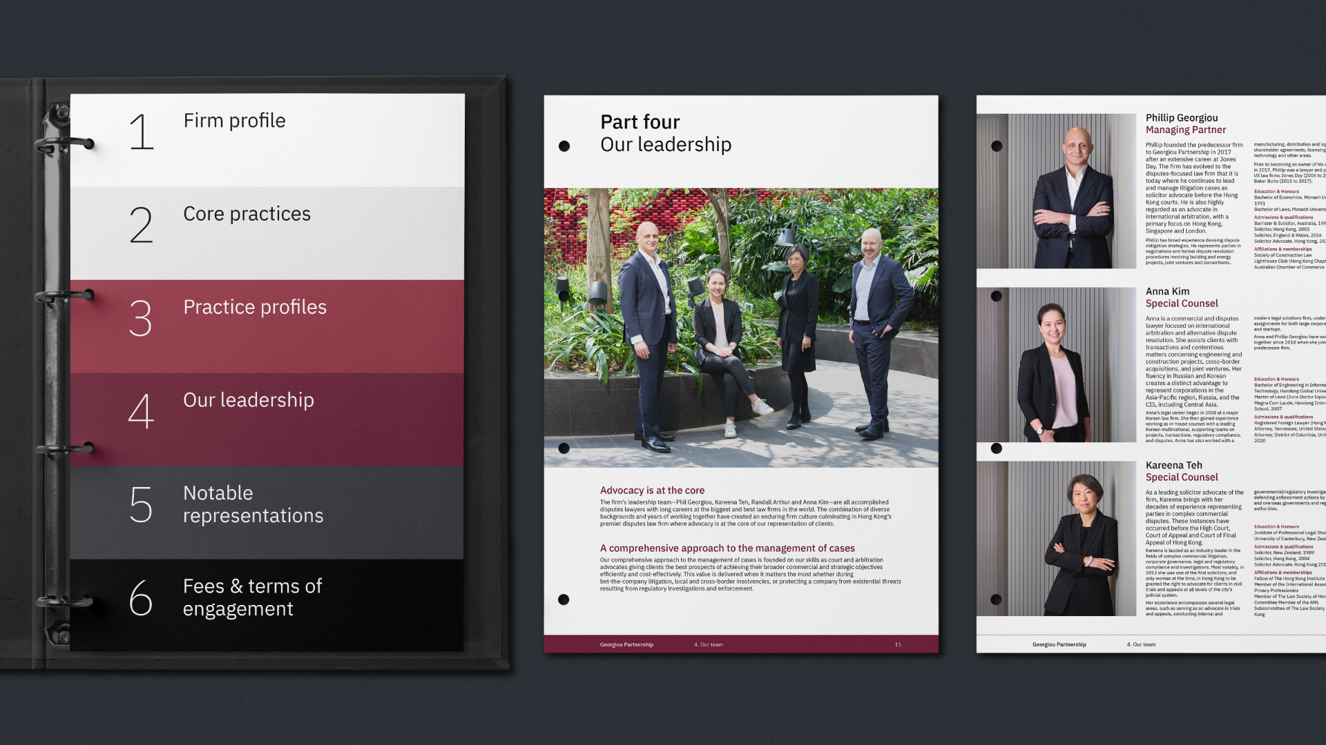
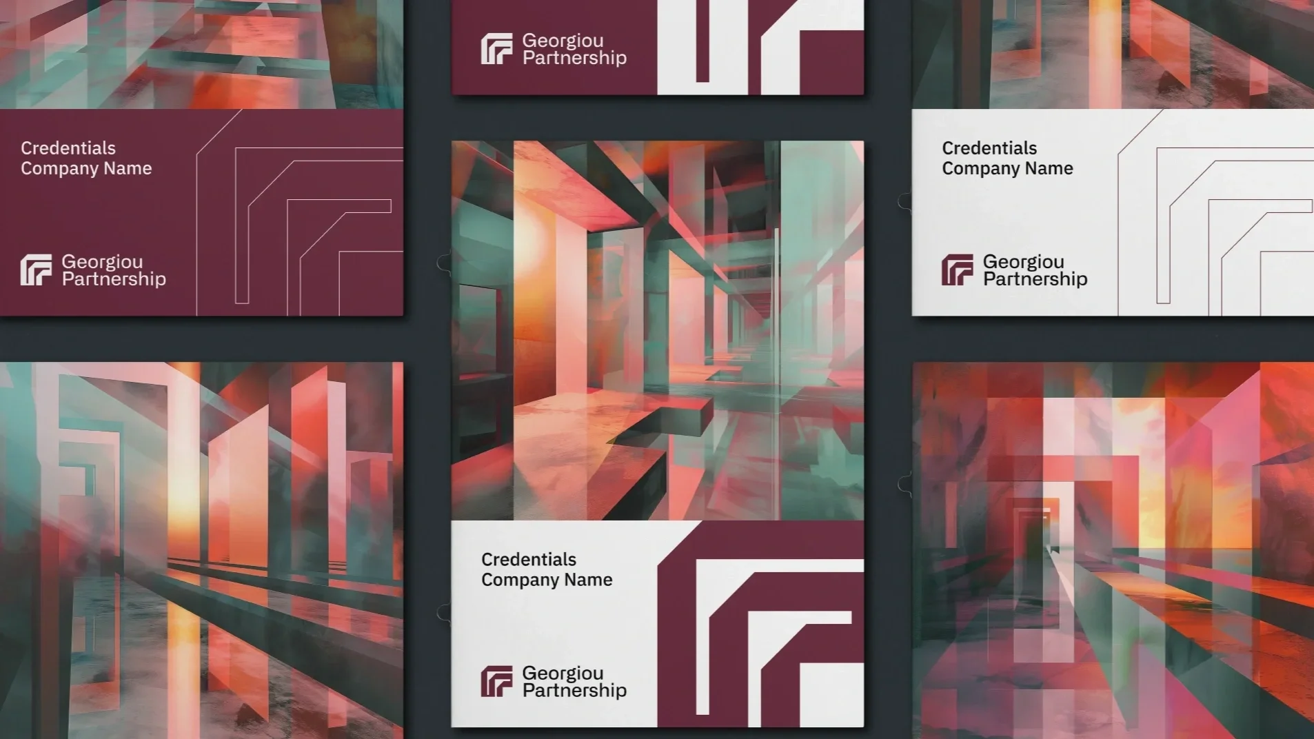
That understanding became the foundation for a bold identity with its own character. Architectural geometry inspired the distinctive GP monogram, while layers of Hong Kong imagery brought depth and energy to the wider visual language.
Applied across communications, credentials, photography and digital touchpoints, the identity gave a newly independent practice the confidence and coherence of an established firm, while remaining unmistakably connected to Phillip’s vision for the business.
ASTP
Year
2019
Category
Education, Not-for-Profit
Service
Logo Design, Identity System, Guidelines, Strategy
Following a strategic merger, ASTP needed a brand that could bring its newly unified organisation together and better represent a network of more than 800 knowledge transfer professionals across 40 countries. Through stakeholder interviews and discovery workshops, we worked with the leadership team to uncover the organisation's shared purpose and create a clearer foundation for its next chapter.
“The new brand and logo received overwhelming praise from the client’s membership, who complimented the modern look and feel.
BrandCraft delivered materials that grabbed attention while articulating ideas to non-native English speakers without words. Their reliability stood out.
[Update in 2023] After 4+ years, we remain delighted with it; the colours are so expressive and the design so versatile that ASTP is now easily recognisable to the knowledge transfer community worldwide.”
— Noeleen O’Hara, Communications Manager
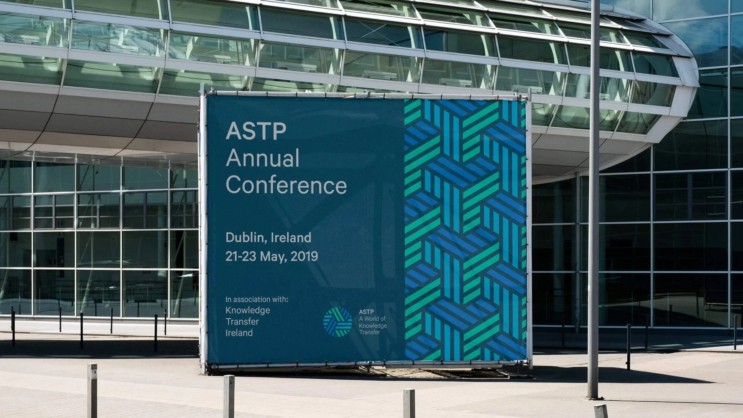
The idea of transfer became the thread connecting strategy and identity. We distilled ASTP’s role into two ambitions, fostering community networks and inspiring knowledge transfer, and translated these into a dynamic visual system built around connection, movement and exchange.
The new identity gave ASTP greater clarity and recognition across its communications and international events, while providing a flexible platform that has continued to serve the organisation for years after its launch.