
Index > Hack Chinese
Mandarin Made Simple
Context
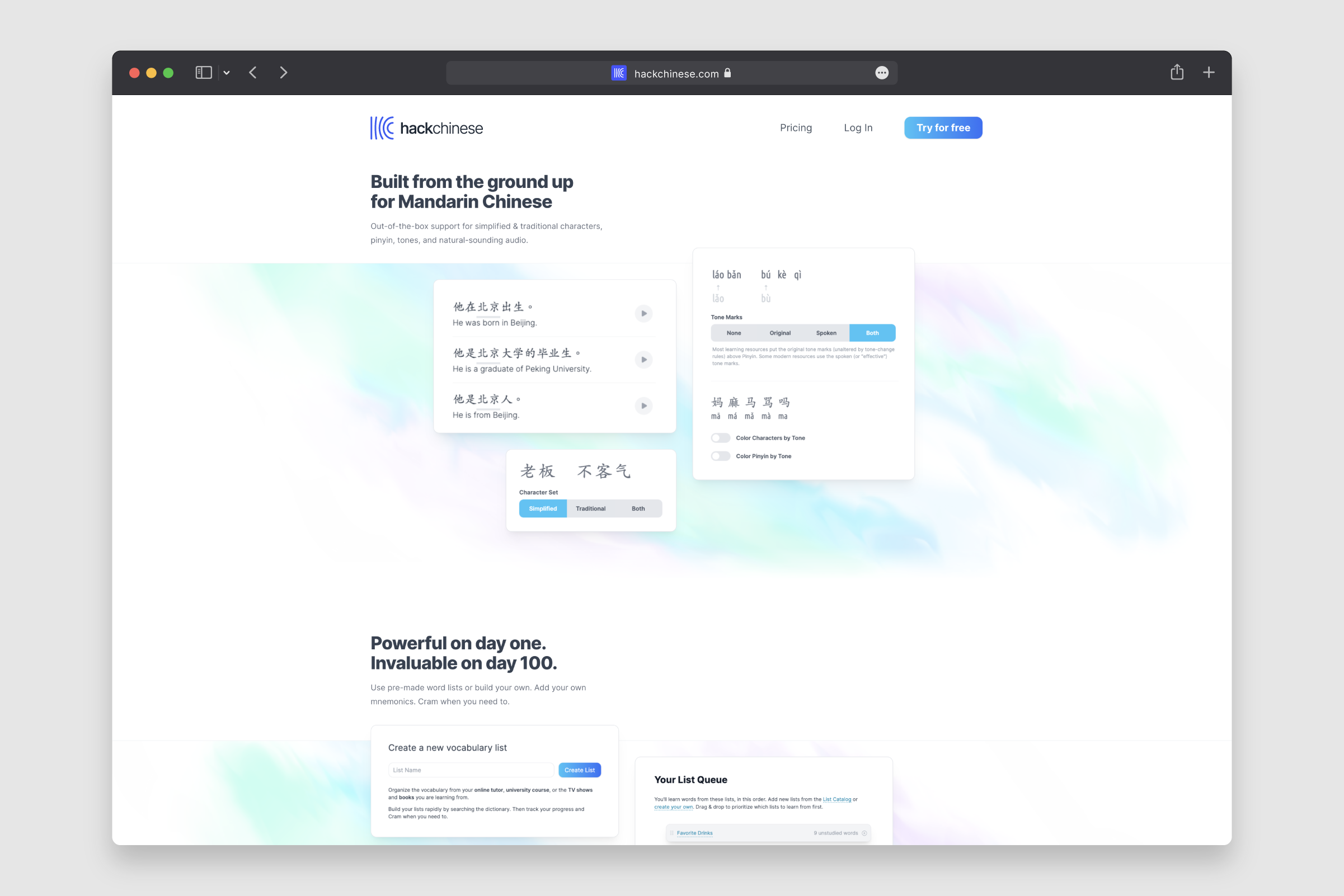
Hack Chinese is an online learning platform that helps students learn to read Mandarin Chinese. The founders approached us to refresh their website, visual identity, and to overall humanise the brand experience.
During the first phase of the project, we dove deep into the company and industry, speaking with the founders through our brand strategy workshops to tease out the key messages that would need to be communicated through their updated brand identity.
— Spaced repetition learning
— Personal development
— Communication

Inspired by the fluidity and curved forms of traditional calligraphy and elements of Chinese architecture, the logo is designed to abstractly represent both the company’s initials and the practice of spaced repetition learning. As the five lines move to the right, their form becomes curved, depicting the idea of memories becoming stronger.


We paired the identity with Google’s ‘Inter’ typeface, a functional and clean sans-serif font.

The highlight Hack Chinese colour palette is based on the ancient Chinese pigment, Han Purple, a synthetic colour created in the Han dynasty, using barium copper silicate pigments.
Han Purple was used to paint the Terracotta Warriors and for garments created for the Han Dynasty Royalty. The colour palette is balanced with a range of blues and greys, to ensure a harmonious, yet technological aesthetic.


Along with a 28% reduced homepage bounce rate, within 30 days of relaunching, Hack Chinese experienced a markable upswing of subscriptions compared to the old website.
“We are thrilled we took the opportunity to work with BrandCraft. The project began as a website refresh but ended up as a complete rebrand and professionalization of the ‘Hack Chinese’ brand and business.
BrandCraft helped us tell our story in a concise, long-lasting way that our colleagues and customers can equally get behind and champion as we grow. The team pushed us to be critical of our brand, and ambitious in our vision, and the whole team enjoyed the process. They’ve been a fantastic partner from start to end, unified in our project’s success.”
Daniel Nalesnik
Founder, Hack Chinese
Next project
