
Case Study
Humantics
Bridging boardrooms and factory floors
BrandCraft developed the brand strategy and visual identity for Humantics, a consultancy helping businesses build responsible supply chains. The brand connects its commitment to worker dignity with a clear case for business resilience.

Humantics works where supply-chain decisions meet people’s everyday lives. Its approach combines evidence, cultural understanding and practical action to help businesses improve worker wellbeing and strengthen their operations.
We translated that approach into a shared brand strategy and a distinctive visual identity. A bridge-inspired wordmark connects the consultancy’s analytical expertise with the people at the heart of its work.
A modular graphic language, confident colour palette and flexible brand templates give the team practical tools to communicate consistently across reports, presentations and digital channels.
Challenge
Speaking boardroom language without losing factory-floor authenticity.
Humantics needed a brand that could communicate the commercial value of responsible supply chains while keeping worker dignity at its centre. It had to feel credible to business leaders, grounded in the realities of local workplaces and ready to operate internationally.
The challenge was to express both sides of its character: evidence-driven but never heartless, rooted in local culture but built to scale globally.
Approach
Building the brand around a shared conviction.
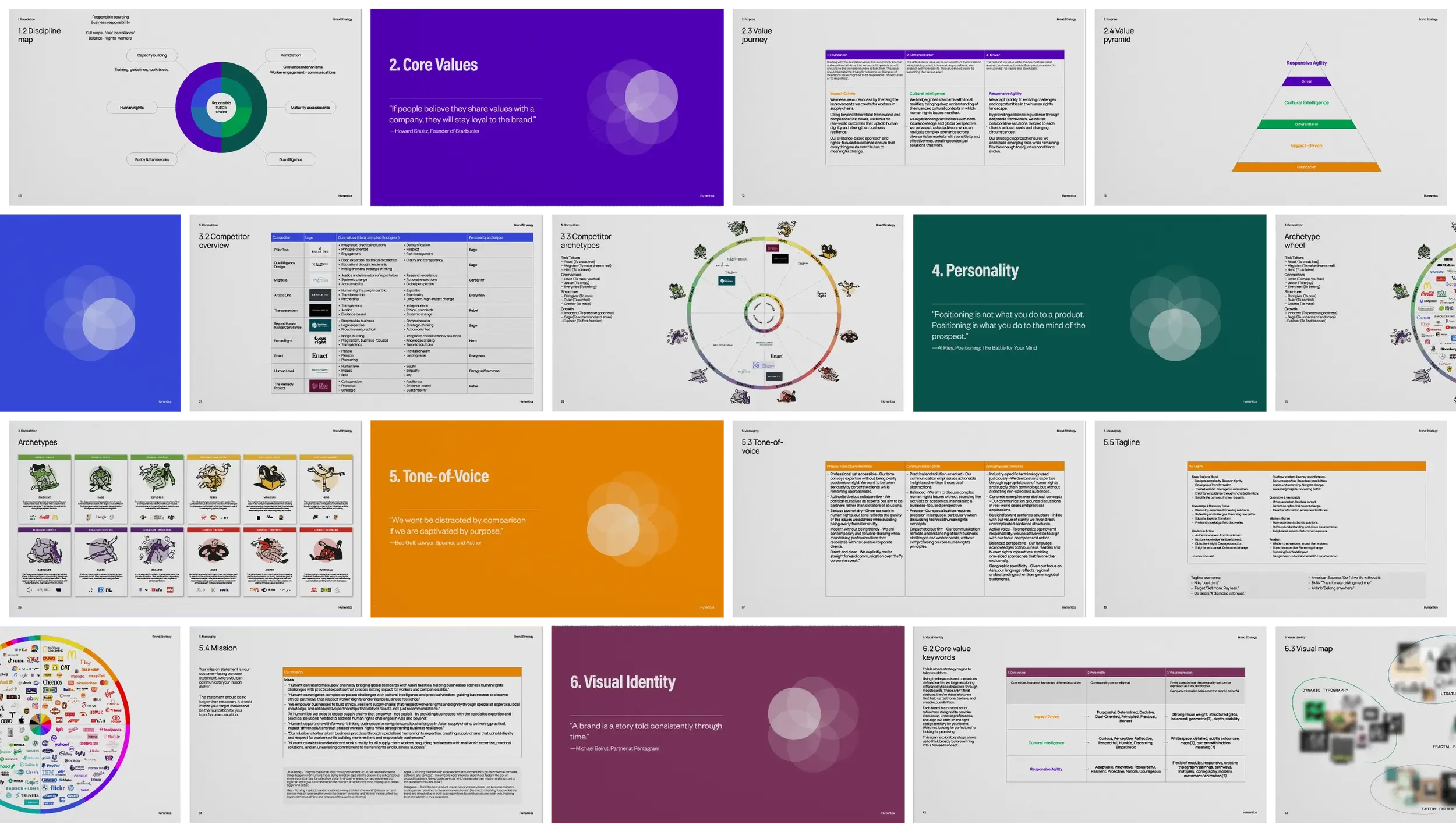
Through strategy workshops with the partners, we uncovered the belief driving Humantics: worker dignity is non-negotiable, and ethics play a crucial role in great business.
We developed the strategy around three core values: Impact-Driven, Cultural Intelligence and Responsive Agility. Together, they express an approach grounded in measurable outcomes, local understanding and adaptable, practical solutions.
During the strategy review, we explored creative directions alongside these values, establishing a shared visual direction before developing the identity concepts.
Solution
A brand with backbone.
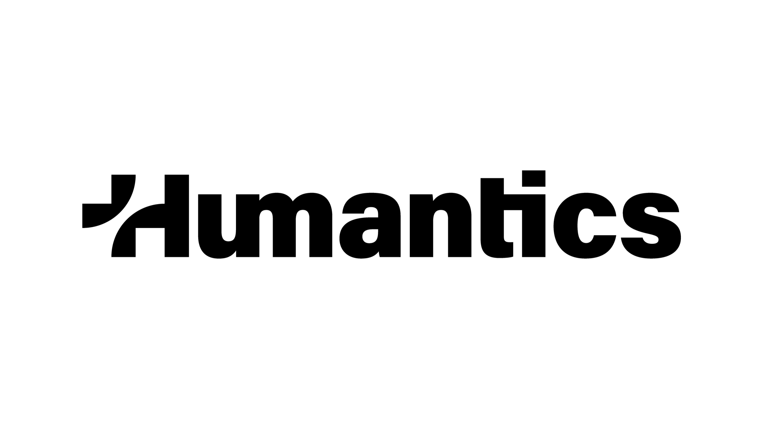
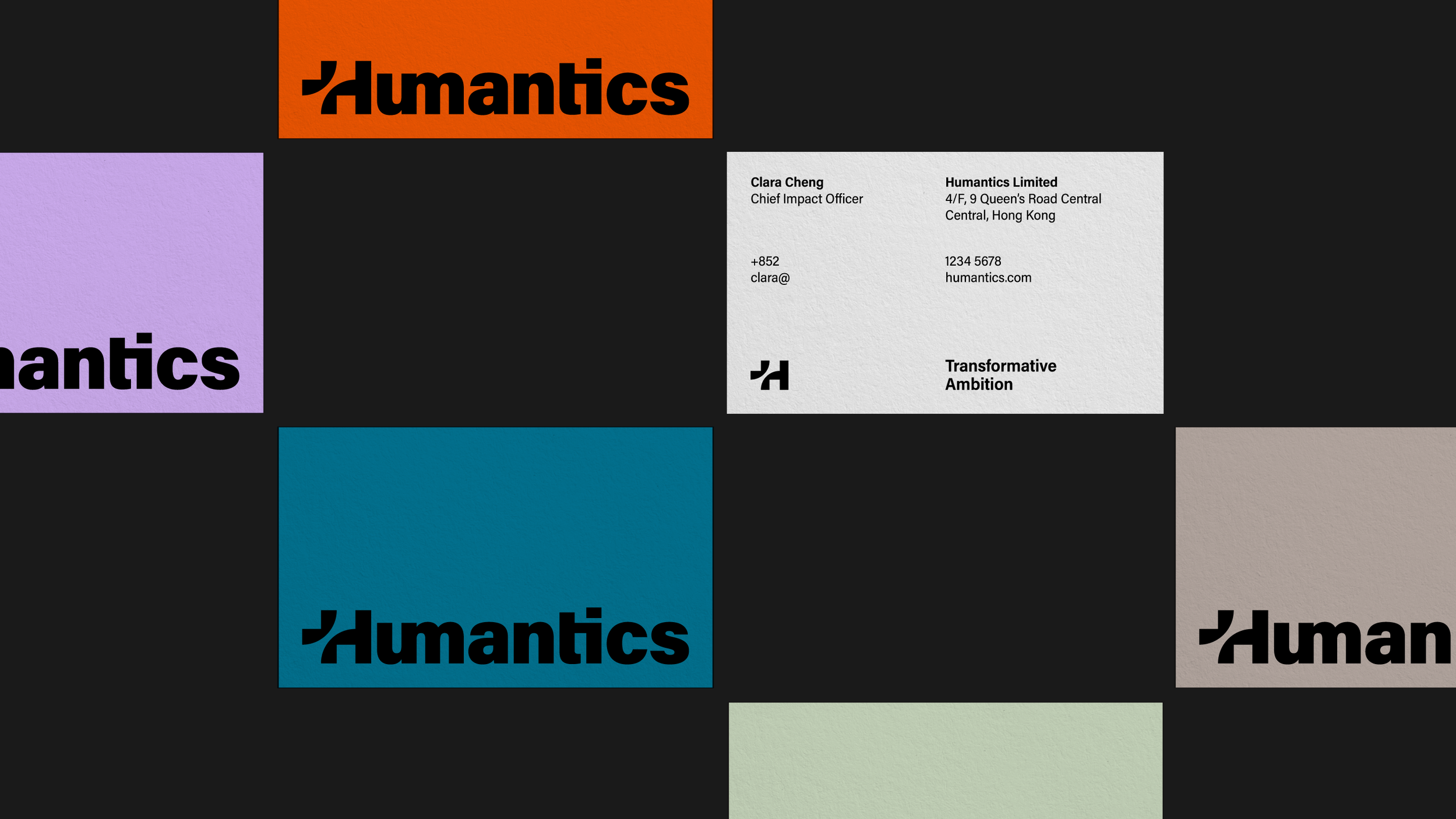
The Humantics wordmark is empowered, straightforward and purposeful. A deliberate gap in the “H” introduces a bridge formed from two opposing arcs, connecting policymakers with practitioners, data insights with human dignity, and local solutions with global impact.
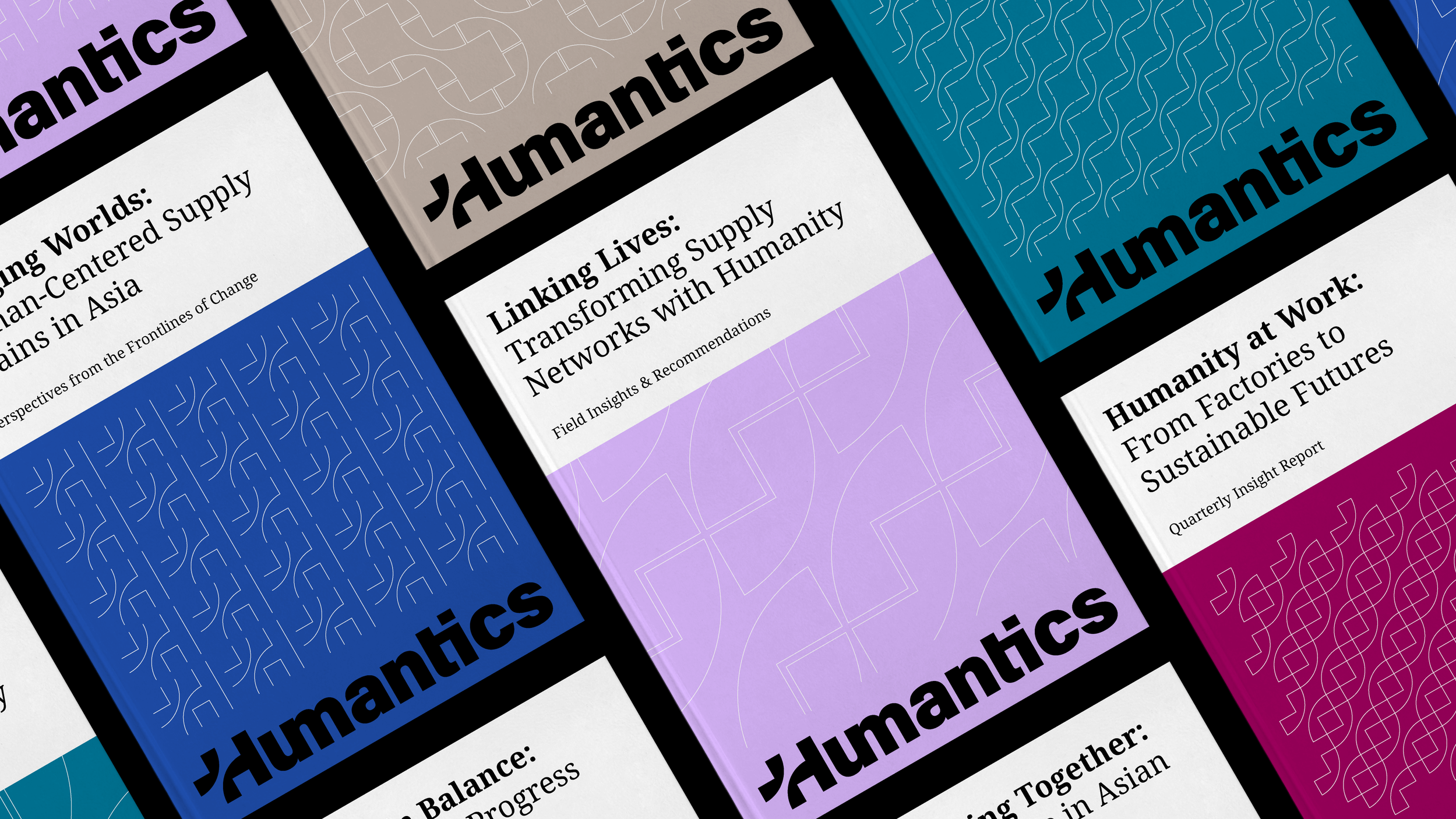
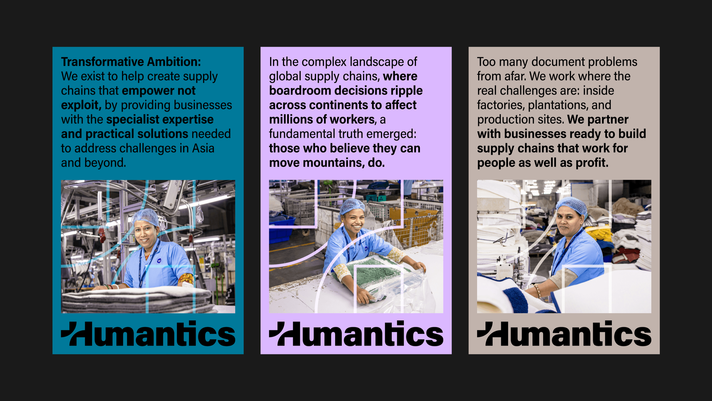
This bridge becomes the foundation of a modular visual language. Its forms can frame photography, stand alone as callouts or link together into patterns. A confident, optimistic colour palette and typography combining Acumin Variable Concept with Noto Sans balance authority with accessibility.
Photography keeps real people and working environments at the centre of the story. Across presentations, reports, social content and brand templates, the system gives the team practical tools to communicate consistently and distinctly.
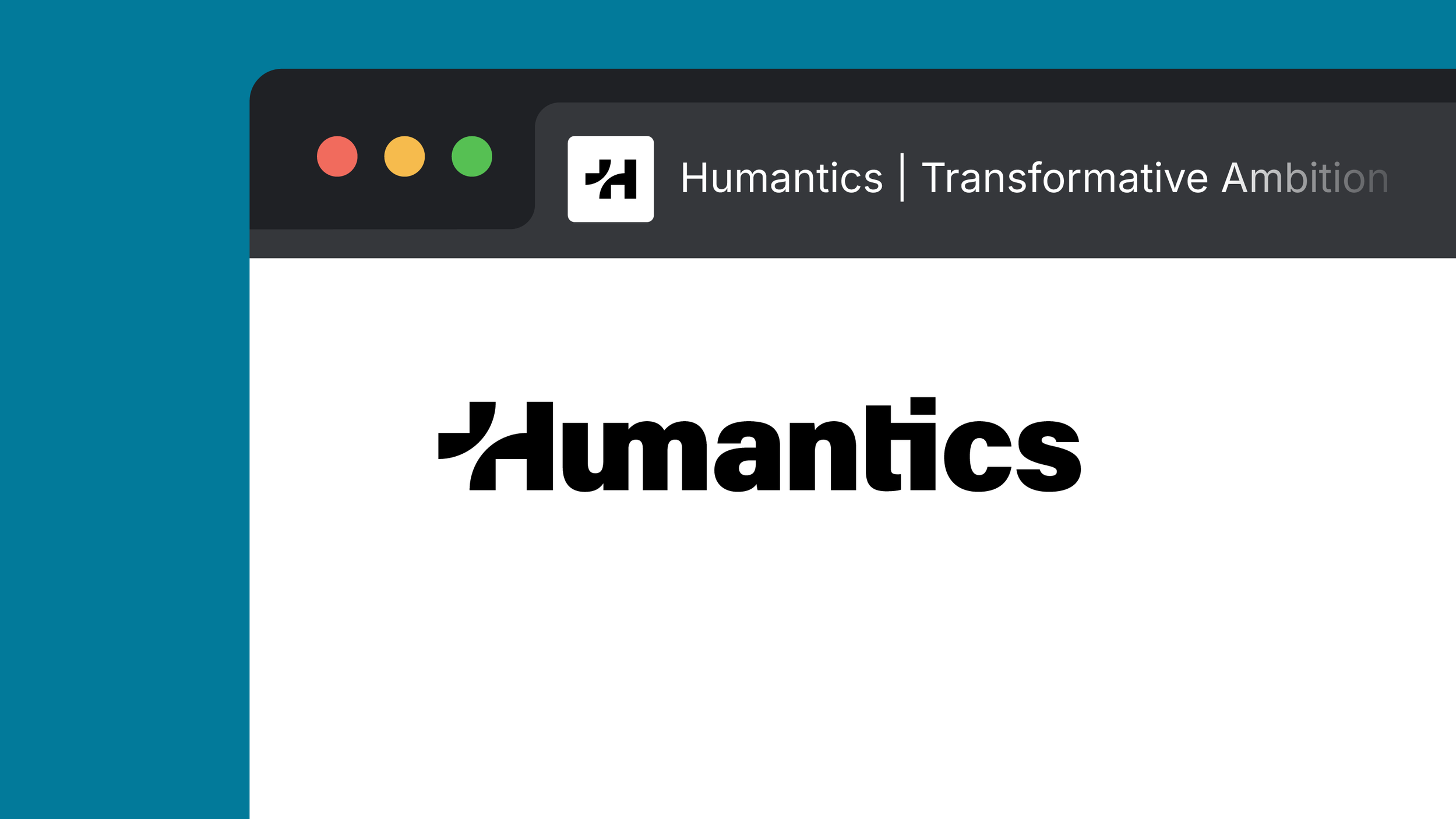
— Logomark for socials and favicon
— Wordmark


— Modular and extendable patterns


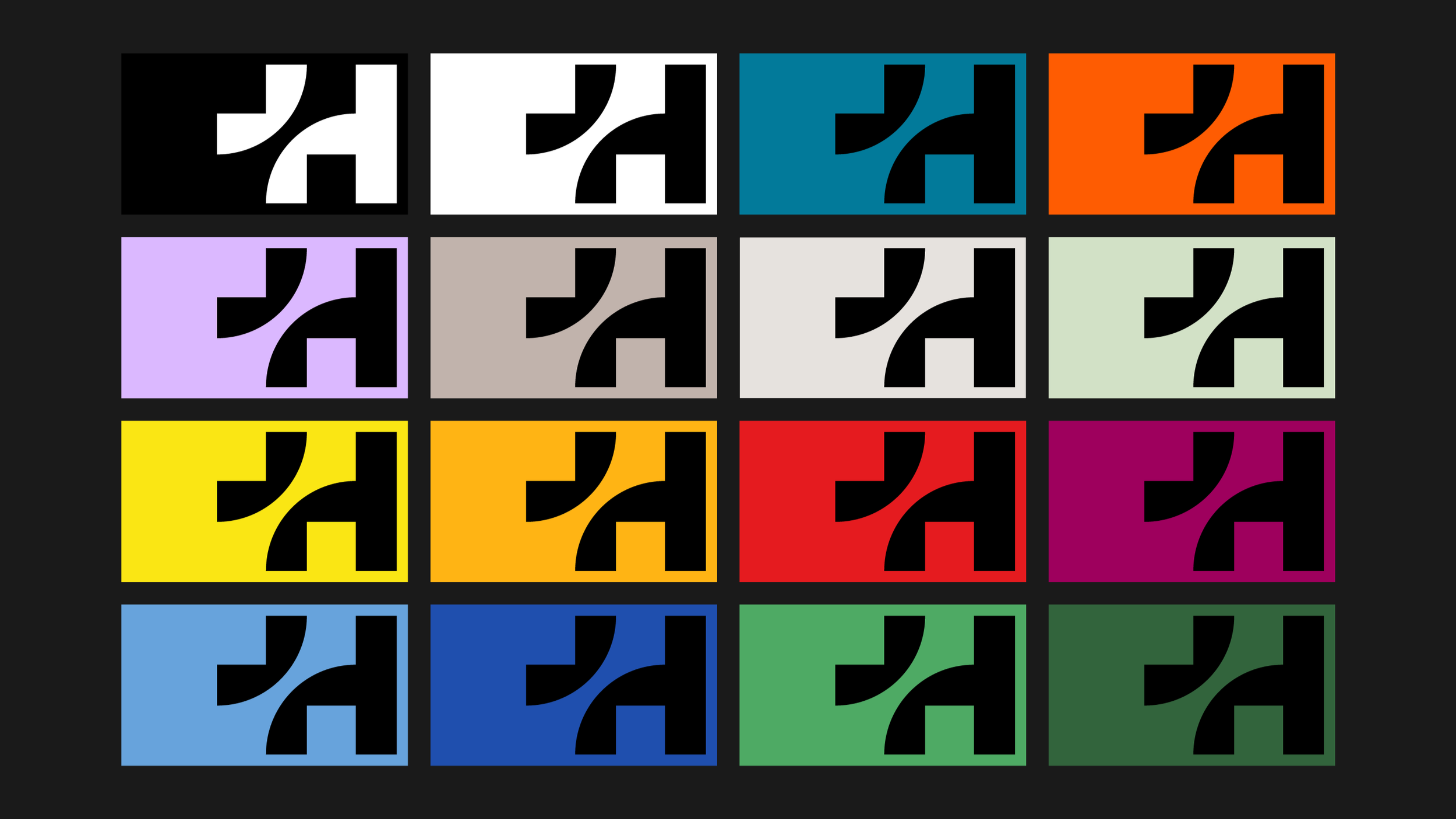

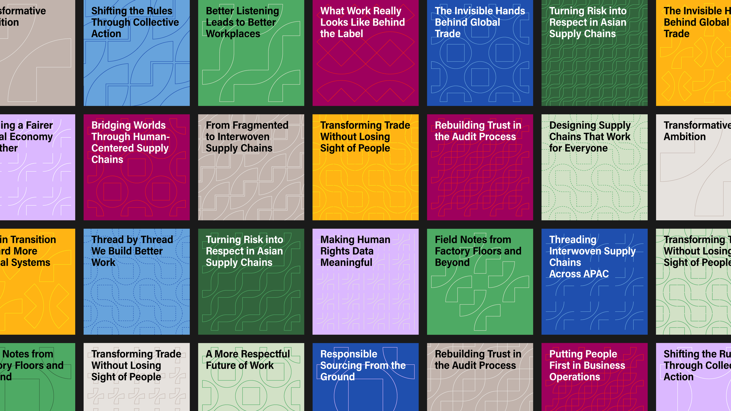
The bridge element is the foundation for the visual identity system. The modular ‘+’ can frame and interact with imagery, stand alone as callouts, or become linked into brand patterns.




Client Feedback
“We’re already using the brand templates, and we’re absolutely blown away by the design language you’ve created. Everything is incredibly intuitive, cohesive, and works seamlessly together.”
Amelia Smith
Partner, Humantics
Project Timeline
8 Weeks
From kick-off to launching the visual identity and brand templates.
Collaboration
Thank you to Humantics’ partners, Amelia and Nawin, for the trust, insight and collaboration they brought to the project.
Next project
