Robin Bridge & John Liu — PROFESSIONAL SERVICES

Refreshed visual identity for a firm with 40 years of history

RBJL is a Hong Kong law firm specialised in intellectual property. With 2023 marking their 40th anniversary, RBJL approached BrandCraft to help refresh their brand, website and overall visual identity. Founded in 1983, RBJL has a wealth of experience and recognition in the industry.

Working directly with RBJL's two partners, Anthony and Anthea, we started the brand refresh with a brand audit. We looked at every visual brand touchpoint, and understood current pain points the team experienced when using the slightly dated existing brand identity.

Blurry night image of a moving city tram with neon lights and motion blur.
Night view of a cityscape with numerous skyscrapers, brightly lit buildings, and a visible bridge in the distance, under a deep blue sky.

The existing logo was lackluster, and in much need of a feeling of energy. The typography was inconsistent and the mark was difficult to use, with no sense of harmony or symmetry which was also reflected in the brand touchpoints.

Logo for RBJL with an orange star and curved line, text reads 'Robin Bridge & John Liu Solicitors & Notaries'.

— Existing brand mark

RBJL has three core values of "Professional, Proactive & Pragmatic" which were important to keep highlighted through the rebrand.

We chose to focus the identity refresh around the metaphor of connection through the visual metaphor of a bridge.
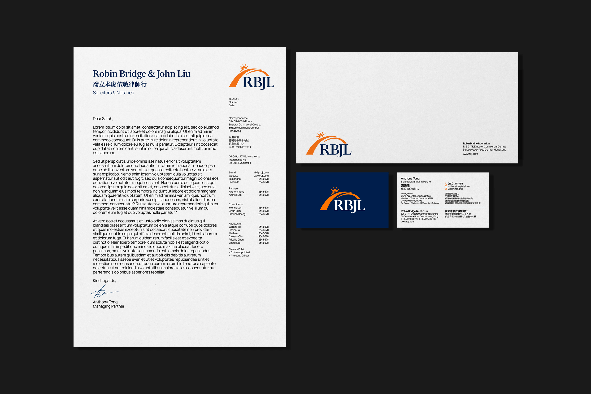
The solution is a sensitively refreshed brand logo, consisting of the revised logomark, brand typography, and brand assets, combining a mixture of photography layered with the abstract bridge.

The original orange was made more vibrant for improved contrast on white backgrounds. We introduced a legal, deep ink blue and a highlighting bright blue to be used sparingly in brand touchpoints.

RBJL company logo with the slogan "Professional, Proactive, Pragmatic" and an orange swoosh design.
Logo featuring the letters 'RBJL' in white with an orange arc and starburst on a dark blue background.
City skyline at sunset with mountains and ocean, featuring a logo with the letters "RBJL" and an orange arc with a star.

The brand uses a combination of Financier Display and the Manrope type families.

Font specimen of Financier Display
Font specimen of Manrope
LinkedIn company profile for "Robin Bridge & John Liu," featuring a Hong Kong skyline banner, logo "RBJL," and description of the law firm’s services in intellectual property and litigation.
Screenshot of a LinkedIn profile showing a professional headshot of a woman in a suit. Text includes her name, "Anthea Loo," and her position as "Partner at Robin Bridge & John Liu." The profile mentions "Hong Kong SAR" and 288 connections. The background features a motion-blurred image of a tram, with the "RBJL" logo displayed.
Professional profile featuring a smiling man in a suit with glasses against a city skyline background. Details include managing partner at a law firm, director position at a research institute, location in Hong Kong, and connection information.
Corporate stationery set featuring letterhead, envelope, business card, and logo design for "Robin Bridge & John Liu," a solicitors and notaries firm. The letterhead includes contact details and a mock text letter. The logo features the initials "RBJL" with an abstract orange graphic.
Business cards and logo for "RBJL," with contact details for Anthony Tong and Anthea Loo, solicitors from Robin Bridge & John Liu in Hong Kong.
Corporate branding materials for RBJL with logo and stationery
Presentation slides with blue and white design themes, featuring "Proposal Title," "Firm Credentials," and "Introduction" sections with the logo "RBJL." Two slides include bridge images, dated September 16th, 2025.
Screenshot of seven website pages with a consistent layout, featuring a header with a banner image, navigation menu, and footer. Each page contains a combination of text, images, and contact information. The pages appear to include content about company background, team members, services, and contact form.
Blue tote bag with orange handles and RBJL logo on gray background.
Brand guidelines document pages layout, showcasing logo designs, color schemes, typography, graphic assets, stationery, and digital applications. Includes sections on logo usage, color palettes, typeface examples, and digital marketing materials.

BrandCraft transformed RBJL’s digital presence, including its customer journey. The final result is a highly professional website, with restructured content that compliments the refreshed brand identity.

With a huge thank you to the RBJL partners, Anthea and Anthony for trusting us with your vision.

Learn more
RBJL rebrand blog post

“I am a bit overwhelmed when I read [the case study] of our re-branding journey. Adam injected new life into our brand. Anthea (my business partner) and I love everything about Adam, whether as a most gifted artist or as an individual.

Adam has a Western perspective but also fully understands the Hong Kong culture which is exactly what we need for our brand refresh.

We spent a lot of time brainstorming together. It's been a wonderful journey and we have received numerous positive feedbacks from our friends and clients. Thank you, Adam”

Anthony Tong
Managing Partner, Robin Bridge & John Liu


Next project