
Index > Georgiou Partnership
Fearless advocacy. A brand for uncompromising defence.
Overview
We first worked with Phillip, the founder of Georgiou Partnership in 2020 on the brand identity of his previous firm, GPS.
As a branding agency, it is not often that we get the chance to work with the same client on multiple branding projects. In this case, Phillip was splitting off from the existing firm, and starting his own firm specialised in disputes and compliance.
Brand Core
We talked with Phillip about the vision for his new company to learn more about the organisation he was building.
Core values:
– Partnership and strength of our leadership
– An enduring passion to defend our clients
– Fearless approach ‘David vs Goliath’
– Authoritative, respected by clients, and competition


Creative
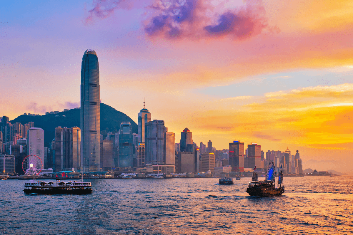
Our visual inspiration initially came from the architecture that dominates the corporate landscape of Hong Kong. As we looked deeper into the architectural details of geometry and grids, we explored the practice of collage. We were drawn to the visual metaphors of Hong Kong’s unique cultural layering, contrasts between the old and the new, and the seemingly infinite grid-like pathways that we use to traverse the city.


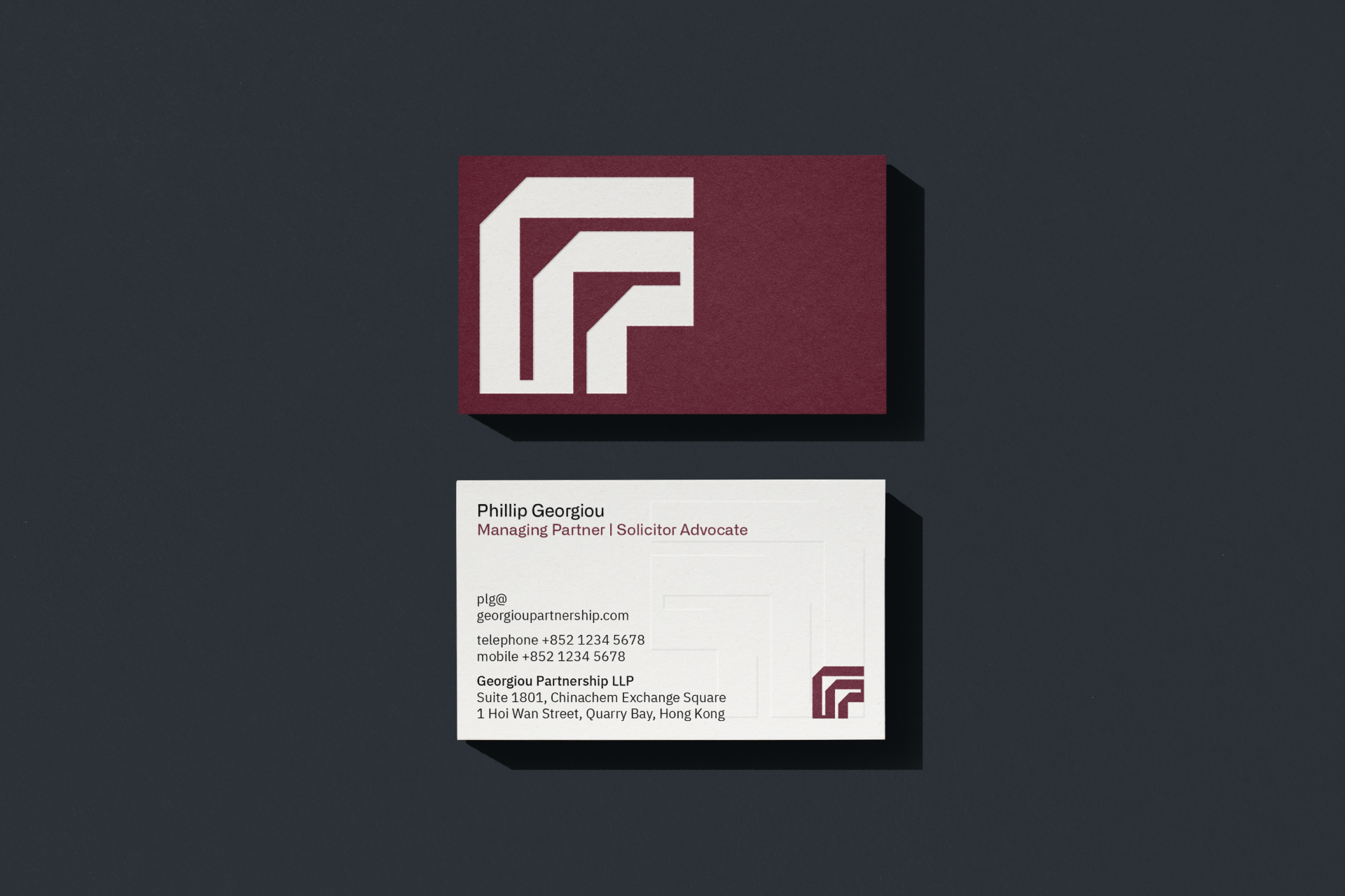
Logo
We honed in on a strong, geometric and authoritative brand lockup. Based on a square grid, the logomark uses a continuous path to express the brand name. The overall expression is designed to be authoritative and strong, whilst revealing an ‘aha’ moment


Expression
We knew we wanted to find a unique font for the GP logotype. We chose Alliance No.2 Medium because it echoes the unique geometry of the logo.
We chose IBM Plex Sans as a complimentary content font because it is functional, strong and open source.


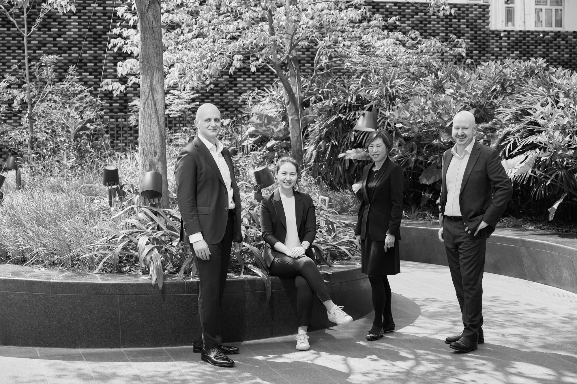
Corporate photography by the inimitable Harold de Puymorin


Impact
“BrandCraft genuinely care about your business. They come into the job with an open mind, they take the time to open your mind, and through the ‘discovery process’ you learn a great deal about your own business including your place in the market you operate in.
With these valuable data and insights Adam Charlton takes his graphic design skills to create a brand that almost miraculously encapsulates the essence of the why, who and what of your business.”
Phillip Georgiou, Managing Partner, Georgiou Partnership
Next project
