Index > JaneClare
JaneClare stands for clean without compromise. Our rebrand put purity and performance front and centre.
Context
Clean since 2003, JaneClare is a pioneer of truly natural skincare. Founded by Angela Lee, a former partner at an international law firm, the brand applies uncompromising safety standards to clean beauty—formulating without ingredients of concern while delivering real efficacy.
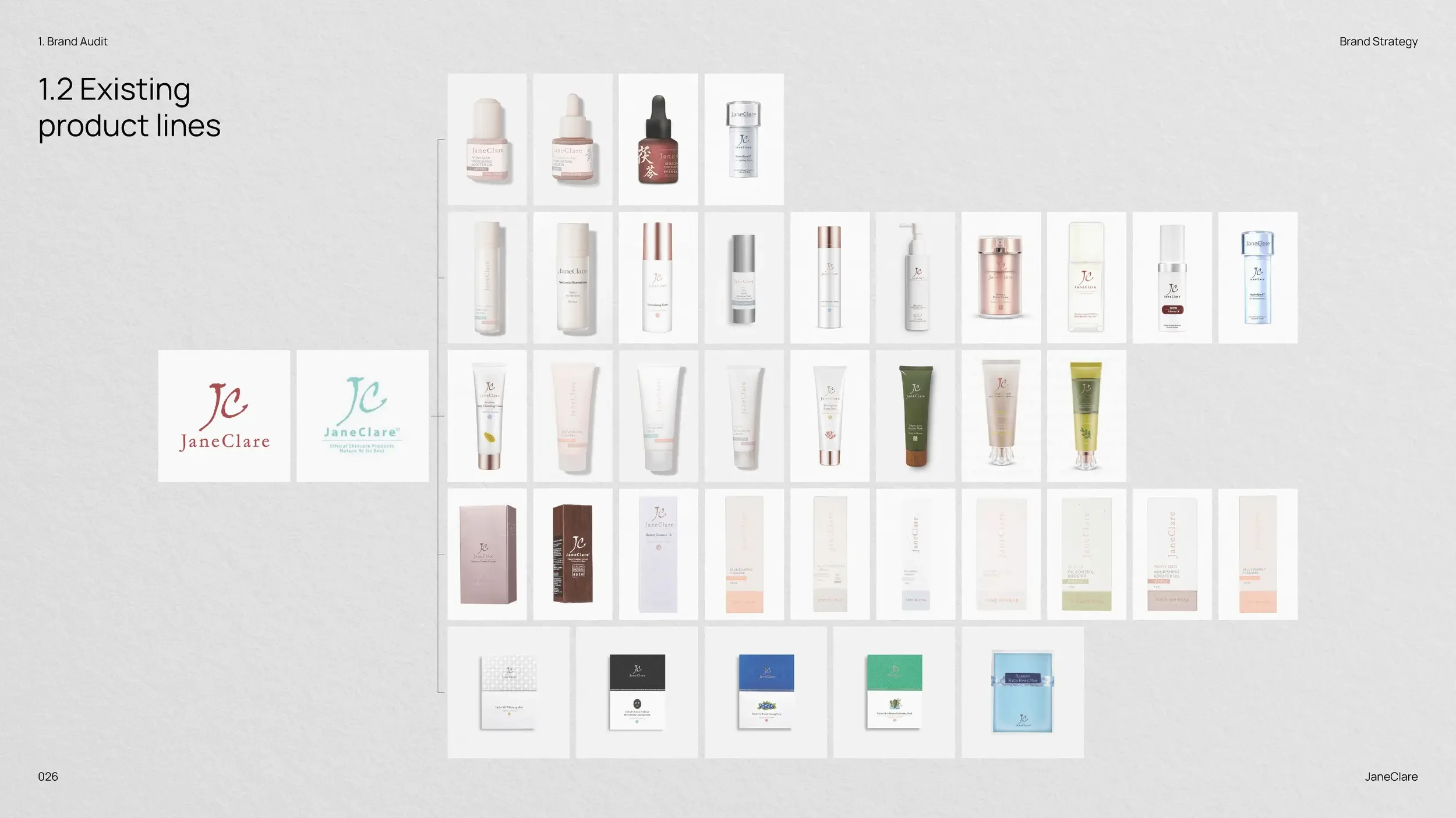
JaneClare first approached us for a logo refresh, which evolved into a complete reimagining of the brand identity and packaging system. The expanded scope brought its 2003 heritage to the surface and sharpened a story that had stayed mostly hidden.
Direction
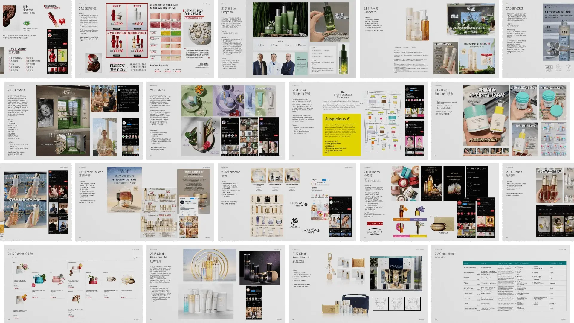
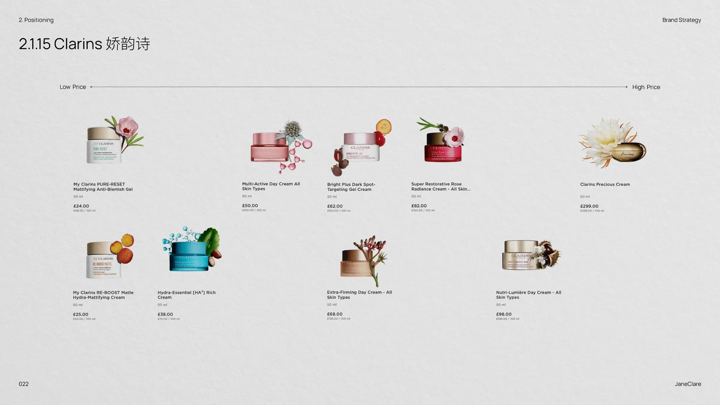
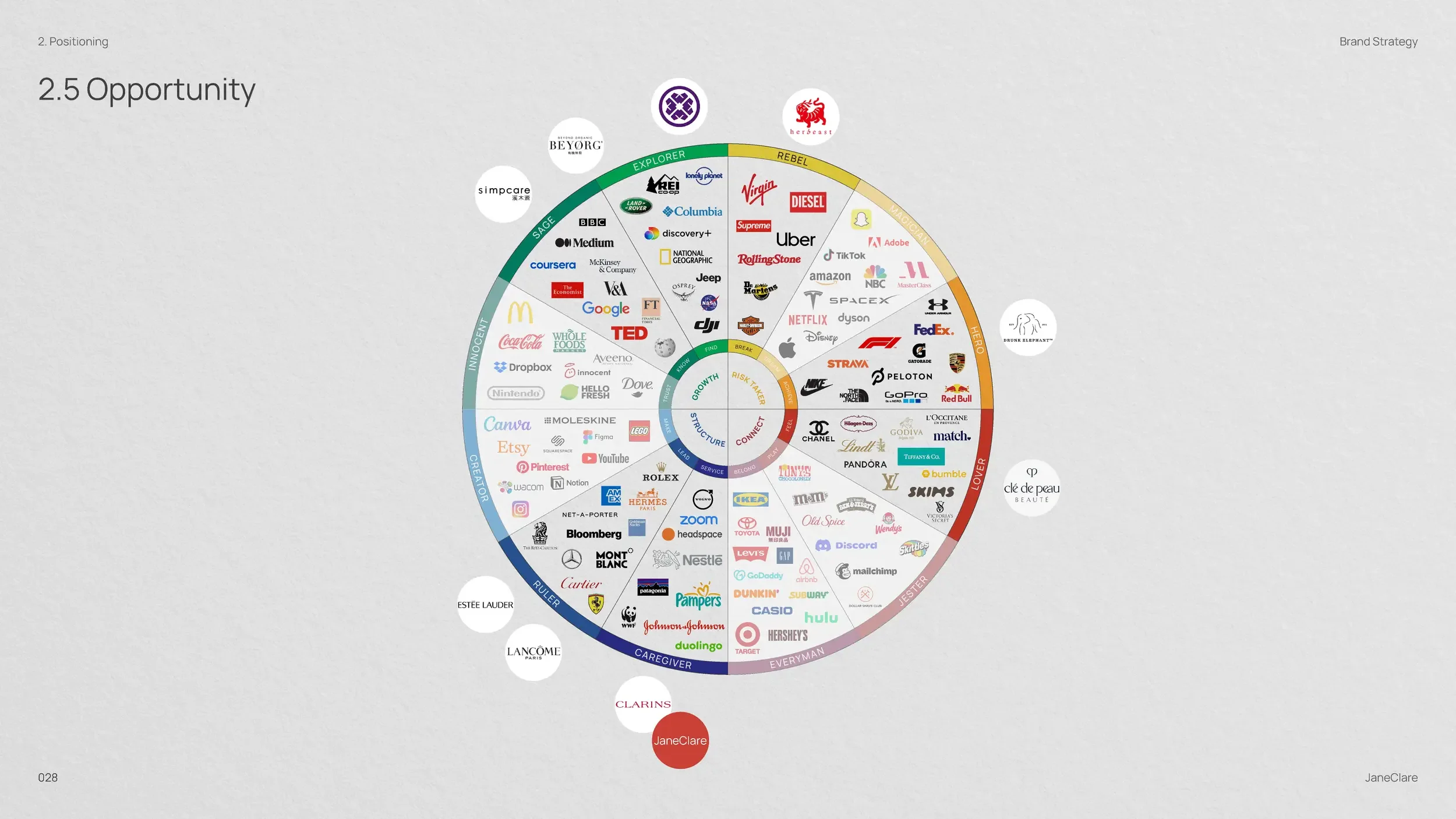
Our branding journey began by examining the most compelling elements of JaneClare’s story: the perfect union of Modern Chinese Medicine and cutting-edge scientific research, their uncompromising stance on ingredient purity, and their founding vision of efficacious natural skincare that genuinely works.
Working collaboratively with the JaneClare team, we developed a brand strategy that finally gave proper expression to their exceptional products and philosophy. The result positions JaneClare not merely as another natural skincare line but as a pioneering authority in scientific, truly natural formulations that deliver on their promises.
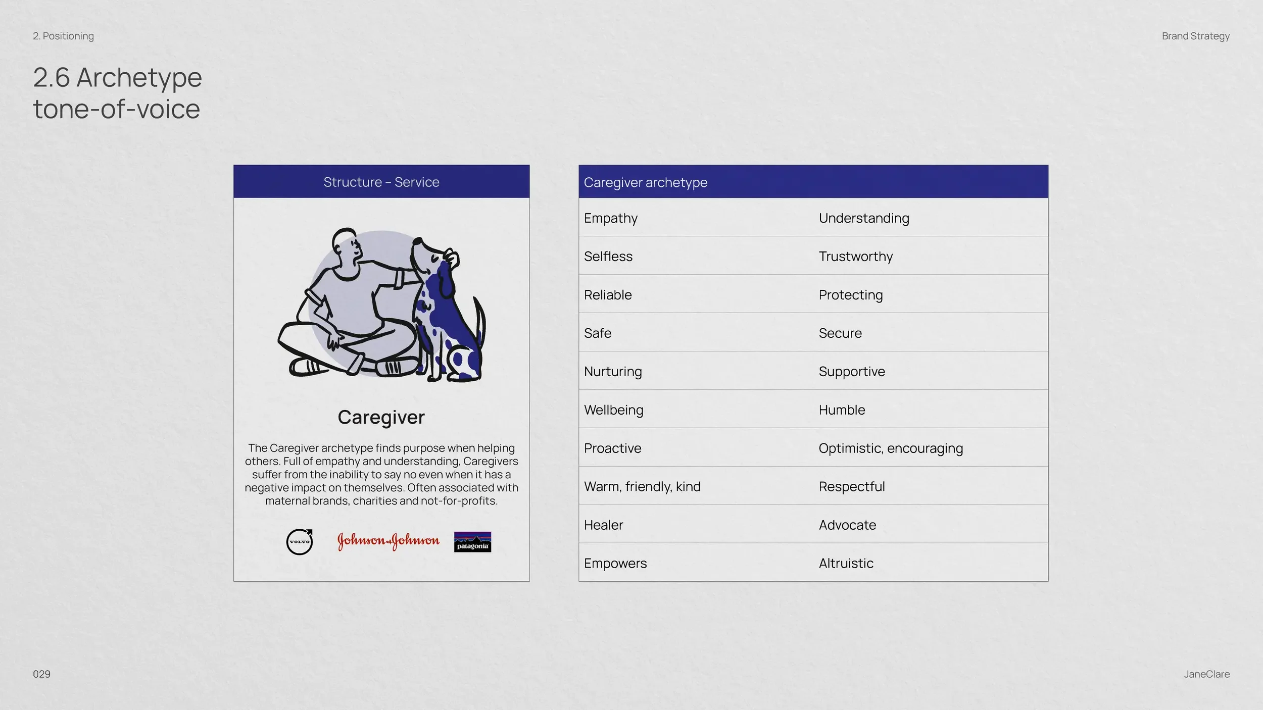
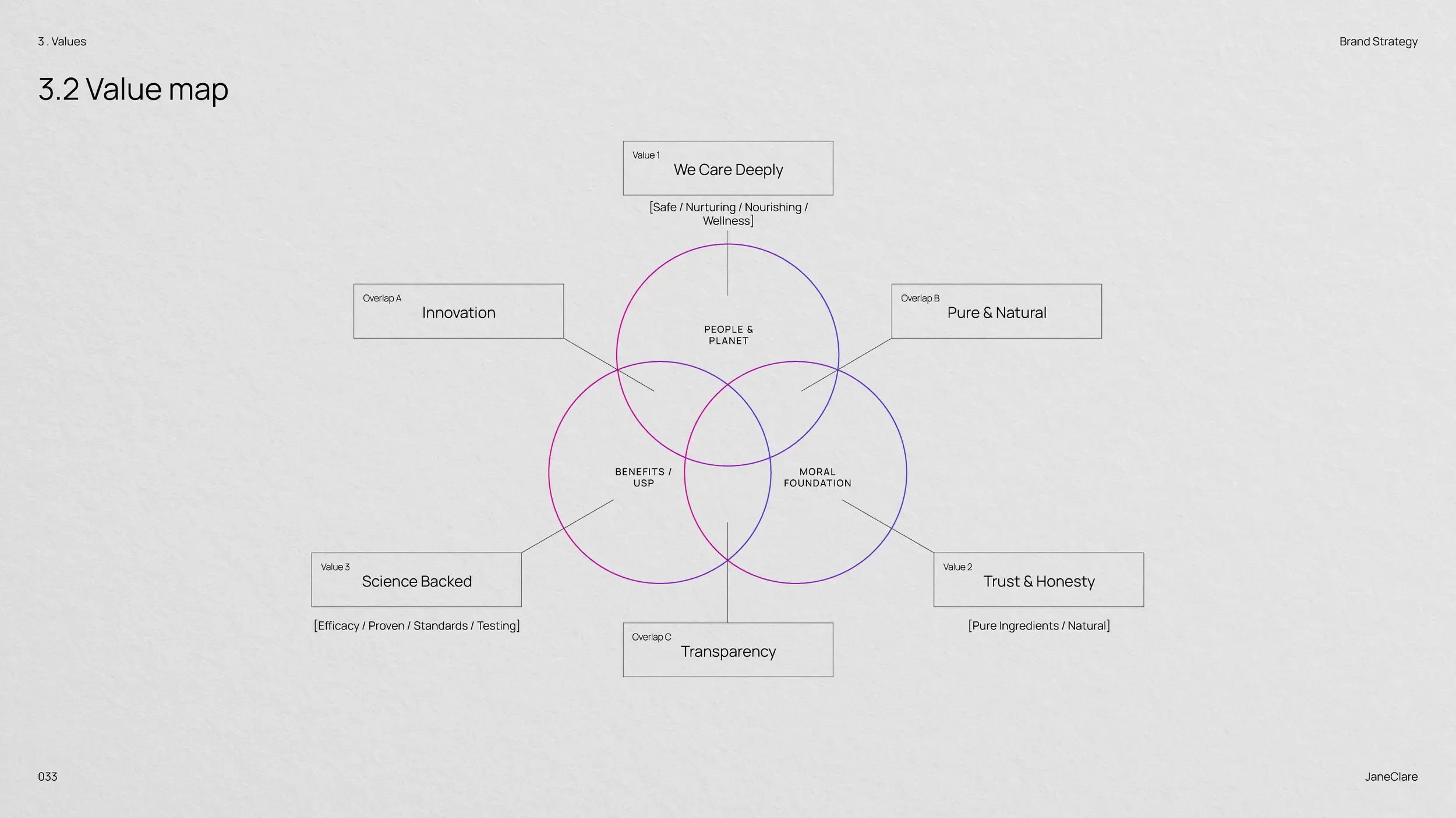
We defined three brand pillars for JaneClare:
We Care Deeply
JaneClare’s genuine commitment to improving skin health goes beyond commercial interests. Their dedication to addressing challenging conditions like eczema and psoriasis stems from a profound understanding of how skin issues affect overall well-being. Our strategy positioned this empathetic approach as a cornerstone of their brand identity.
Science-Backed Products
While many natural skincare brands rely solely on tradition, JaneClare distinguishes itself through rigorous scientific validation. We highlighted their investment in research and clinical testing, demonstrating how each formulation balances natural ingredients with proven efficacy—a powerful differentiator in their market segment.
Trust Through Honesty
In an industry often characterised by exaggerated claims, JaneClare’s transparent approach to ingredient sourcing, manufacturing processes, and realistic results expectations stands out. Our communications emphasised this refreshing honesty, building credibility with increasingly knowledgeable consumers seeking authentic brands.
KEY MESSAGING
Key messaging infuses calmness, care, and credibility across every customer interaction. This balanced approach helps to build the trust that’s essential for a brand offering natural remedies for challenging skin conditions like eczema and psoriasis.
The messaging strikes a balance between emotional reassurance and scientific validation, which is precisely what consumers require when seeking relief from skin concerns. By maintaining consistency across all customer interactions, JaneClare’s communications reinforce their position as trusted experts who combine genuine empathy with proven natural efficacy.
Identity
We explored multiple creative directions during our concept phase, seeking ways to bring JaneClare’s vitality to life.
Our exploration led us to a balanced system combining natural elements with refined typography, creating the visual diversity needed to express the brand’s caring yet sophisticated personality.
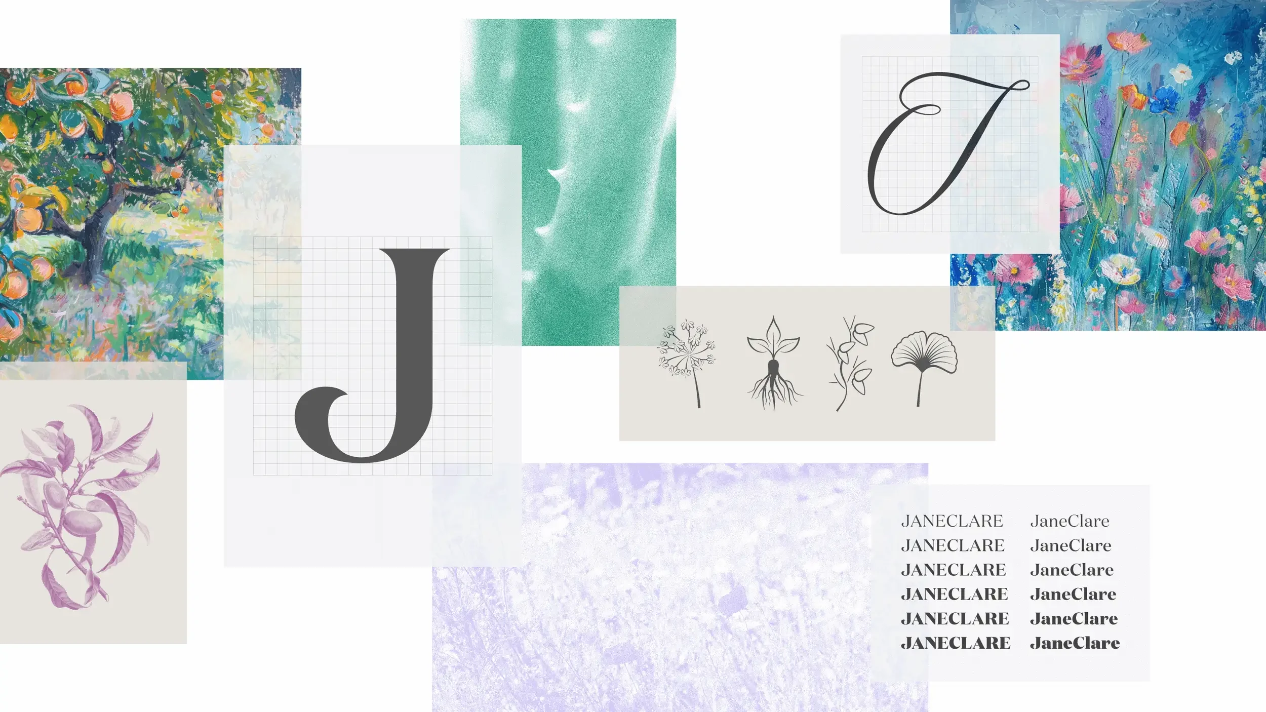

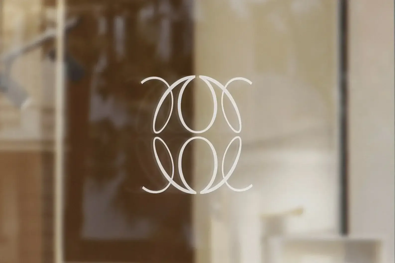
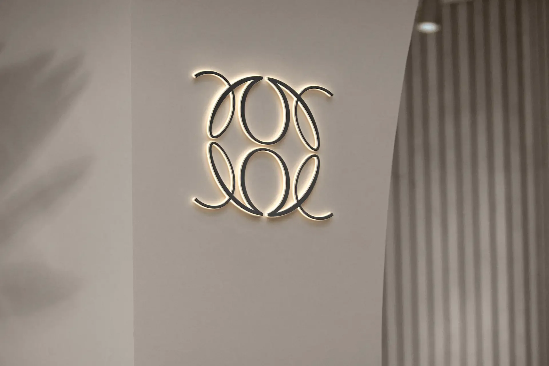
Left: The JaneClare logomark constructed from an abstract ‘JC’ mark repeated and mirrored to create a unified whole.
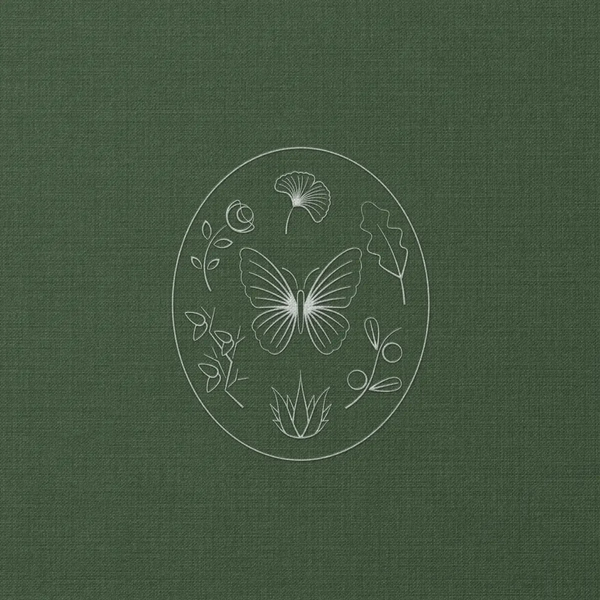
Right: The JaneClare seal captures common ingredients such as Gingko, Olive, Aloe and Almond. The butterfly illustrates the metaphor of renewal, while silk, created by silk-moths is a key ingredient to many of JaneClare’s products.

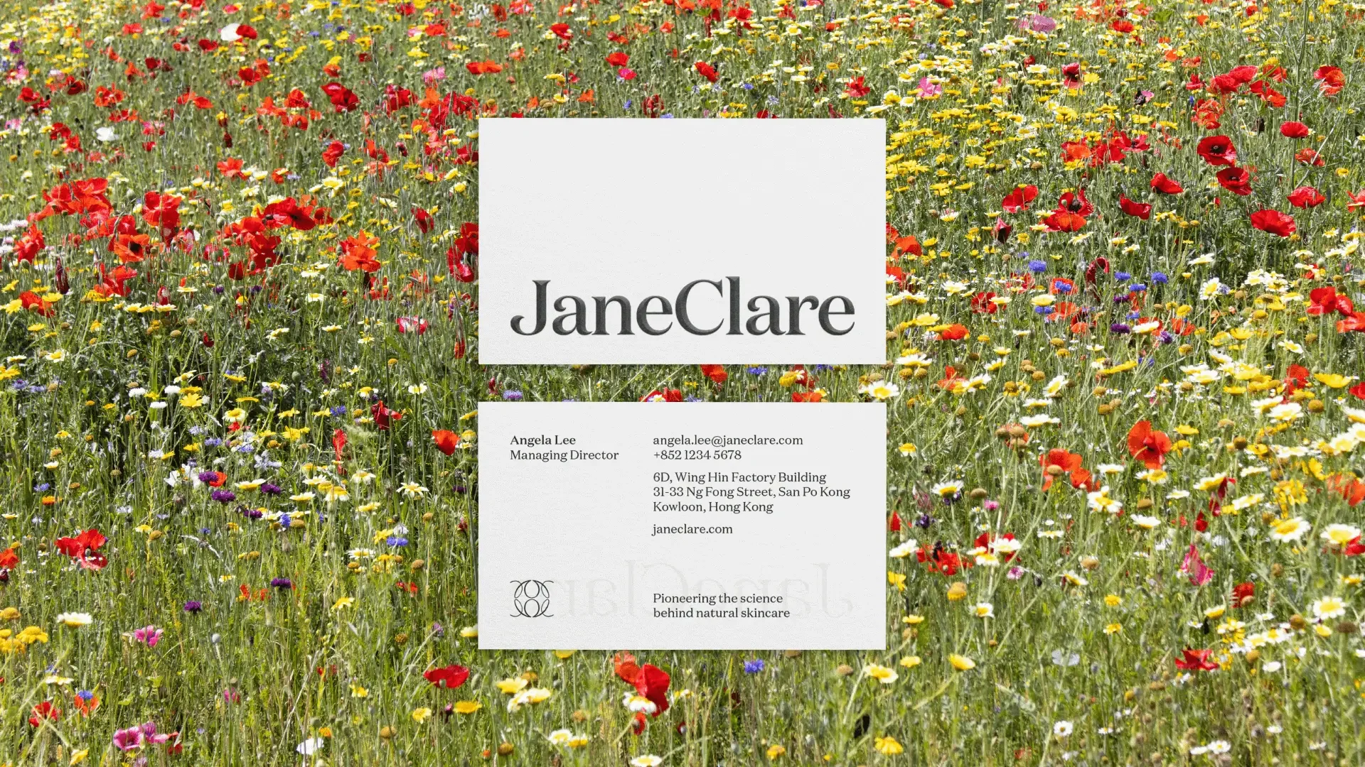
We chose the Domaine font family from Klim Font Foundry for the brand’s typographic expression. The chosen typography communicates both heritage and innovation, reflecting the brand’s unique positioning at the intersection of time-honoured wisdom and contemporary science.


We extended the logotype to the group brand, LabJaneClare, and its monogram.


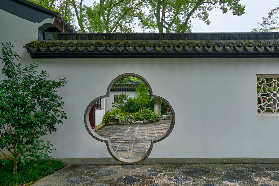
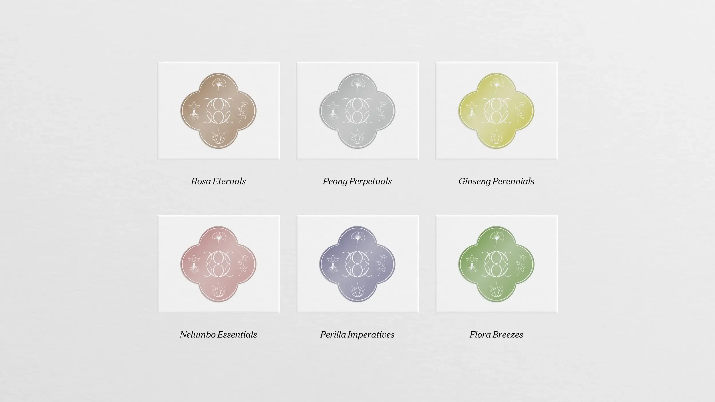
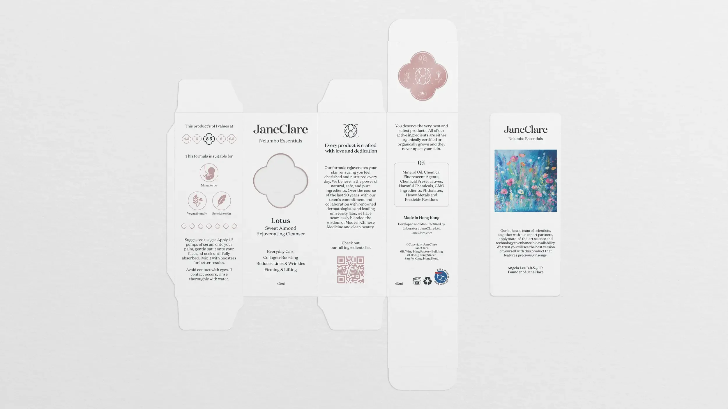
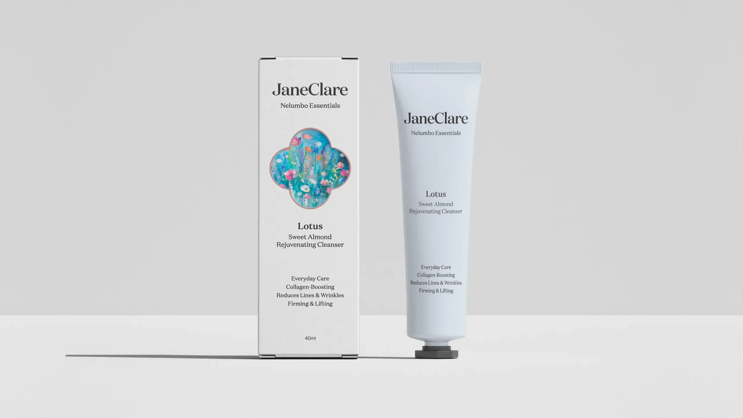
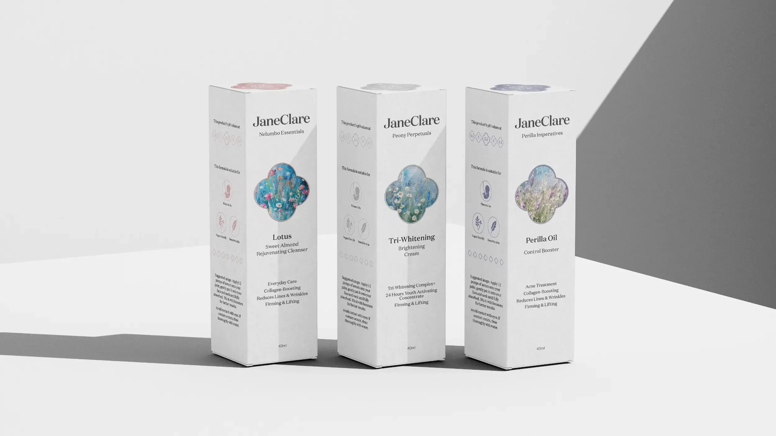
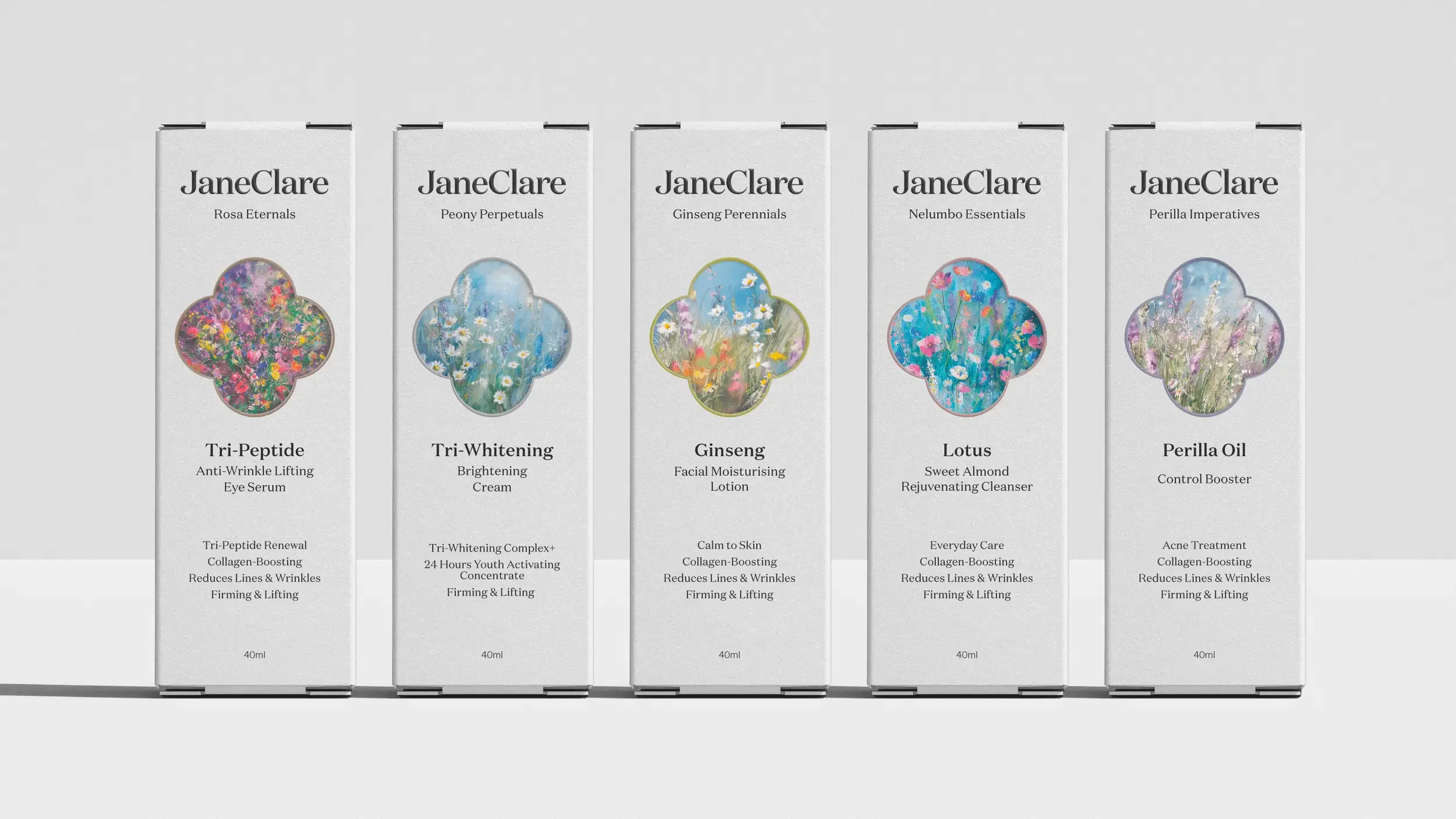
The logomark is extended into a crest used on packaging with a ‘Quatrefoil’ — a four-leaf decorative shape commonly found in ornate windows and doorways in Chinese gardens.

When developing the brand identity, we focused on two essential aspects of JaneClare’s market position: its established reputation and maturity in the industry, alongside its innovative scientific approach to natural skincare.
Expression
When developing the brand identity, we focused on two essential aspects of JaneClare’s market position: its established reputation and maturity in the industry, alongside its innovative scientific approach to natural skincare.
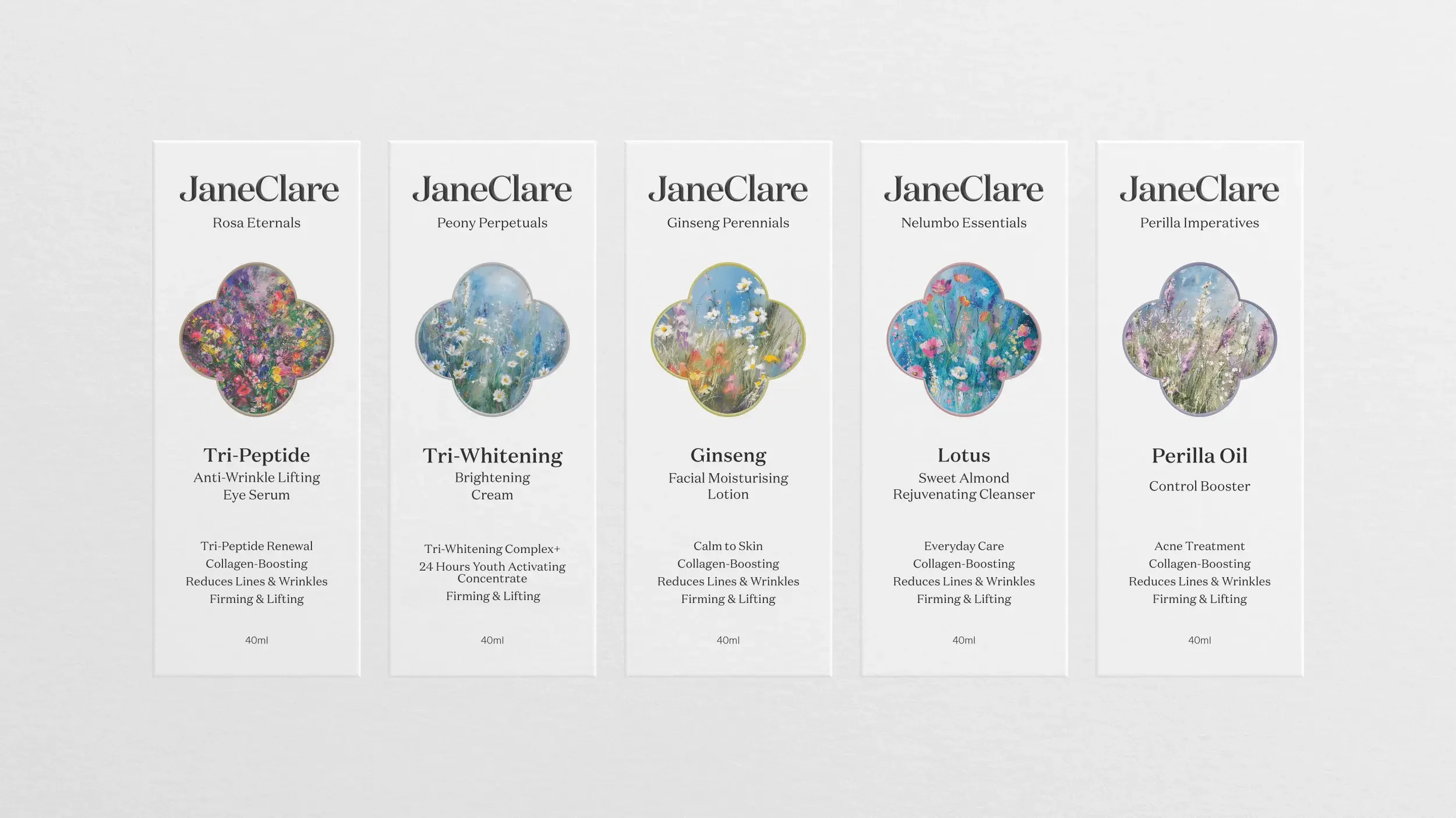
The shape is extended into a window in the front of the packaging, revealing removable product information cards. The information cards feature delicate watercolour illustrations of key botanical ingredients, adding an artistic dimension while maintaining the clean, minimalist aesthetic of the primary packaging.
This refined packaging system communicates JaneClare’s unique positioning—combining traditional wisdom with modern science in truly natural skincare formulations.
Impact
“As part of our ambitious market expansion strategy, which included the development of our three-story flagship store on Canton Road, we knew our brand needed to evolve. Engaging with Adam and Shirley for our rebranding proved to be an excellent decision.
The new logo design and packaging system they created have been exceptionally well-received by our clients. Their thoughtful approach to balancing our natural ethos with sophisticated design elements perfectly captured JaneClare's essence while elevating our market presence.
The rebrand has been instrumental in supporting our growth as we continue to expand our premium natural skincare offerings in new markets.”
Angela Lee
Founder, JaneClare
Next project