
Index > Raw Lily
Raw Lily stands for pure, no-nonsense wellness. Setting new standards in Hong Kong.
Context
Raw Lily is a new e-commerce wellness brand based in Hong Kong, dedicated to offering only the highest quality wellness products. The founder approached us to position and rebrand the business for launch into Hong Kong's emerging wellness market.
The wellness industry in Hong Kong is still in its early stages, creating both opportunity and challenge. Consumers are increasingly health-conscious but often overwhelmed by choice and skeptical of inflated claims. Raw Lily needed a brand that could cut through the noise and establish genuine trust in a crowded, often confusing marketplace.
Direction
We positioned Raw Lily as a rebel within the wellness landscape—a brand that refuses to compromise on quality and cuts through industry B.S. with refreshing honesty. This rebel archetype gives Raw Lily permission to challenge conventional wellness marketing while building authentic credibility.
The brand strategy centres on an unwavering commitment to product excellence and transparent communication. Where other wellness brands make grand promises, Raw Lily focuses on what matters: sourcing the absolute best products and telling customers exactly what they're getting.
Identity
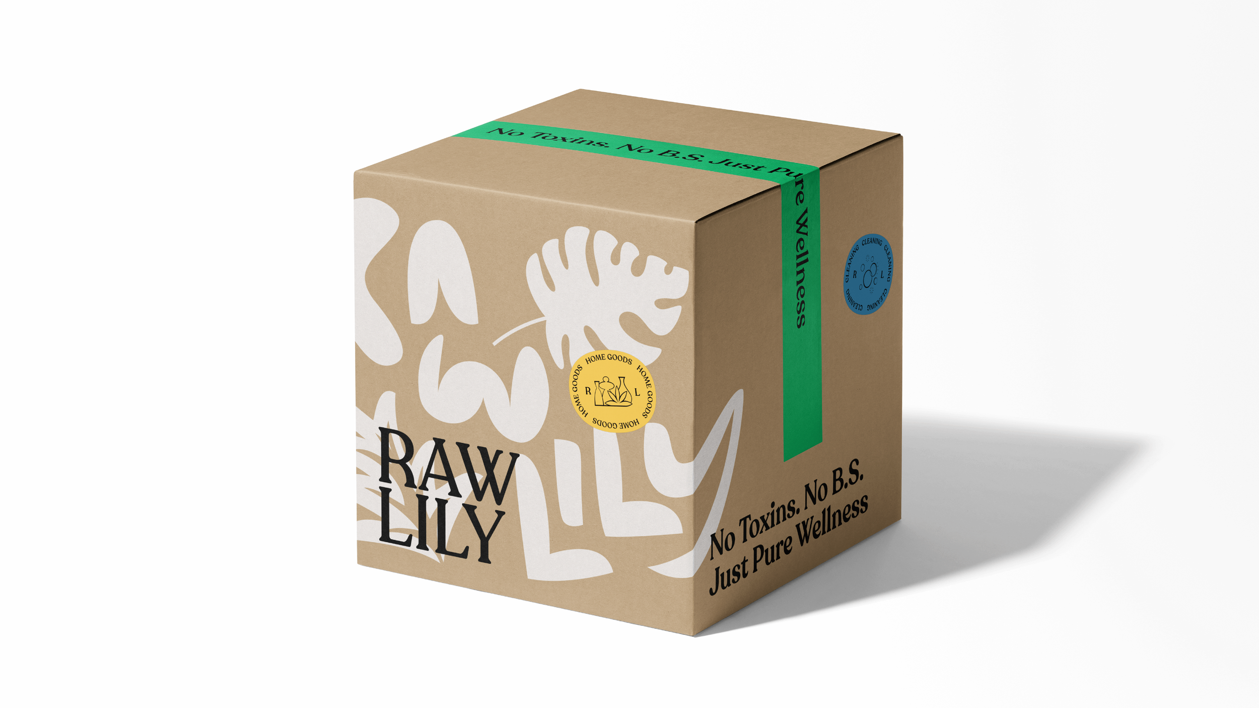
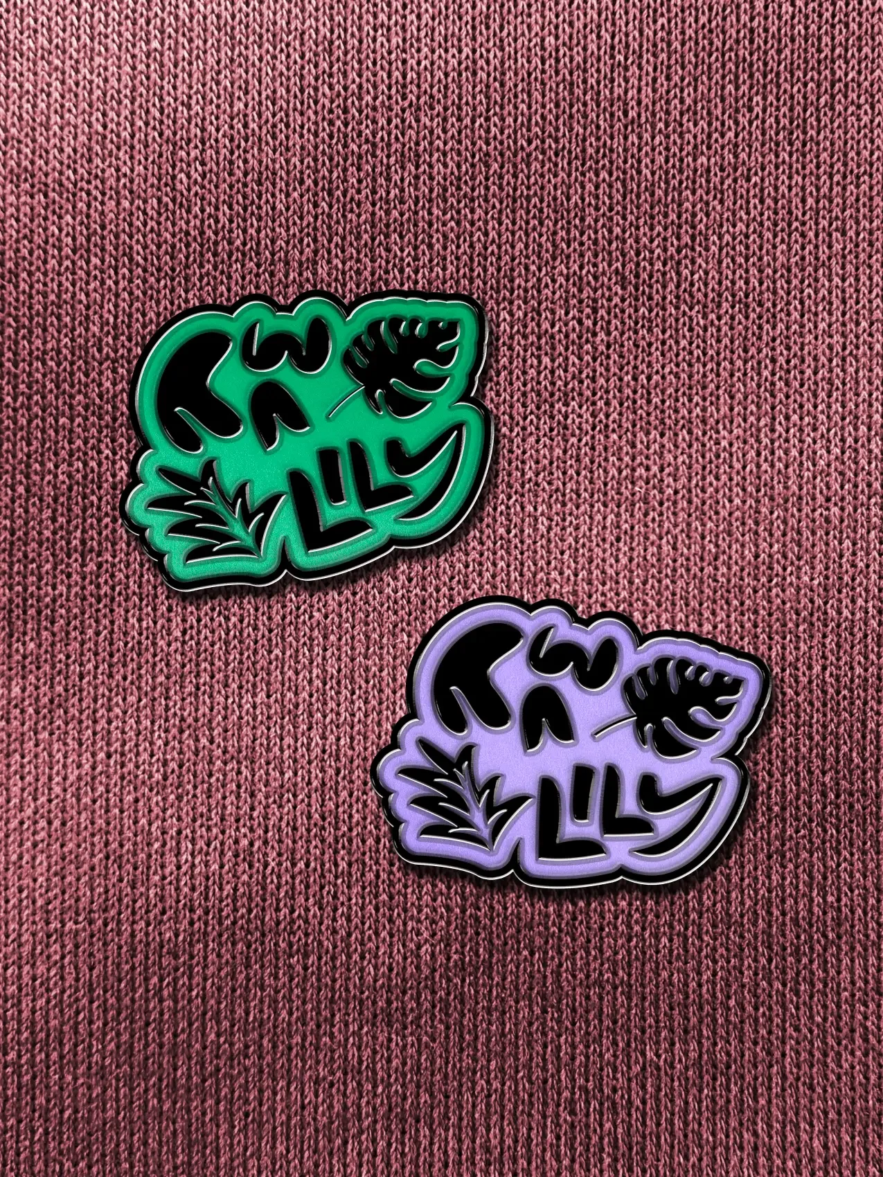
The Raw Lily wordmark pairs a refined, rounded serif with decisive spacing to signal what the brand stands for: pure, no-nonsense wellness. Set in uppercase, the forms feel assured and commanding—more apothecary than cosmetic—so the mark reads as a stamp of standards, not a slogan.


Key Messaging
Raw Lily’s brand purpose centres on education—cutting through an industry drowning in meaningless buzzwords and fleeting trends. The brand exists to help customers make informed choices in a marketplace that often prioritises marketing over substance.
We crafted a voice that strikes a balance between authority and approachability. Raw Lily speaks with the confidence of deep product knowledge, but never talks down to customers. This creates empowering messaging that educates without overwhelming, building trust through transparency rather than jargon.
Raw Lily uses two distinct methods for selecting products, and we created individual lockups for each approach. These visual stamps act as trust signals—clear indicators that tell customers exactly how and why each product earned its place in the Raw Lily store.

— ‘Conscious Curation’ communicates the brand’s rigorous approach to product curation.

— ‘The Raw Standard’ is Raw Lily’s growing ‘blacklist’ of harmful ingredients and the reasoning why.
Expression


Impact
“It was a pleasure to collaborate with Adam and Shirley from BrandCraft. They were incredibly responsive and helpful throughout the entire process.
They are passionate, kind individuals with a lot of energy which made the experience enjoyable. Their professionalism and dedication shone through, and we truly valued their hard work and commitment.”
Tina Shum
Founder, Raw Lily
Next project
