
A Year for Freedom, Energy & Transformation 🐎
Yet again, we find ourselves approaching CNY in the thick of some wonderful projects. And yet again, I find myself reflecting on the last year. With Apple Notes open, ‘Blog Posts WIP’, and a rare, relaxed afternoon, I can make some sense of the last twelve months and look forward to the next.
By Adam Charlton · 16 February 2026
Posted in Insight
We started 2025 working with the AIA Group brand team on the identity for their Qi Design System, which is an initiative aimed at enhancing design consistency and clarity throughout the organisation.
We then worked with a venture fund on their name and identity, and a lovely project, creating the brand identity for the humanitarian consultancy, Humantics.
In early autumn, we were approached by the Greater Bay Area International Clinical Trial Institute to create its brand identity, which we are currently completing.
In early autumn, we were approached to create the brand identity for the Greater Bay Area International Clinical Trial Institute. Owned by the Hong Kong SAR Government and operated by the University of Hong Kong, GBAICTI coordinates clinical trial resources, connecting the Greater Bay Area with international standards. A wonderful team and project, which we are currently completing.
At the very beginning of 2026, we started work on two of the largest and most in-depth projects we’ve worked on. We’re working with HKU on another, larger, year-long full-scale branding project, and helping a Hong Kong family office with a vast legacy define and create its brand.
It’s been a full-on year, and with these two large projects we’re working on, it will be a full-on 2026!
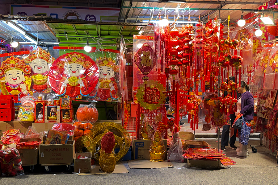
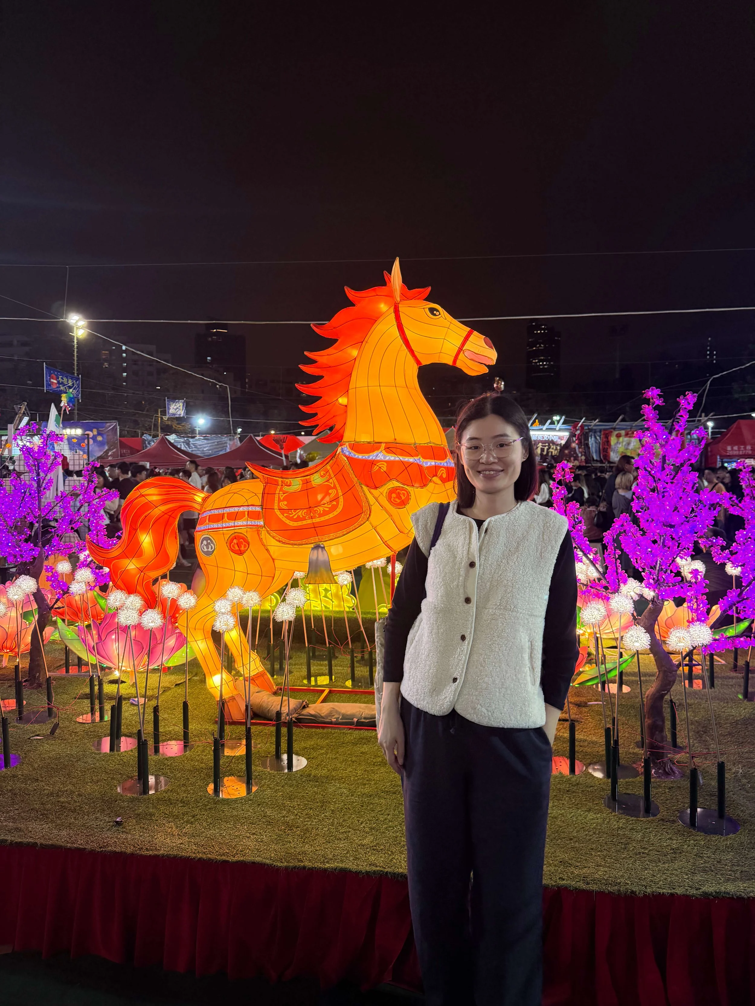
As a gweilo(!) brand designer, I love the depth of CNY culture, its metaphors, and their meanings. The year of the horse is the year of freedom, energy, and transformation. A few thoughts, under those threads.
Freedom
I’m not great at small talk. I don’t immediately understand people’s intentions. The other edge of the sword is that I am good at distilling things to their core components, cutting through noise, and finding the essence. I’ve realised this is a great trait for a brand specialist.
In the last few years, I’ve come to terms with the fact that I have OCD and, likely, what is now known as ASD. These are double-edged swords. Detrimental in some ways, but when focused and honed, they’re superpowers. Hypersensitivity and attention to detail can be applied practically to my practice, BrandCraft. - Focused on finding truths, communicating values, and being purposeful and critical with design. Tuned in the right way, I’ve come to accept and love these parts of myself. Obsessive, ritualistic, focused.
Another part of ASD for me is that I obsess over our work. I obsess about sizing, proportions, geometry, typefaces, colour, and all kinds of design details. Creating a compelling brand that conveys a company effortlessly requires a great deal of work and curiosity. It’s a marathon, and endurance can only be fuelled by passion.
If you’ve ever met me or read some of our blogs here, it’s a cliché to say that I love the work we do. Well over a decade into running BrandCraft, I still sincerely love the work we do(!), and we are both deeply invested in the projects and teams we work with. Each project is as personal as it was when I first started. We do not have to operate in this way, but we take it as a moral obligation. We are our clients’ cheerleaders, and we’re incredibly proud of their successes!
Energy
Hong Kong’s identity is characterised by its relentless energy, which is shaped by its people.
When I am away, and I think of Hong Kong, I think of the energy and pace of its people and infrastructure. I think of its scale, its speed, its rapid evolution. I think of the purposeful, hardworking, resilient people who make our city. A place is its people, its communities. It’s the networks of change, heartbeats and relentless, brutal process.
The sound of Hong Kong is industrious purpose: voices howling from wet markets, the honking of taxis, the trams and trains.
There was a fantastic series of articles written about the Hong Kong MTR system by Christopher Dewolf, who reached out for a few of my thoughts on the MTR logo. This brought back 2017, when I interviewed John Lloyd, who had the honour of helping to steer MTR’s brand towards the future decades earlier.
I was walking back home from the MTR recently, when it occurred to me that the MTR logo is probably one of the best logos in the world. I appreciate that’s a) not a title that’s due much attention in today's world, or b) not something other than designers might care to listen to further, let alone care enough to proclaim an opinion, for or against!
The MTR logo holds a subtle, humble, unspoken role in every Hong Konger’s life. It’s a graphical monolith, sometimes tiny and overlooked, sometimes enormous, proud on building facades. The logo is very much one of our own. It is a loyal subservient icon of Hong Kong. It’s a confident icon.
It holds a wonderful tension between the past and the future. And resonates wonderfully within the graphic landscape of Hong Kong. It’s so beautifully timeless. It would be a crime if it were ever rebranded.
Transformation
I am the son of an automotive engineer and an accounts manager.
My father was an automotive engineer and is amazingly practical. From fixing furniture to bikes and motorcycles, give him a day in his garage, and he can build almost anything. A talented gun for hire, he helped create the McLaren Mercedes SLR, MP4-12C, GMD T50, and even had a hand in the DeLorean. He now humbly helps Shirley and I slowly renovate our apartment, and spends a great deal of the week cycling. He is witty, humble, and honest.
My mother was an accounts manager and is a brilliant, critical, business-minded person. She can help think through problems from any perspective. The daughter of a builder, she studied business as a mature student while my sister and I were toddlers. Ambition, relentless, endurance.
I am a combination of both. Half engineer, lover of geometry, rules, and structure, and half commerce, accounts and business. I am detailed and purposeful, slightly awkward, ambitious, and fascinated by business.
As we enter another year, I feel more comfortable in my own skin than ever. Cheers to a year of freedom, energy and transformation!
Gong hei fat choy,
Adam & Shirley
Back to the Blog

About the author —
Adam moved to Hong Kong in 2012 and founded the branding agency BrandCraft. Adam has built brands for companies at every growth stage and has consulted for some of the world’s most recognised companies.