
Hong Kong Identities - MTR - Q&A with John Lloyd
The MTR railway system in Hong Kong opened in 1979 and is now one of the most successful railway systems in the world. This is a discussion with designer John Lloyd.
By Adam Charlton · 2 May 2017
Posted in Insight

Introduction
The MTR railway system is one of Hong Kong’s most recognisable icons, and its distinctive logo has become integral to the city’s brand landscape since 1979. More than just a transit symbol, it represents the meeting point of efficiency, modernity, and location.
In our ongoing series exploring Hong Kong’s most significant brands, we speak with John Lloyd, the designer who helped evolve the MTR's visual identity in the 1990s. Through his insights, we uncover not just the design principles behind this enduring symbol, but also how it has maintained its relevance and impact through decades of rapid change.
As Hong Kong continues to evolve, understanding the stories behind its most iconic brands becomes increasingly valuable. The MTR identity offers lessons in critical design excellence and how thoughtful brand development can create lasting cultural significance.
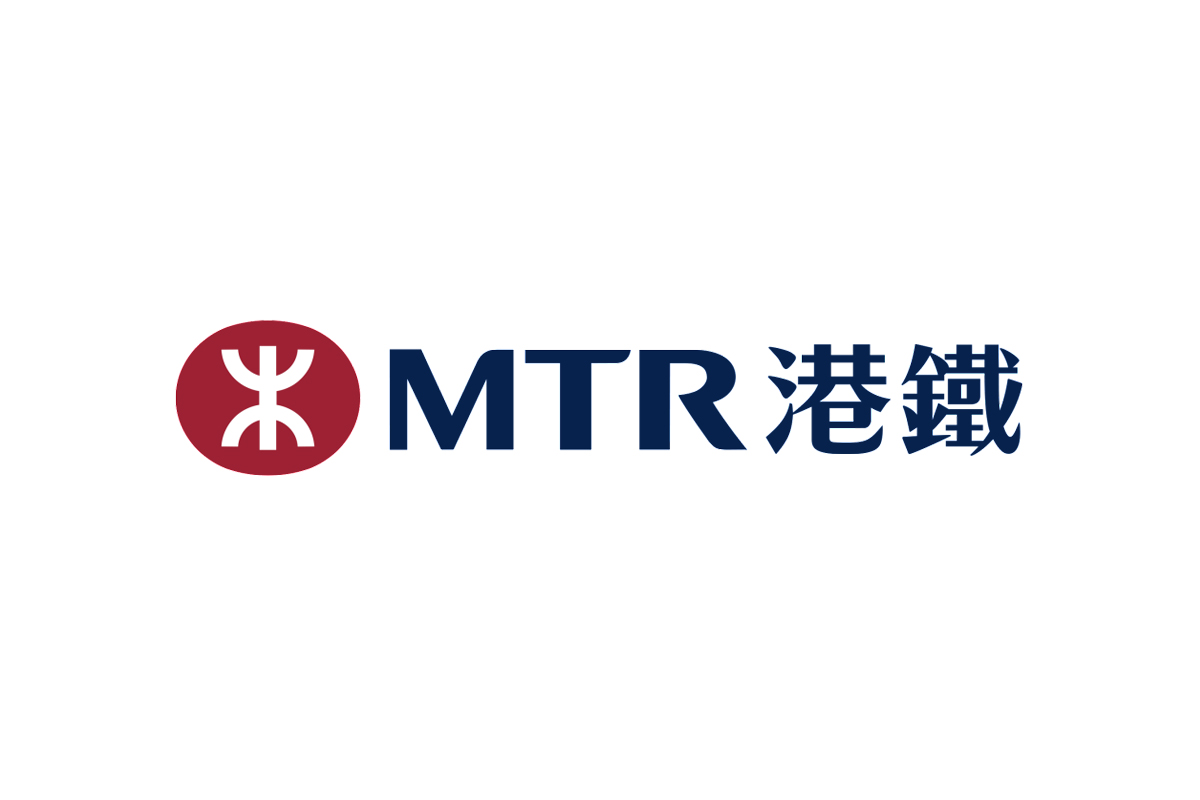
The beautifully balanced logomark is an icon of Hong Kong’s brand landscape, one that feels forever modern, nuanced and precise.
Interview with John Lloyd
A.C: To what can you attribute the long-lasting success of the MTR identity?
J.L: The MTR identity system succeeds and endures because it has within it everything that makes for an effective identity: the logotype is distinctive, legible, identifiable at a glance, memorable, and timeless. The best corporate marks achieve these aims through simplicity and clarity of form. Furthermore, there is a comprehensive design system surrounding the logotype which includes, signs, passenger information, ticketing, uniforms, train liveries and vehicle interiors, corporate and marketing communications, and environments. All these elements are conceived and coordinated to enhance the passenger experience and to reflect the MTR brand values.
A.C: Of course it is always easier to look into a logo once completed, but what were your initial design references and inspirations that had the greatest influence on the design of the symbol?
J.L: An earlier version of the MTR symbol had been devised by Design Research Unit, a British Design Firm, who were hired to create an identity and sign system when the MTR organisation was founded in the early 1970s. In the 1990s, my consultancy, Lloyd Northover, was commissioned to develop a more effective identity and design management programme for MTR, which had grown considerably. We retained the basic form of the established DRU symbol but strengthened it and placed it within a comprehensive design system covering all manifestations and expressions of the MTR.
The MTR symbol is abstract and is not meant to communicate an obvious meaning. I believe that the original rationale for the form was that the two curves represented Kowloon above and Hong Kong island below, connected by the vertical line. The symbol has a distinct and deliberate Chinese flavour but there is no literal Chinese meaning that I am aware of. The symbol is intended to look modern and to reflect the state-of-the-art transportation technology evident in the MTR system.
A.C: How has your process developed since completing the MTR logo in 1998?
J.L: My approach to the identity process remains essentially unchanged. The process has always involved research, strategy development, consensus-building, creative design, implementation, monitoring and control, and continuing design management. Technology has, of course, had an impact but the essentials of what creates an effective identity are, I believe, eternal.
A.C: Has your outlook to client partnership changed since you started your design practice?
J.L: I have always believed that designers should be equal partners with clients. The designer does not always know best and the client is not always right. But teamwork and respect between client and designer are essential. Early in my career, I saw that the most successful designers are those who listen well. My approach to client relationships has always been the same.
Final thoughts
The beauty of the MTR logo lies within its success in sustaining and enduring such a length of time. The logo's social value in Hong Kong is compelling, especially in times of uncertainty for the city. Hong Kong needs to feel ownership of identities like the MTR to grasp and feel attached when moving into the next five, ten, or twenty years.
Back to the Blog
About the author —
Adam moved to Hong Kong in 2012 and founded the branding agency BrandCraft. Adam has built brands for companies at every growth stage and has consulted for some of the world’s most recognised companies.