Case Study
Greater Bay Area International Clinical Trial Institute
Turning research into real-world impact
BrandCraft developed the brand strategy and visual identity for the Greater Bay Area International Clinical Trial Institute.
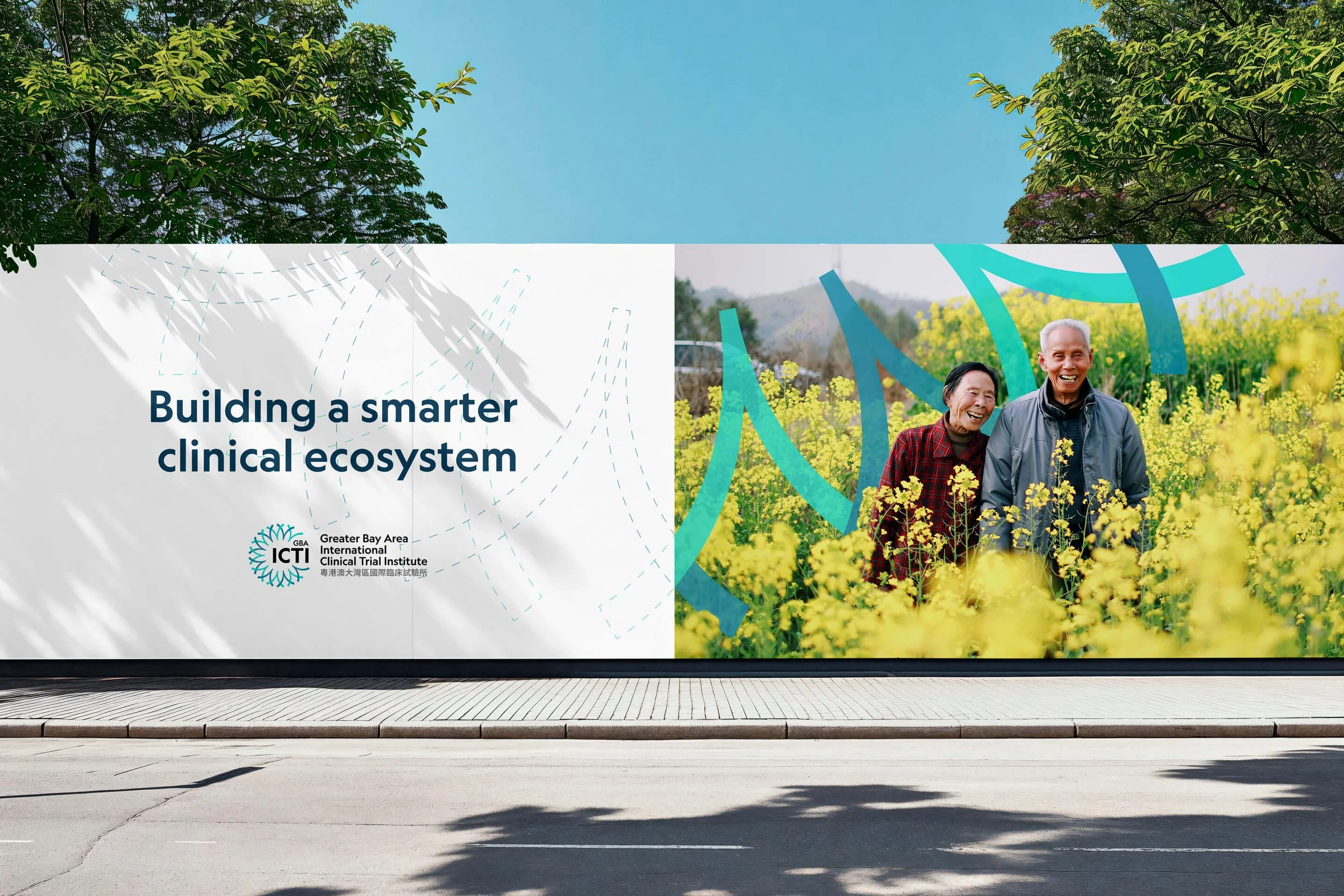
GBAICTI is a government-backed, academically run institute that coordinates clinical trial resources across Hong Kong’s universities, public hospitals and private healthcare facilities. It helps these organisations work together on clinical research.
Challenge
Giving a new institute a clear and credible identity.
The founding team needed an identity that would help researchers, clinicians and institutional partners understand where GBAICTI fits in the clinical trial process. It had to feel credible in a scientific setting and make clear who the research ultimately serves.
Approach
Looking at clinical trials through the people involved.
We explored how clinical trials work and what the Greater Bay Area could offer as a research network. Across the sector, we kept seeing familiar images of laboratories, data and technology. The people taking part in trials, caring for patients and carrying out the research were much less visible.
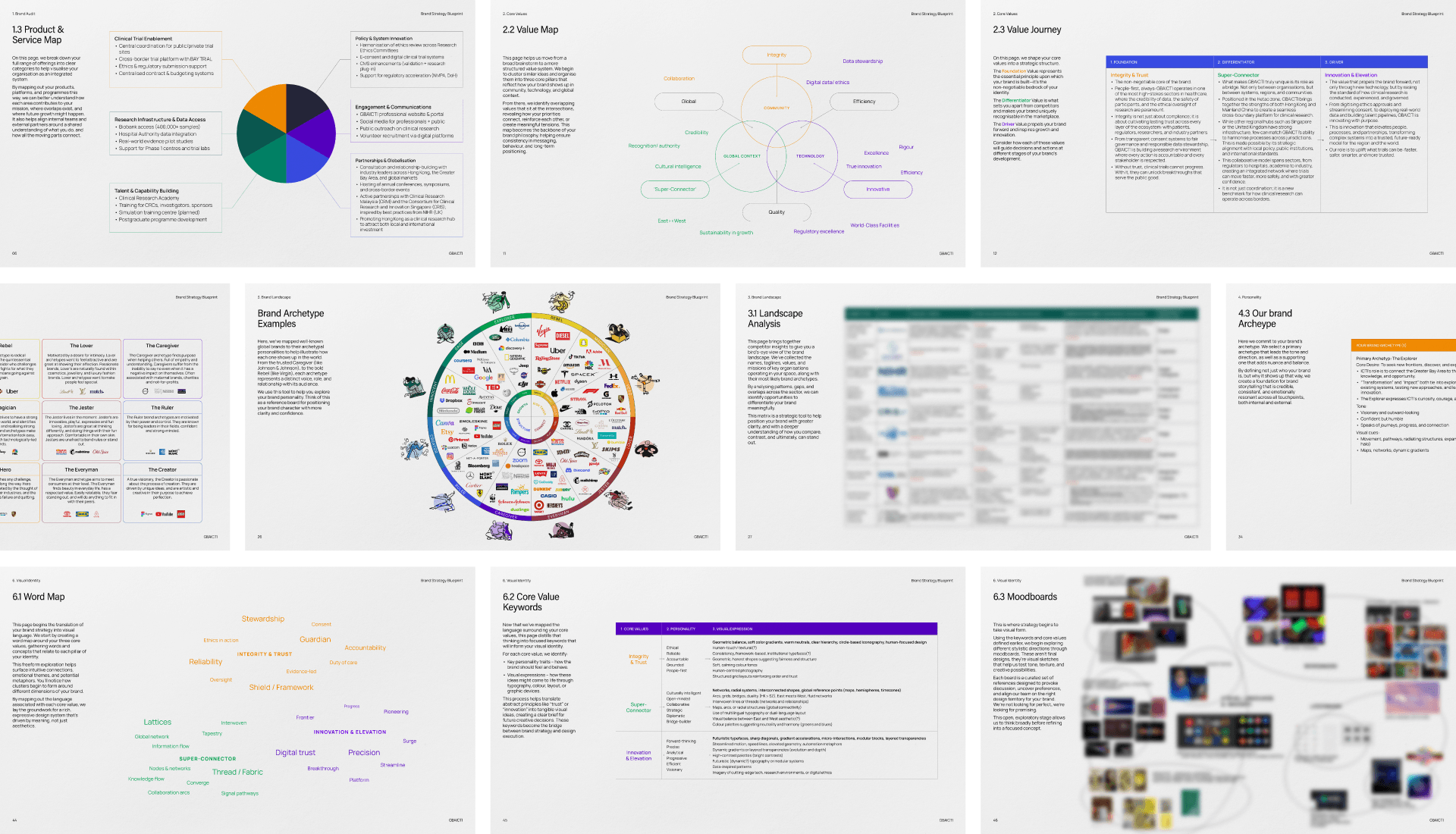
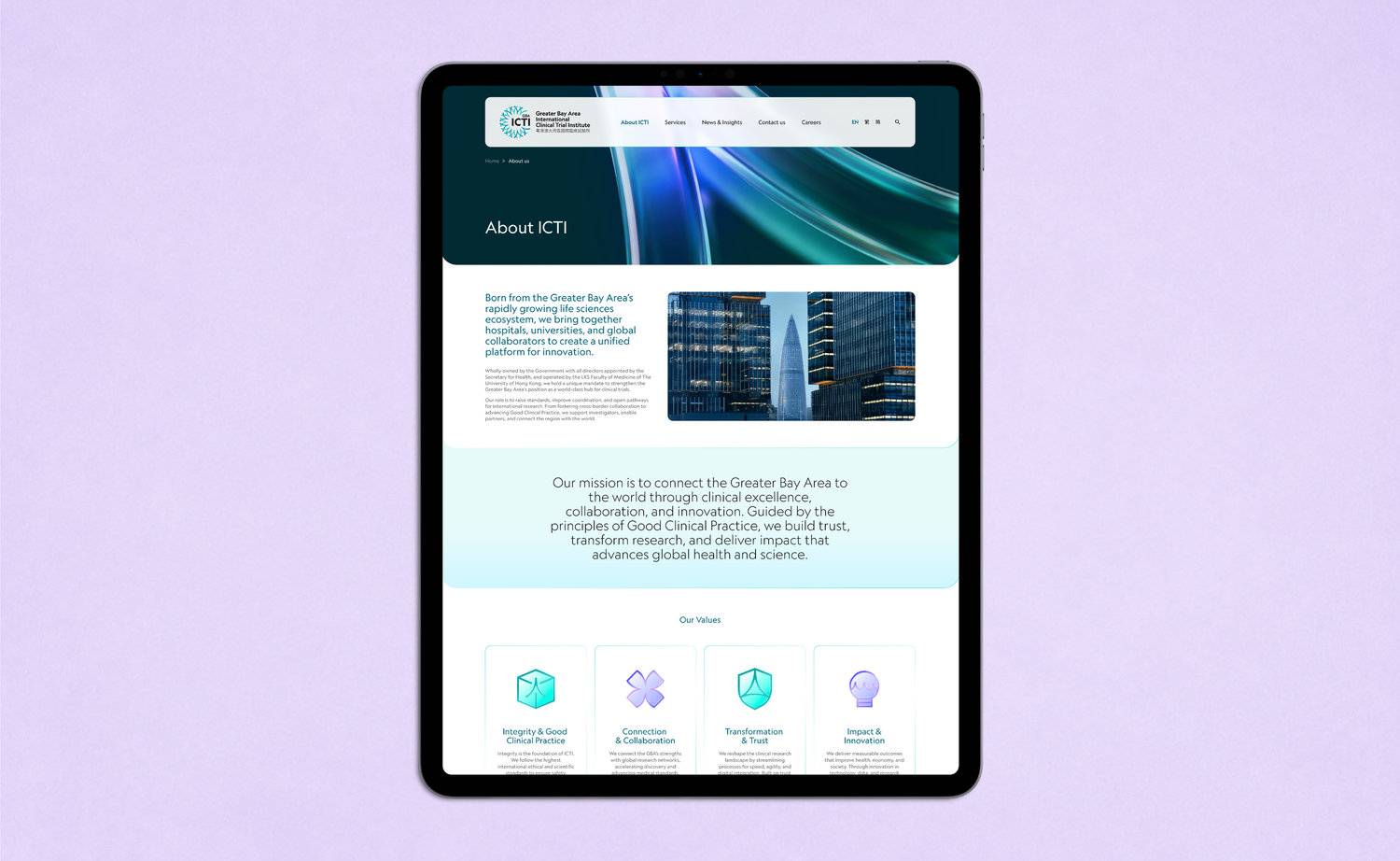
That observation shaped our discussions with the GBAICTI team. Together, we defined four values for the brand: integrity and good clinical practice, connection and collaboration, transformation and trust, and impact and innovation.
Integrity & Good Clinical Practice
Clinical research is only valuable if it is trustworthy, and trust is built through the consistent application of internationally recognised standards. Good Clinical Practice is the foundation on which every partner relationship, every delivered outcome, and every assurance to a participant rests. The same standards are applied to every study, at every site, without exception.
Connection & Collaboration
The GBA’s greatest asset is its density. Within a compact geography, you have world-class universities, one of Asia’s most advanced hospital networks, a deep manufacturing base, and direct access to international markets. GBAICTI exists to activate that density, to bridge the fragmentation that has historically limited what the region could offer as a research environment, and to connect it with global networks. Collaboration here is structural, not aspirational.
Transformation & Trust
The landscape is shifting fast: digital trials, AI-assisted analysis, compressed timelines. The institute has been designed to move with that change rather than resist it. But transformation without trust creates instability. The two have to move together. As processes modernise and the ecosystem becomes more agile, the consistency that participants and partners depend on must remain constant.
Impact & Innovation
The measure of any clinical research institution is whether its work reaches patients. Discovery that stays in the laboratory, or research that never translates into accessible treatment, falls short. GBAICTI’s impact is measured in therapies approved, lives improved, and the region’s growing contribution to global medical progress. Innovation is the engine; impact is the point.
Making a long name work
With the strategy in place, we had a practical question to solve. How do you fit Greater Bay Area International Clinical Trial Institute into a logo that people can recognise and remember? The team proposed GTI, short for Greater Trials Institute, as a working name. We began drawing to see whether a shorter name could carry the identity.

Lockup experiments
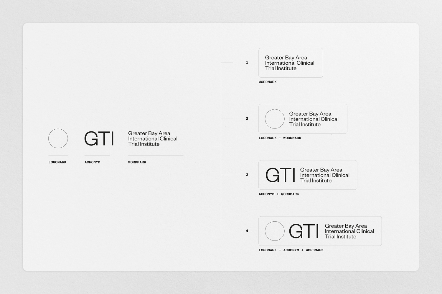
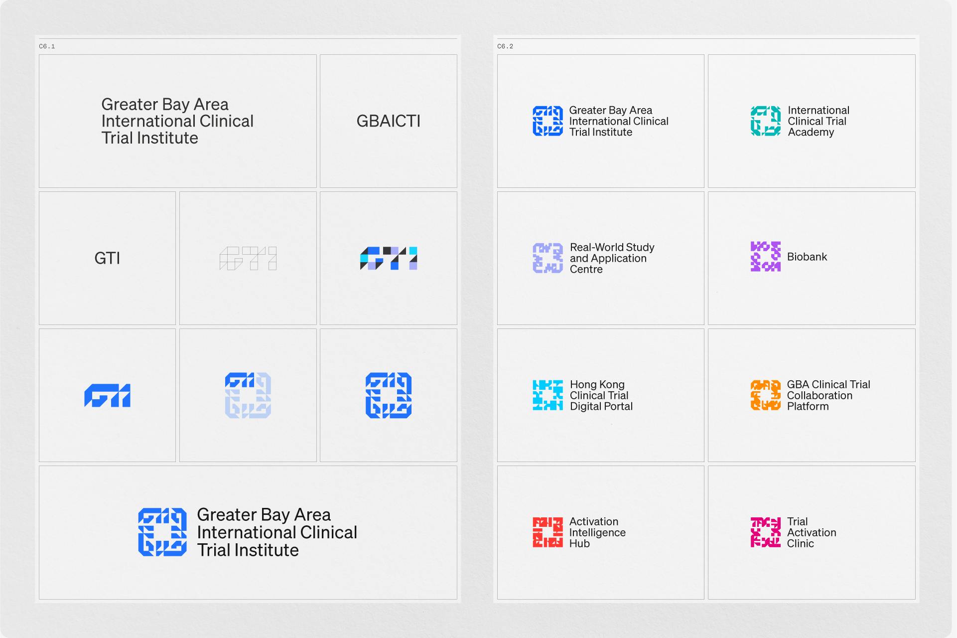
Setting the full institute name across three lines gave us a balanced wordmark. The next question was what should sit beside it. We tested a symbol, an acronym and combinations of the two, trying GTI, GBAICTI and GBA ICTI. We also explored whether the same approach could work for the institute’s programmes and centres.
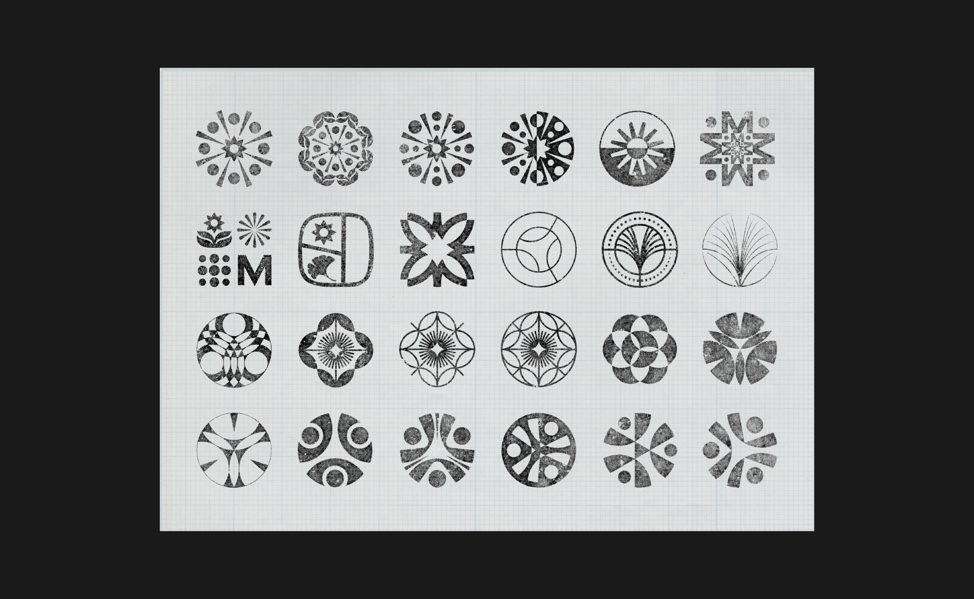
Six concepts in the room
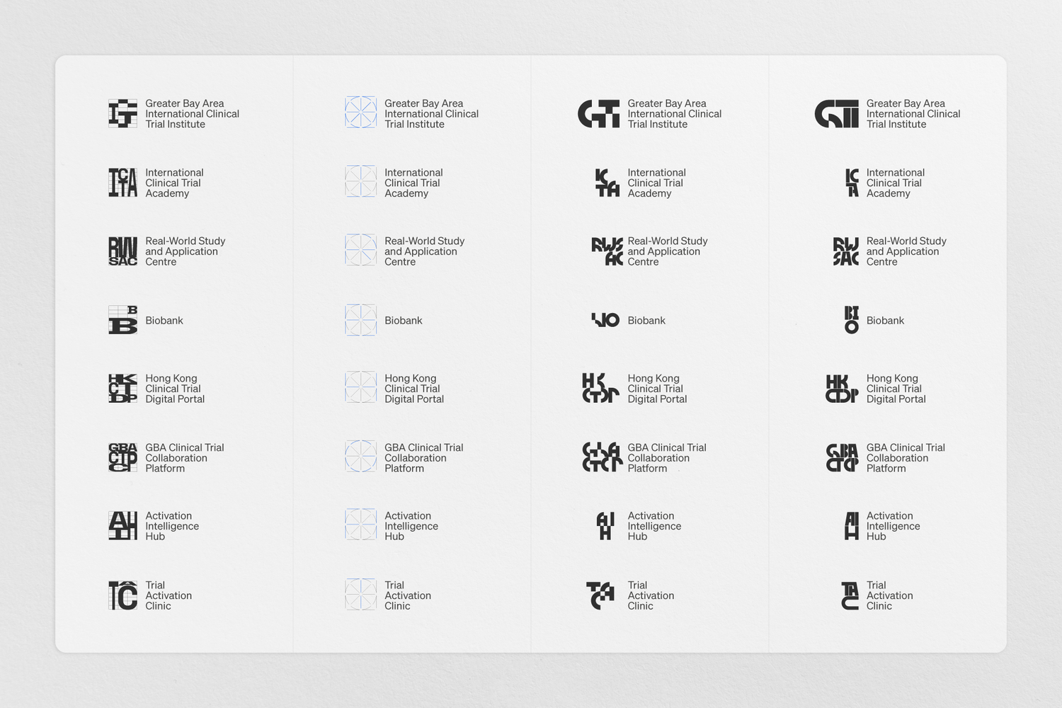
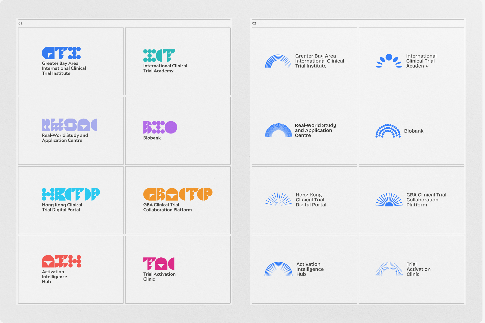
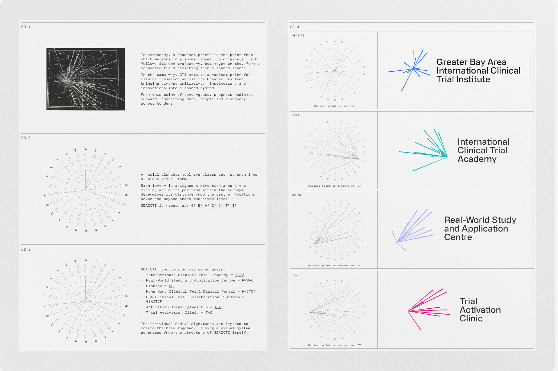
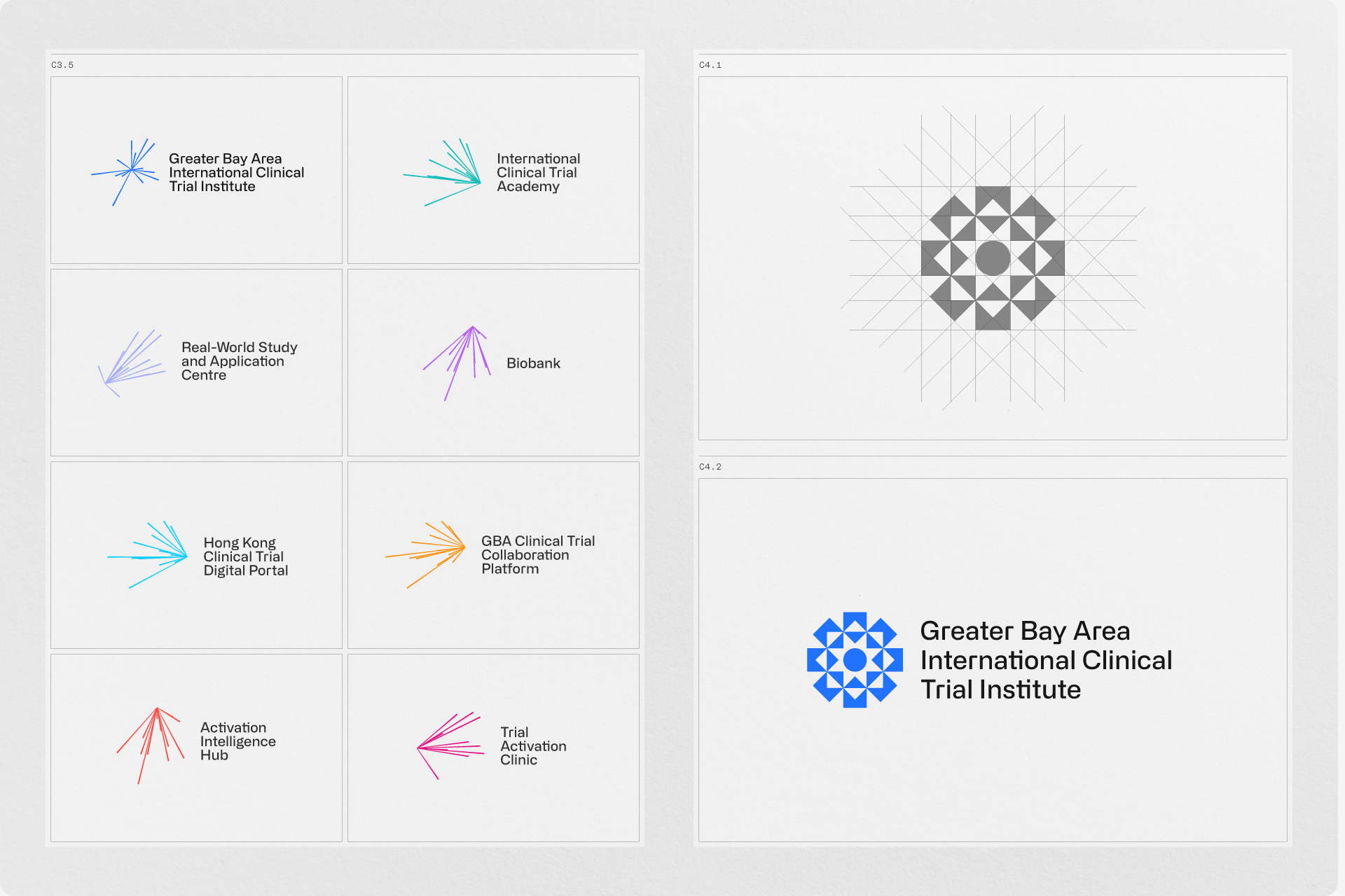
In the early lockups, the acronym and symbol competed for attention. We tried making the acronym itself the mark and explored whether the same idea could extend across the institute’s programmes and centres. The system held together, but the marks felt static. We wanted a visual idea that could express the connections at the heart of the institute.
Our second meeting was a rare chance to get the whole founding team in the room again. We had agreed on the four values. Now we needed to find a visual direction that could express them.
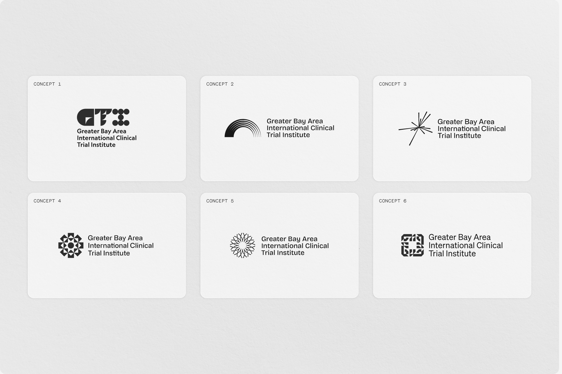
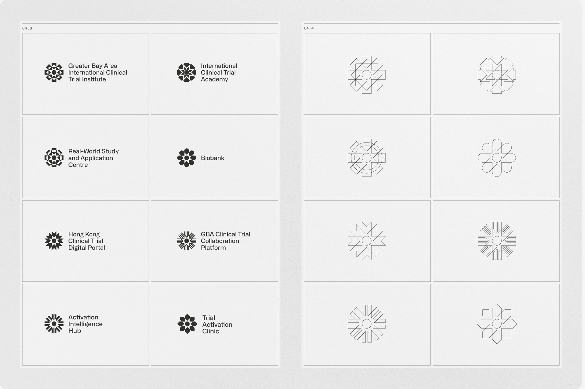
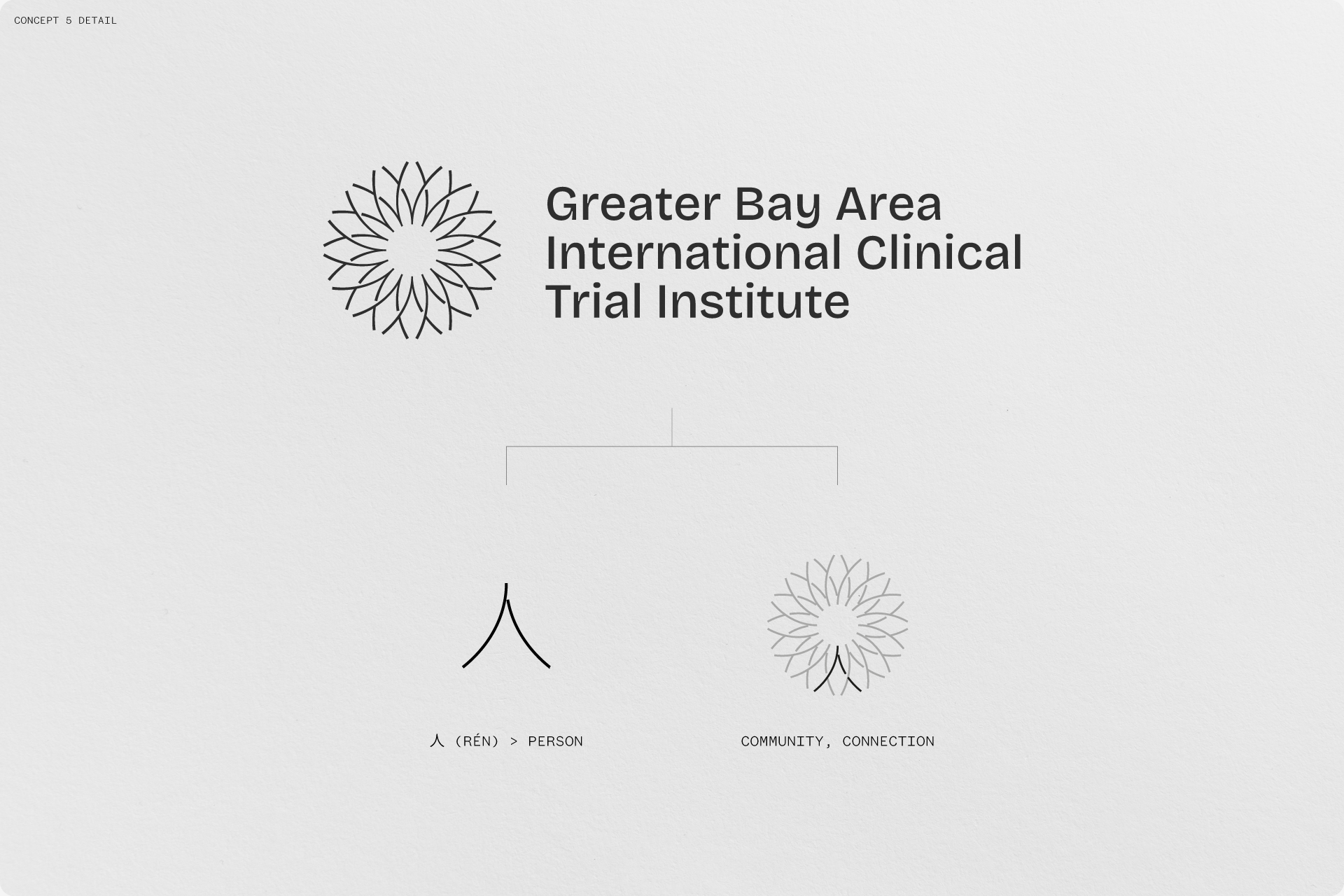
We brought a 60-page deck with six developed concepts and more sketches in reserve. Six was more than we’d usually present, but with everyone in the room, we wanted to give the team a chance to compare genuinely different ideas and tell us what felt right.
Solution
An identity with people at its centre
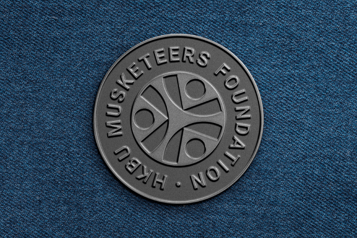
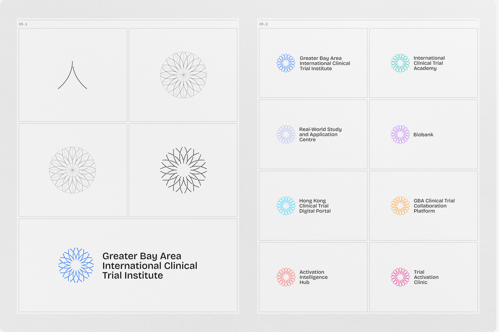
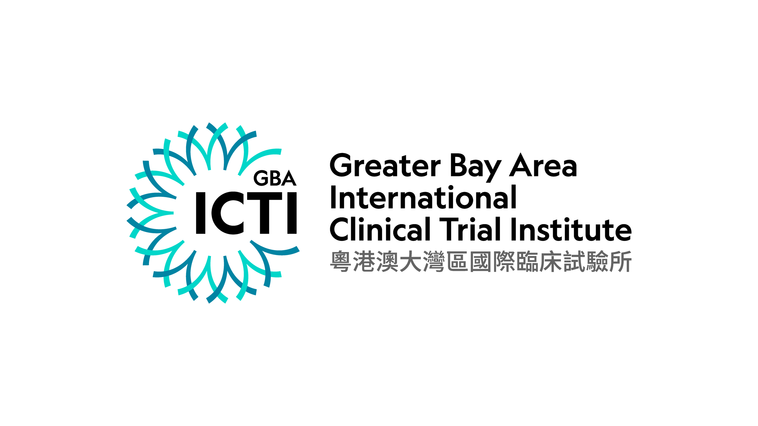
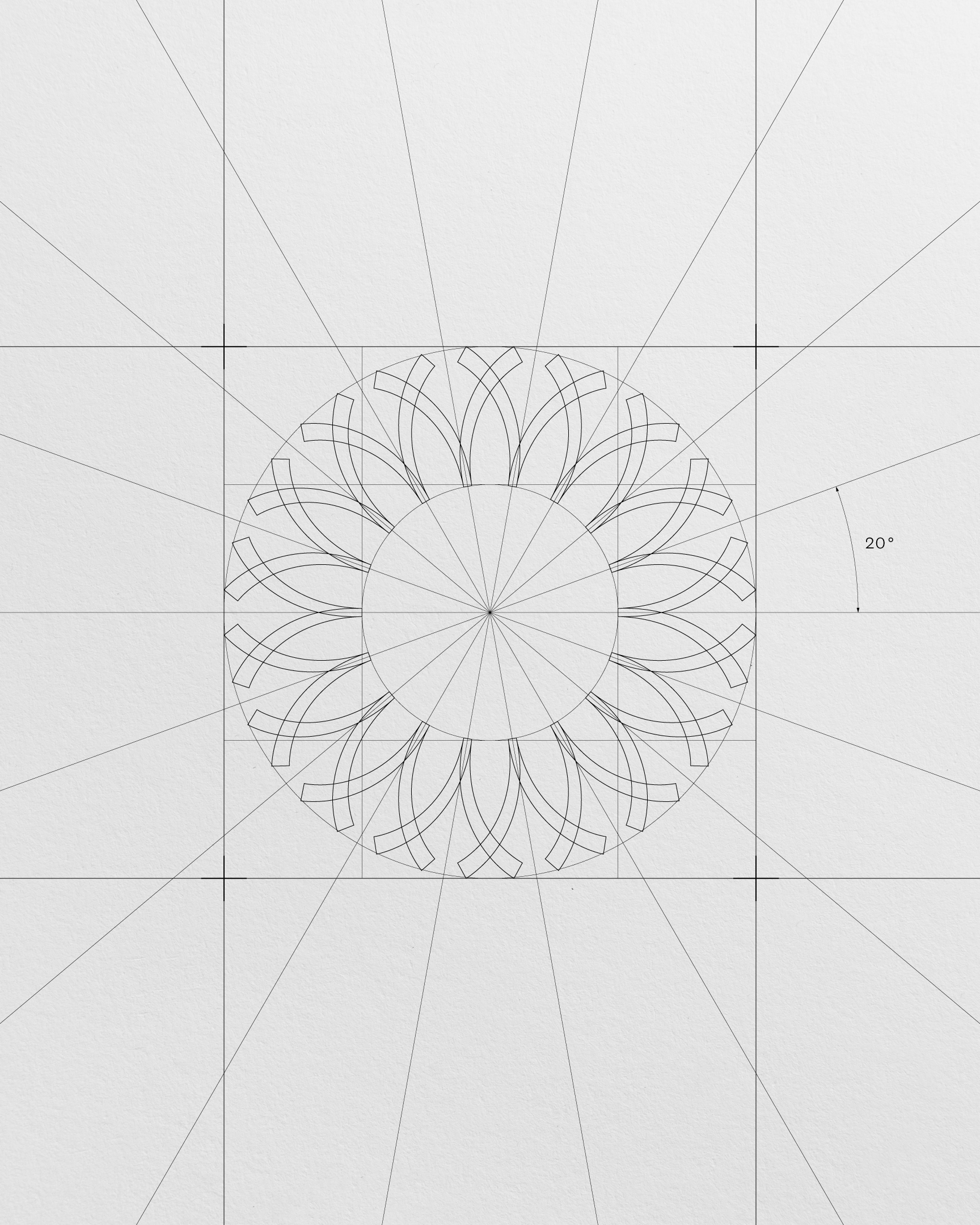
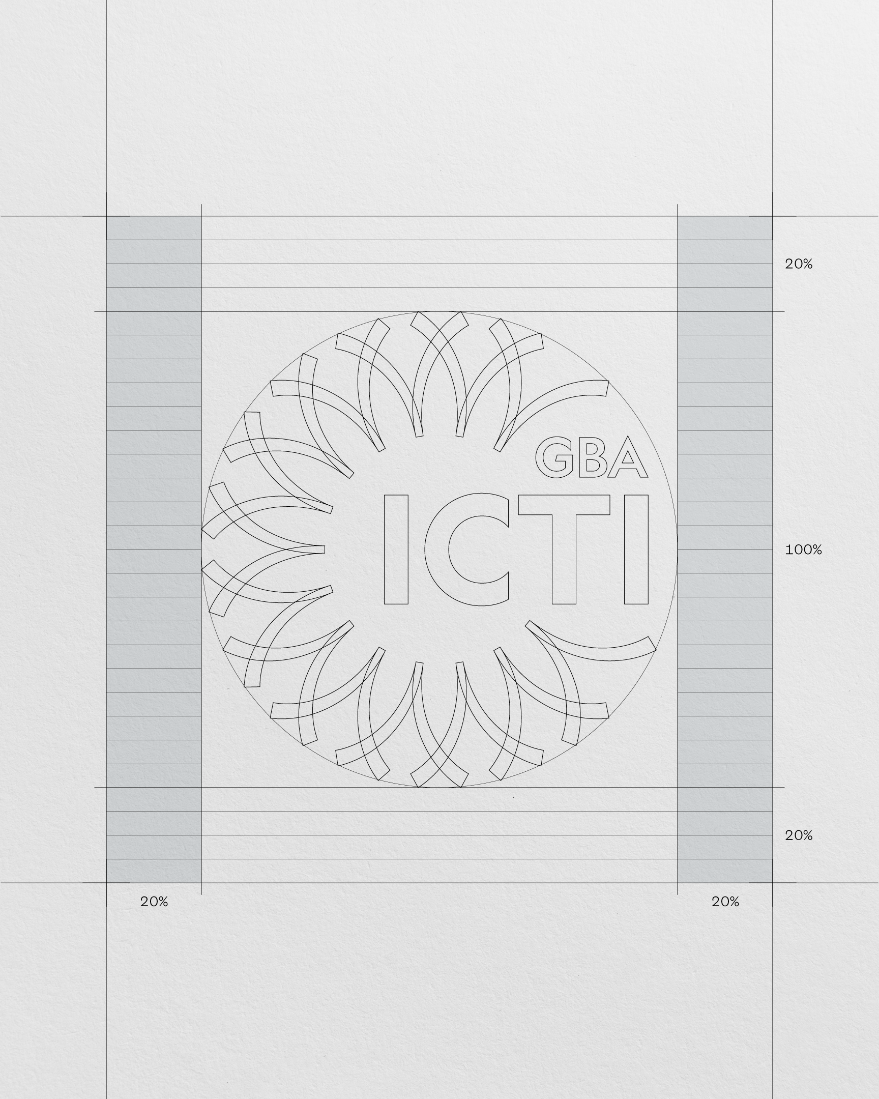
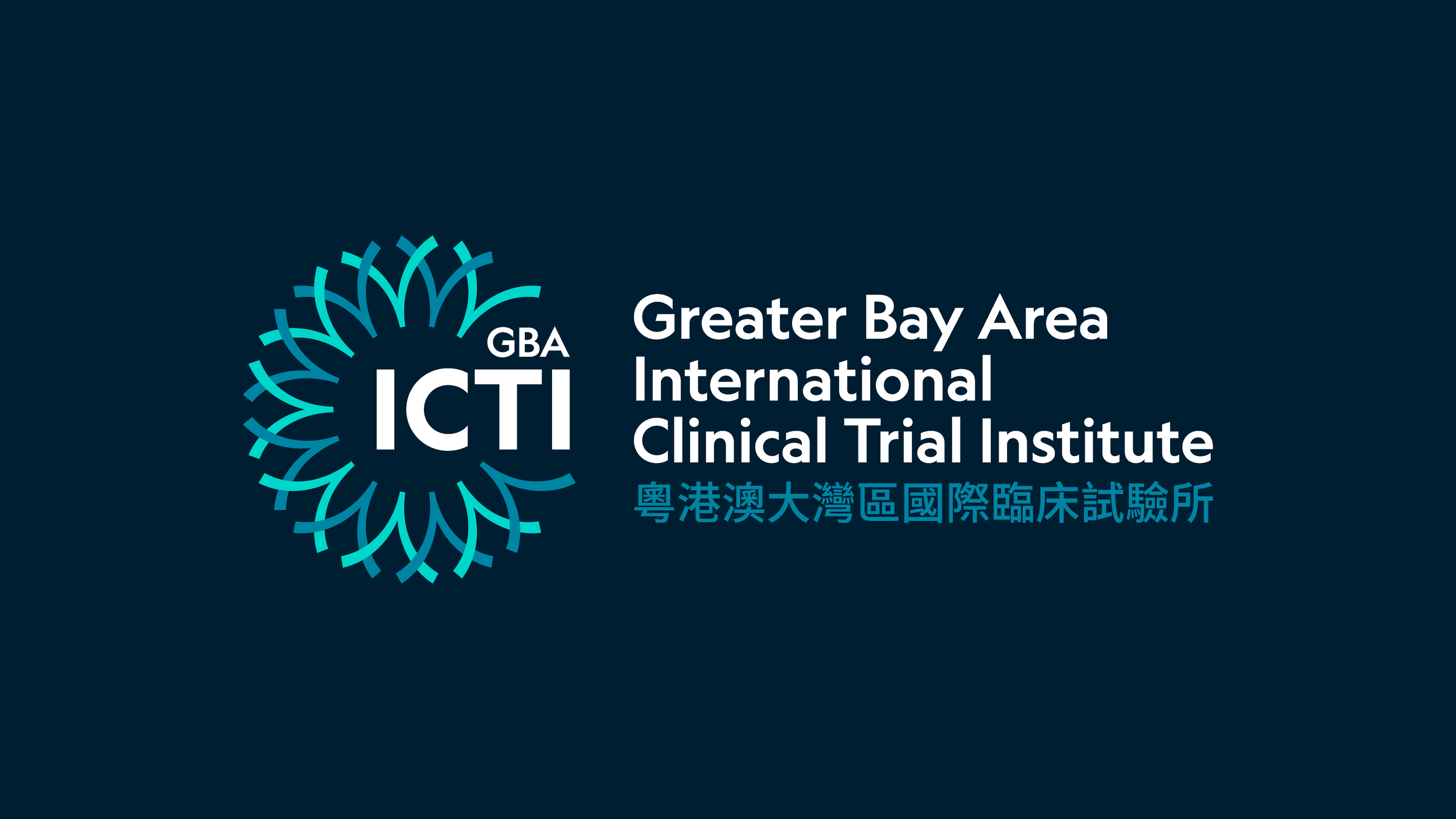
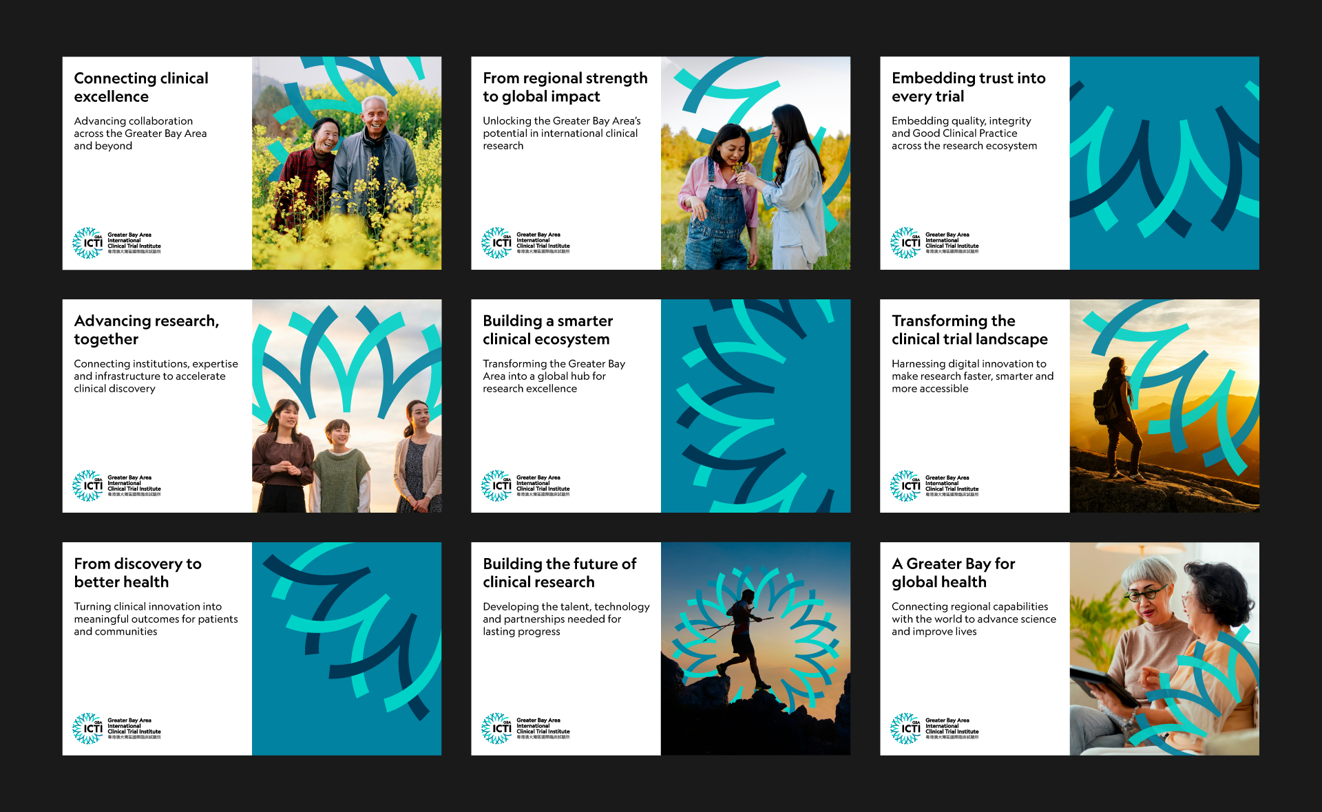
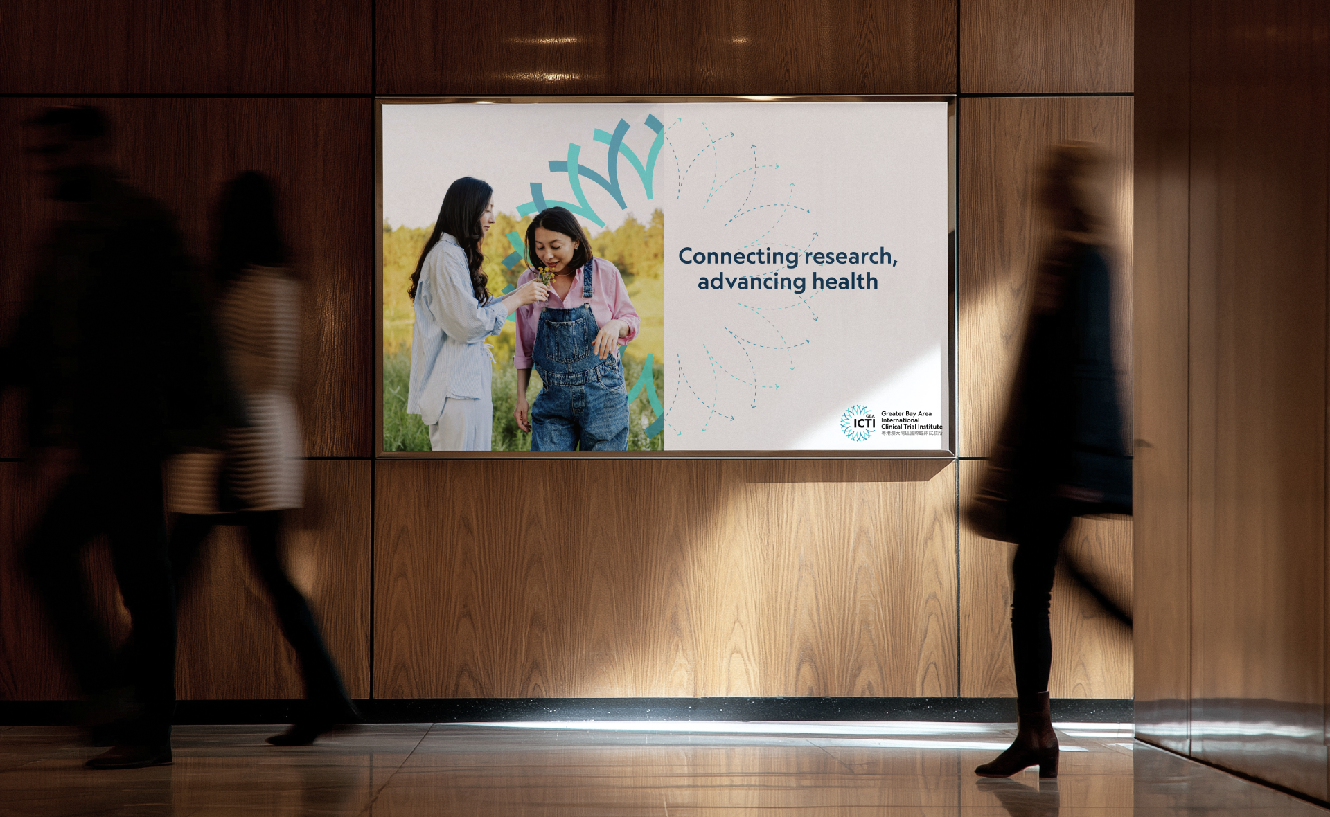
The finished lockup brings the radial mark and GBAICTI acronym together beside the institute’s full name in English and Chinese. At the heart of the mark is 人, the Chinese character for “person”. Repeated around a shared centre, it echoes a dandelion’s seed head and reflects how discoveries can travel through a wider research network.



Project Outcome
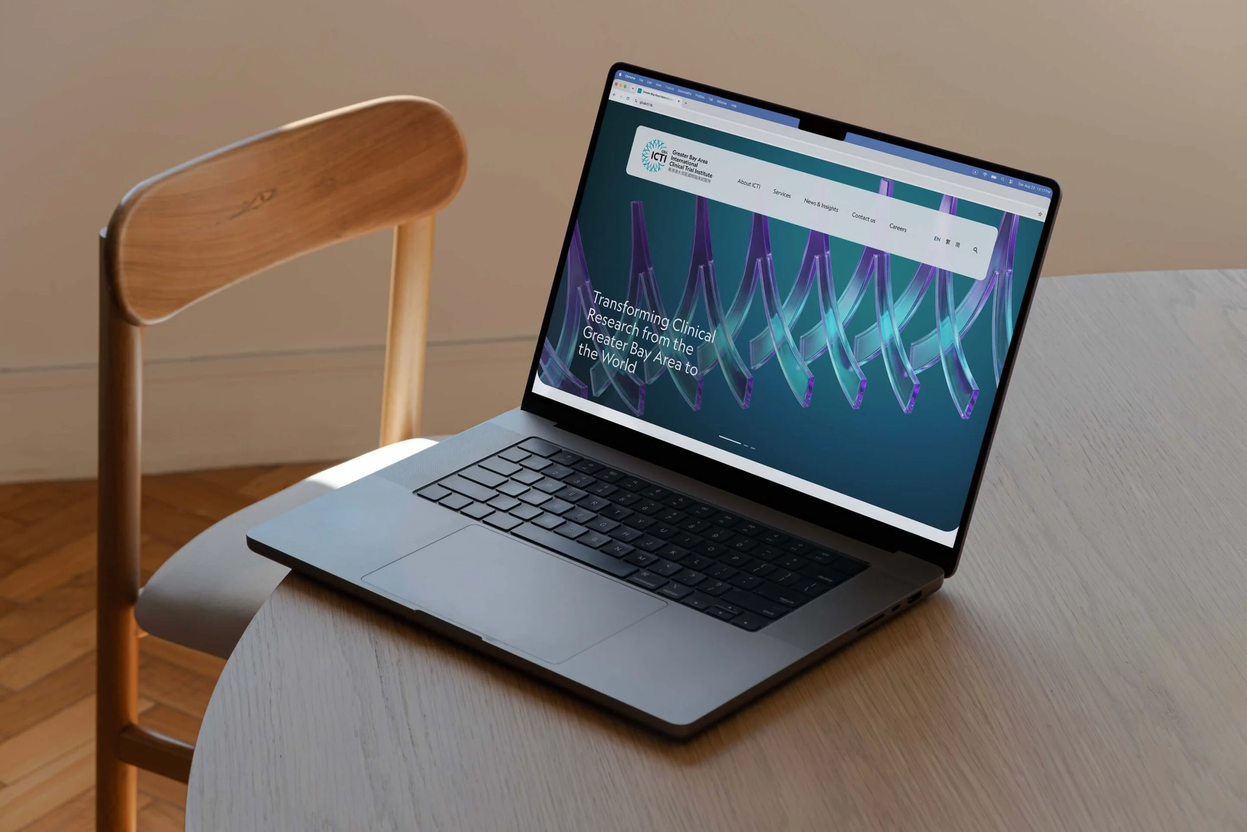
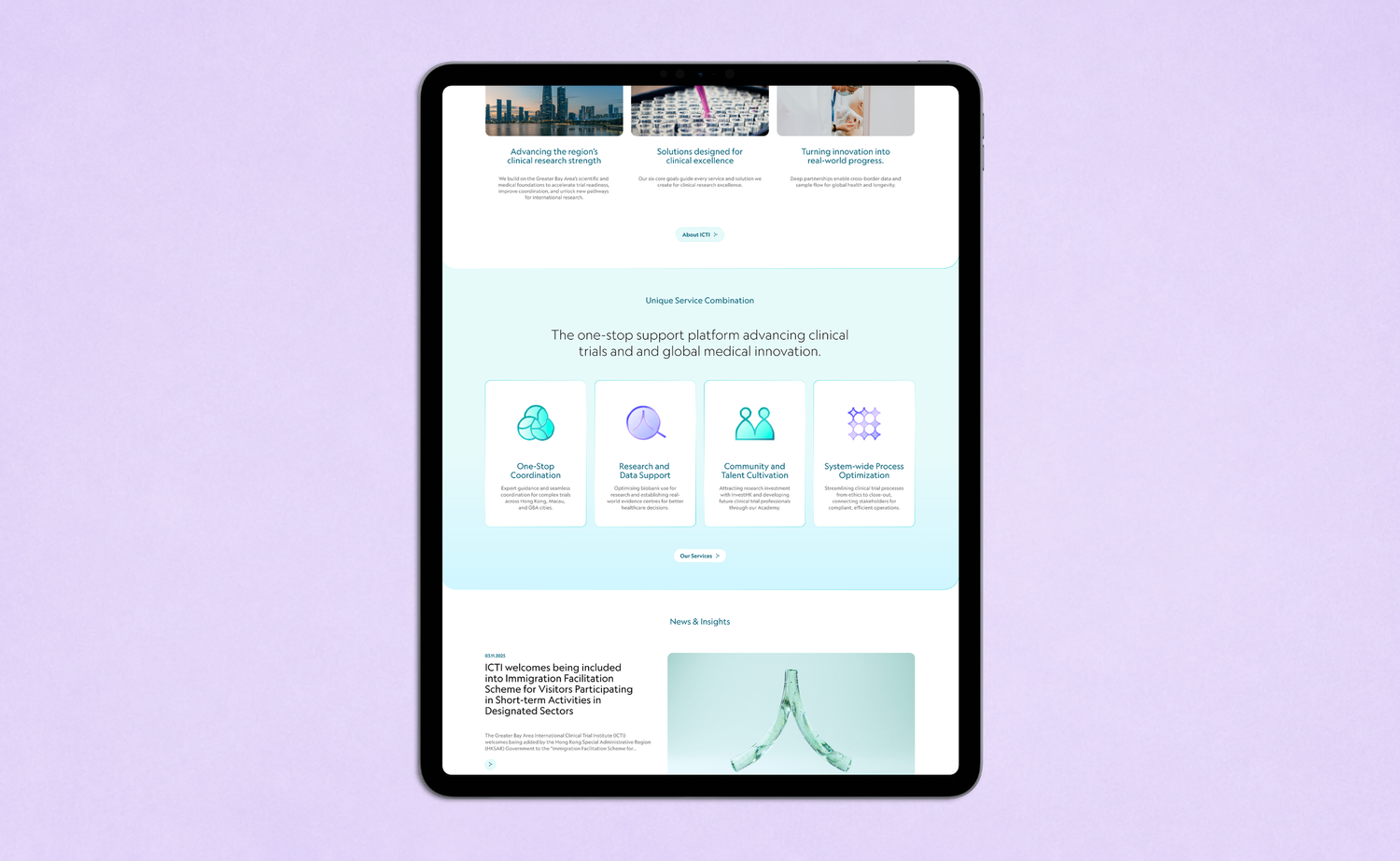
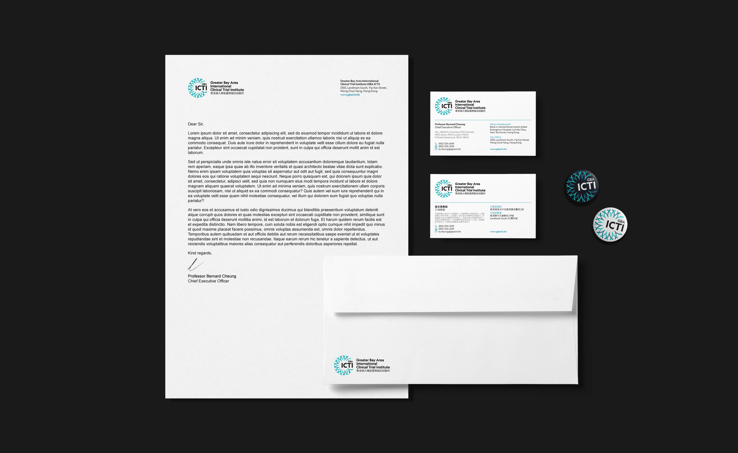
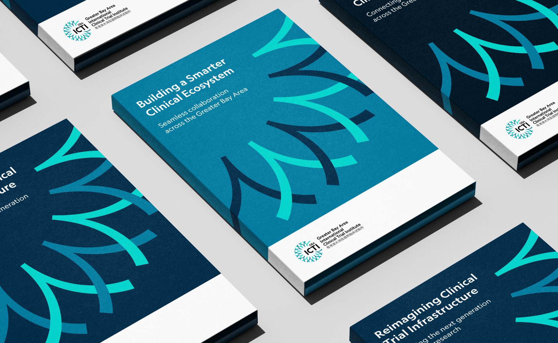
A bilingual identity for the Greater Bay Area International Clinical Trial Institute. The radial mark, built from the Chinese character 人, gives the institute a recognisable symbol and a graphic language that carries through its website, publications and physical spaces.
Project Timeline
13 Weeks
From kick-off through to launching the new brand, covering research, brand strategy and visual identity development.
Collaboration
Thank you to the GBAICTI founding team for helping us understand how clinical trials work and for working through the strategy, concepts and final identity with us.