Index > The University of Hong Kong
Empowering changemakers for the University of Hong Kong, the region’s longest-established higher education institute.


Context
In 2024, HKU approached us to create the brand identity for a new school, combining the Department of Computer Science and the Department of Statistics and Actuarial Science.
We created a bold, compelling brand identity for the future-facing faculty that unites AI, computer science, and statistics.
The brand helped position CDS as a global force in tech education, supporting its rise in global university rankings — climbing from 25th to 18th in Data Science & AI, and from 52nd to 21st in Computer Science & Information Systems.
Direction
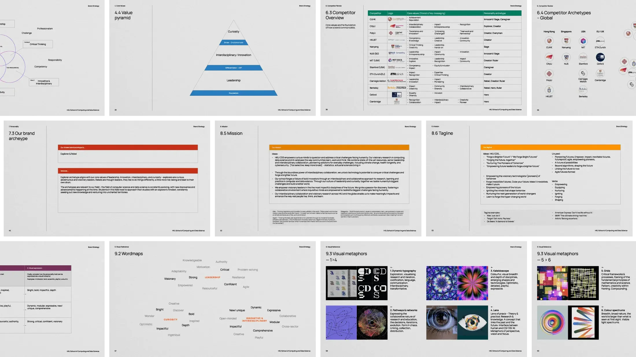
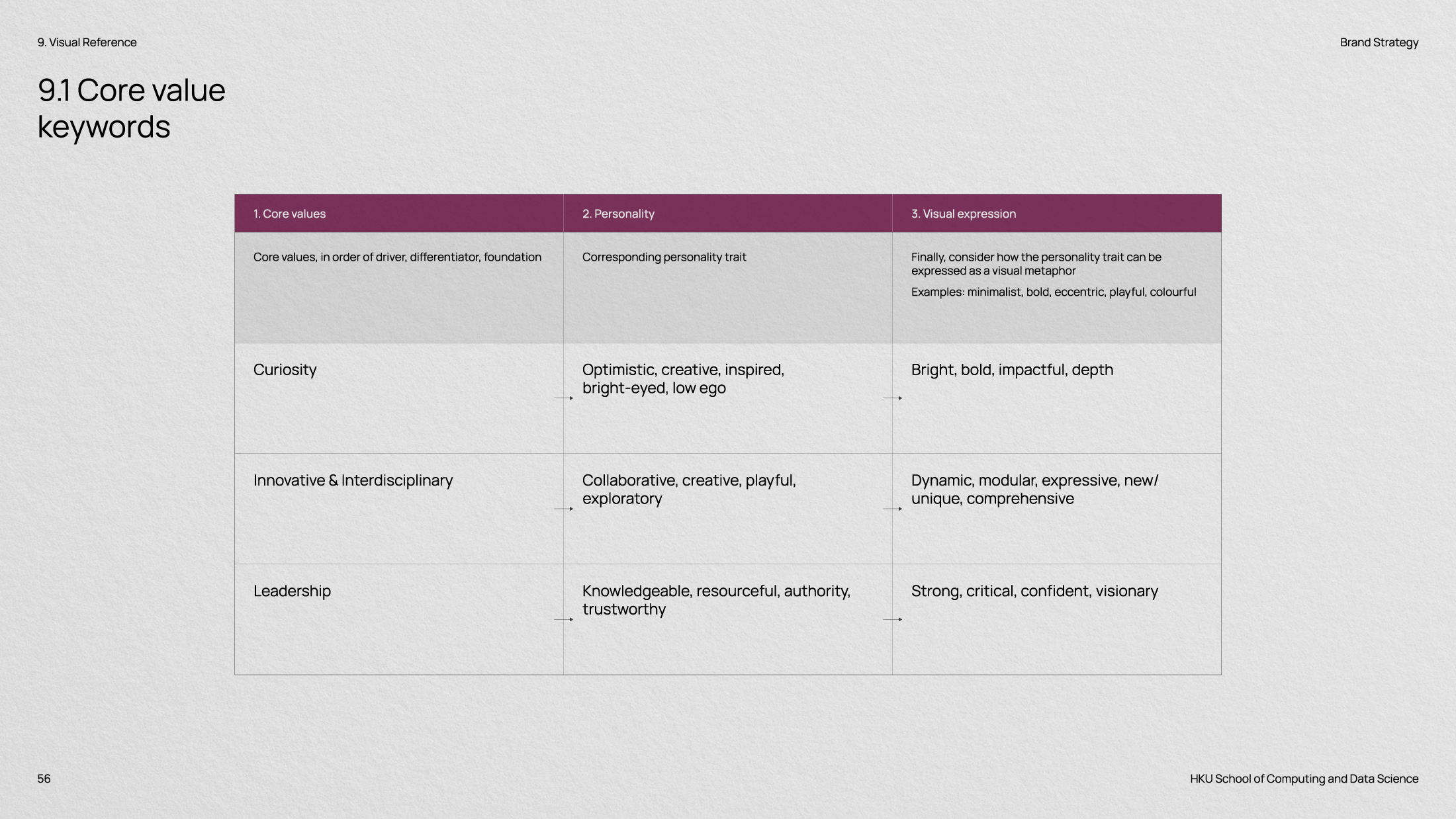
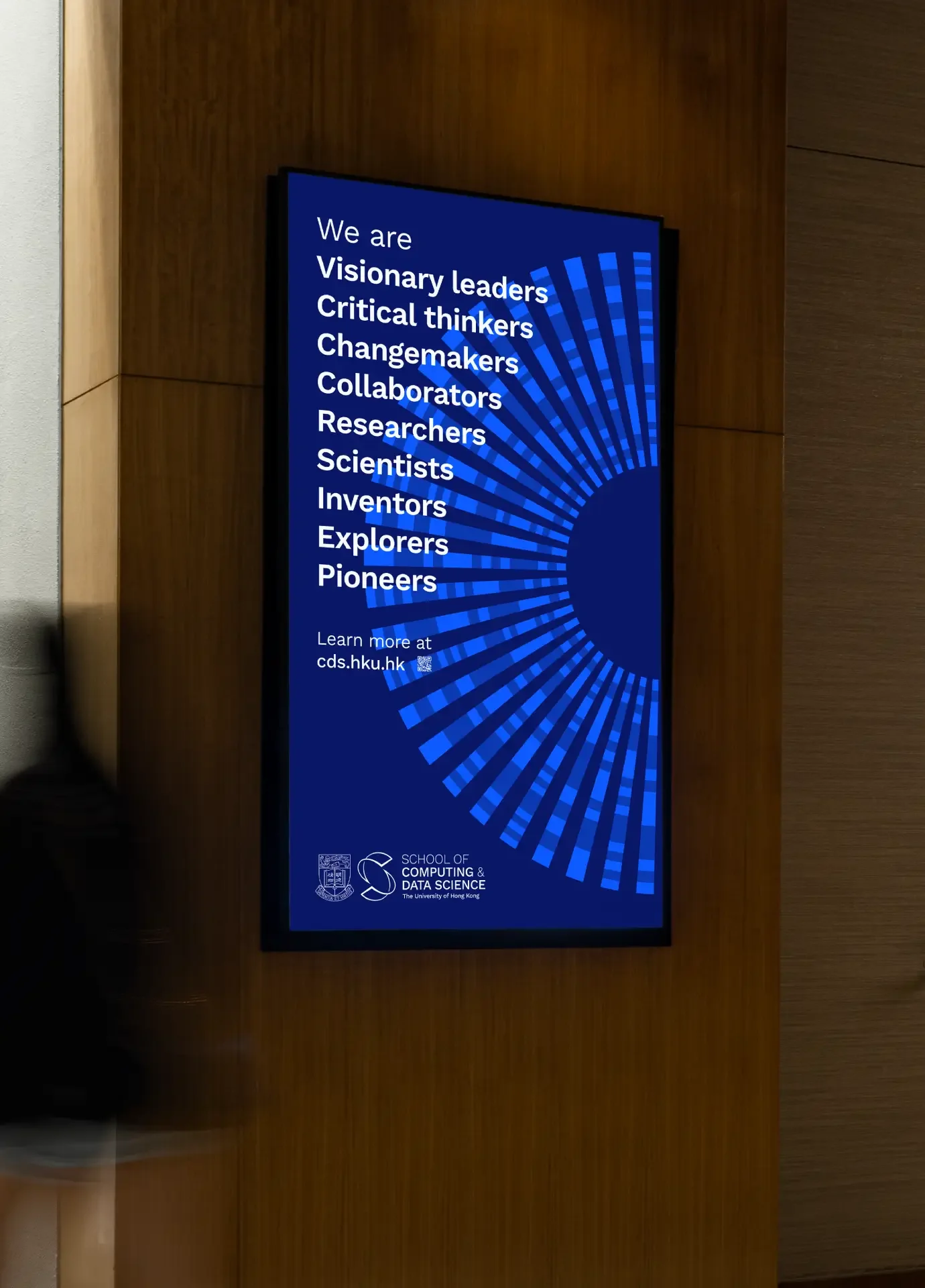
Through our brand strategy workshops, we worked closely with the department’s professors and stakeholders to uncover core values of leadership, interdisciplinary innovation and curiosity.
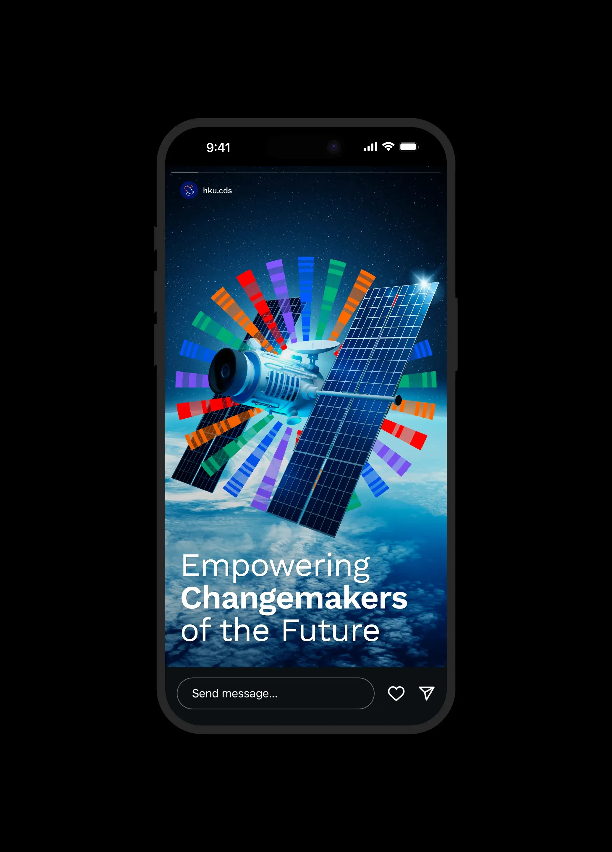
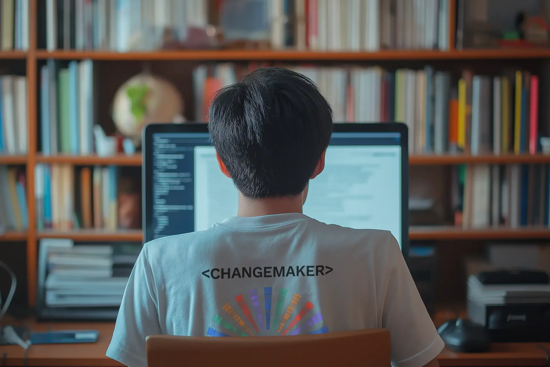
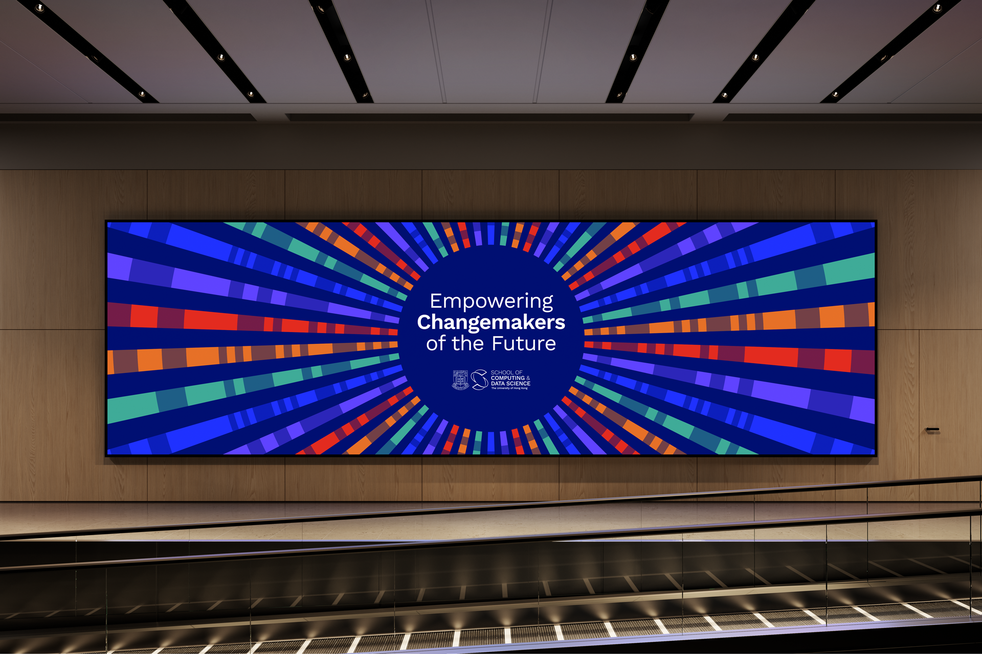
The core values were evolved into a unique personality, positioning and purpose for the school, unified in the mission of ‘Empowering Changemakers’.
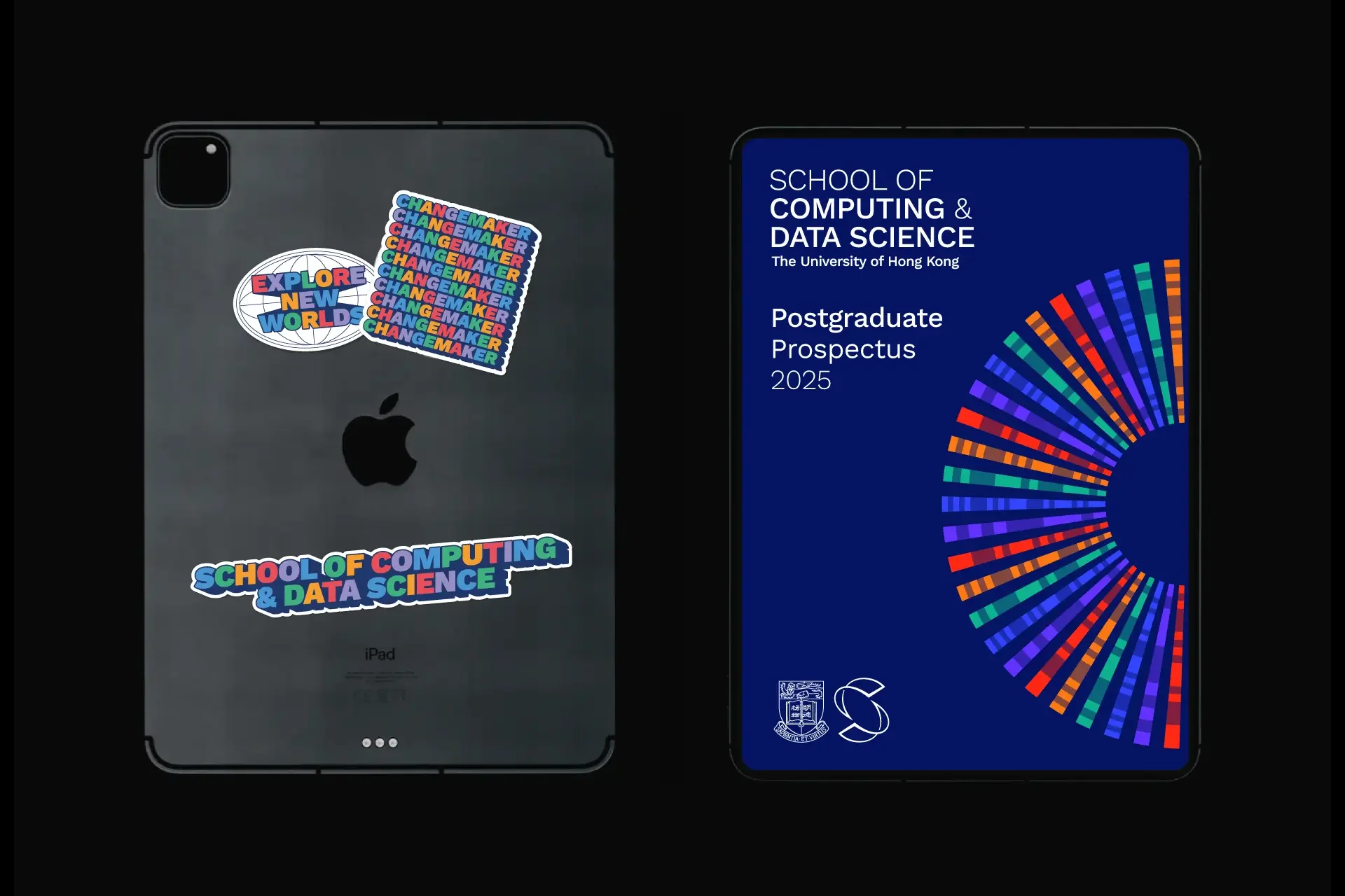
Identity
We built the brand through an iterative, collaborative process, presenting brand concepts and then refining and refining to a critical logomark and identity system.
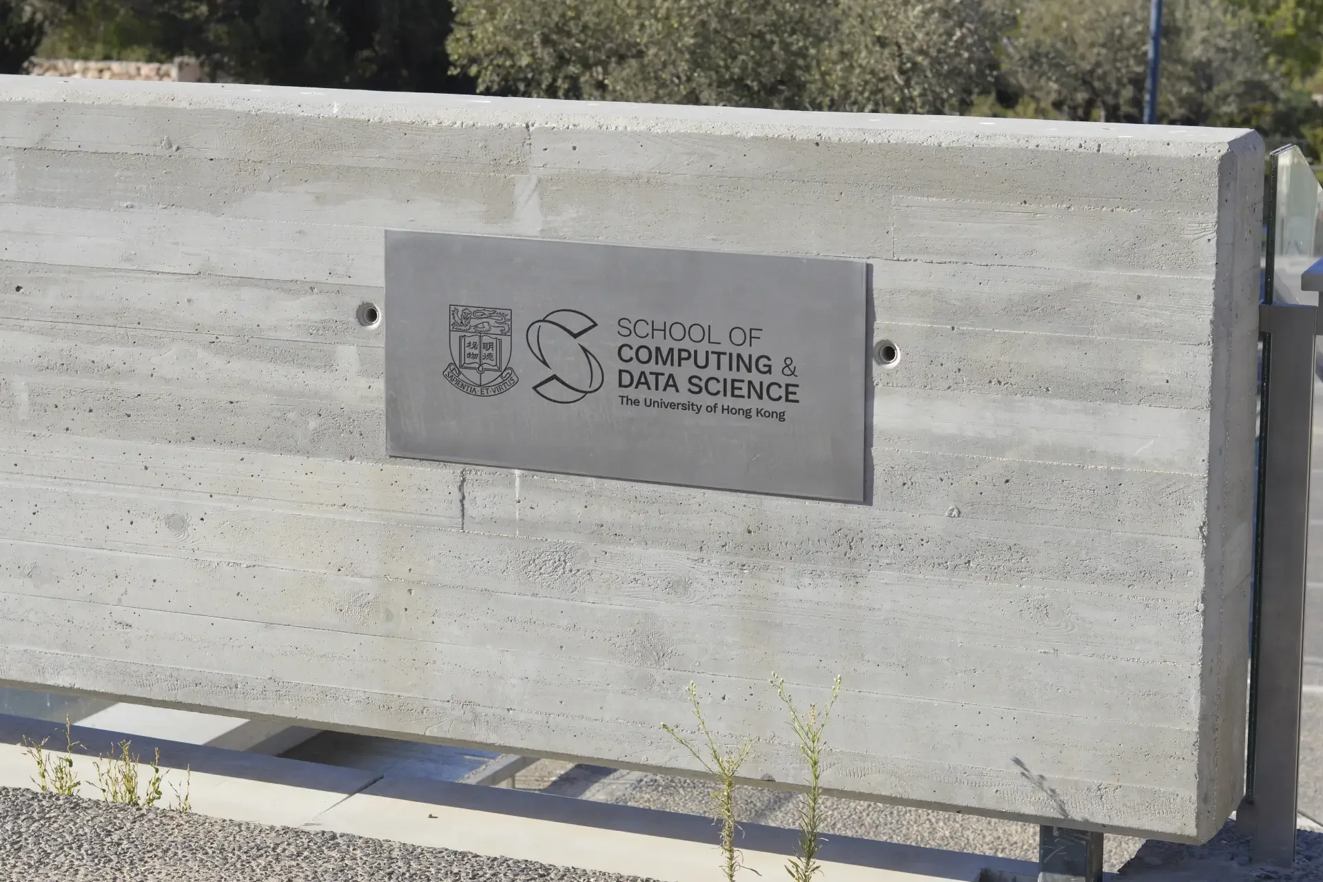
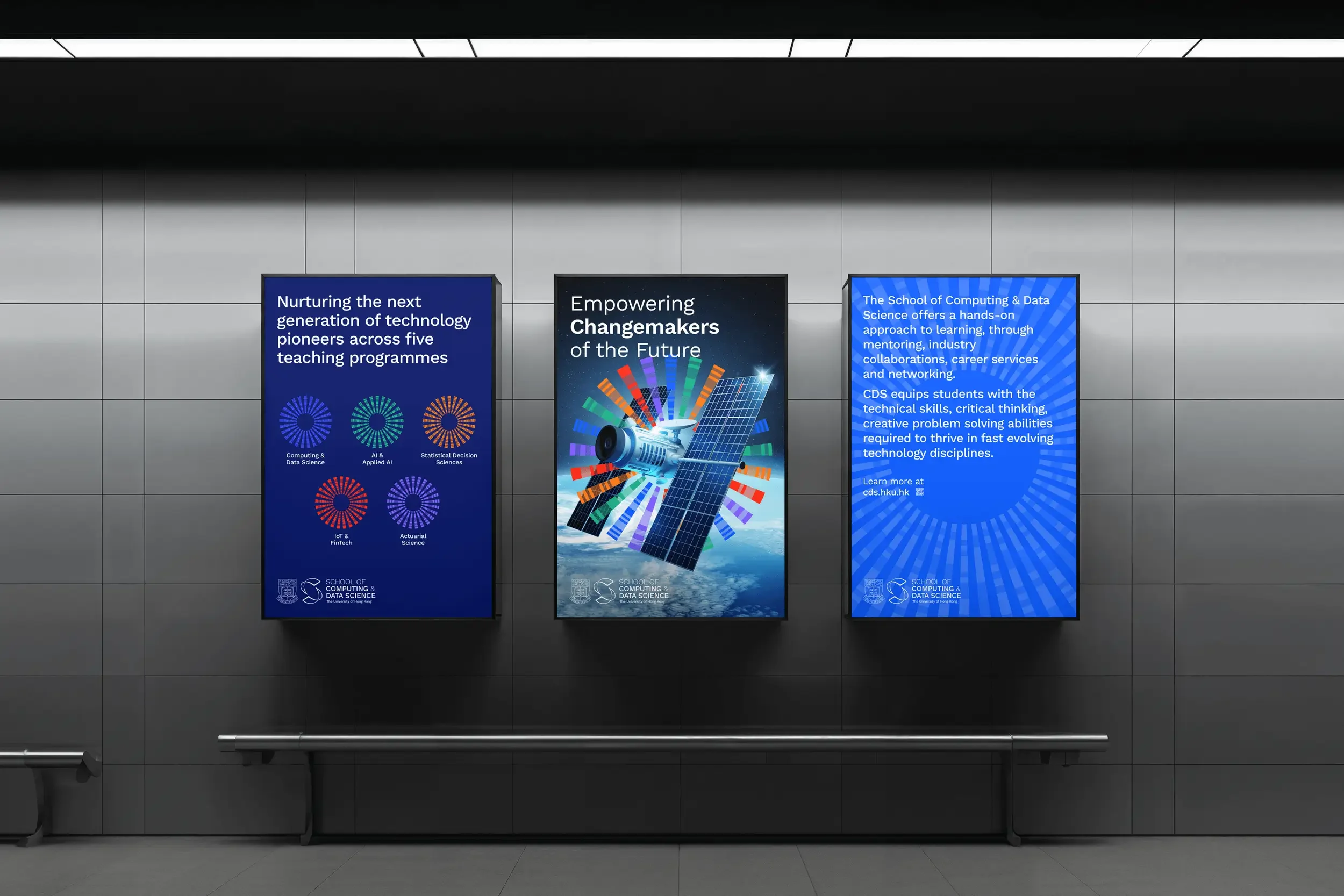
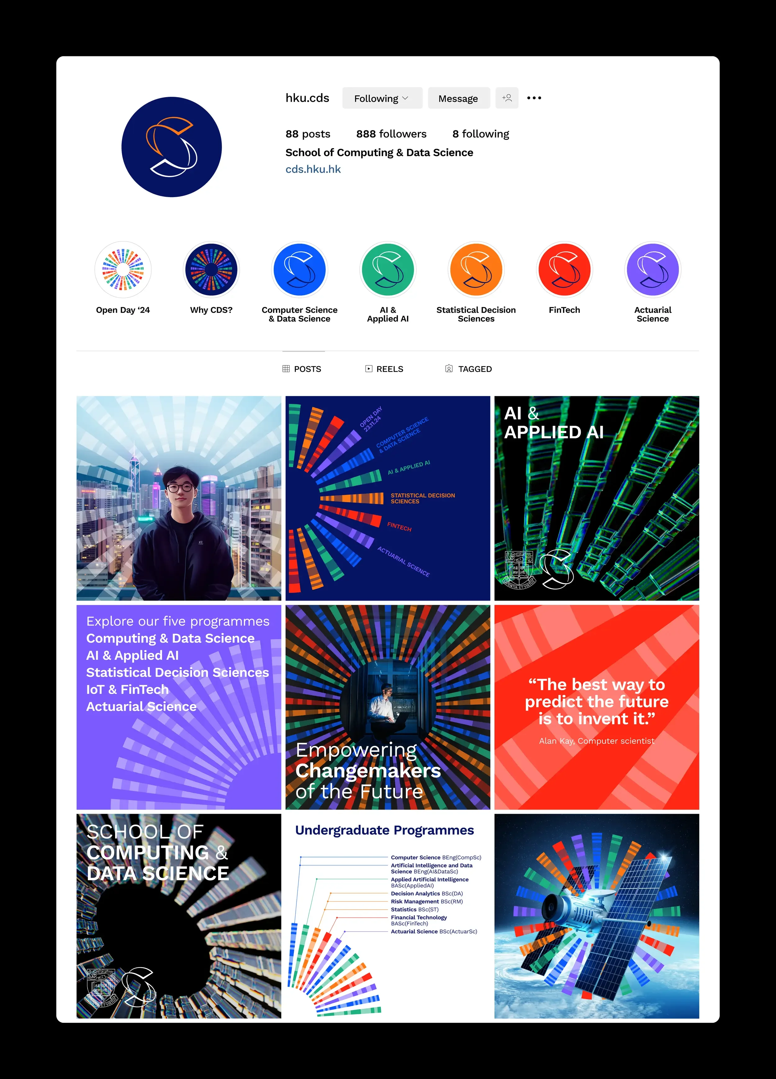
The logo highlights the coming together of the two departments, the ‘C’ of ‘Computing’ and ‘D’ of ‘Data Science’. The overall ‘S’ form signifies the ‘School’.
We took inspiration from the earliest computers, the beginnings of codification and Morse code, and the speed of technological evolution.
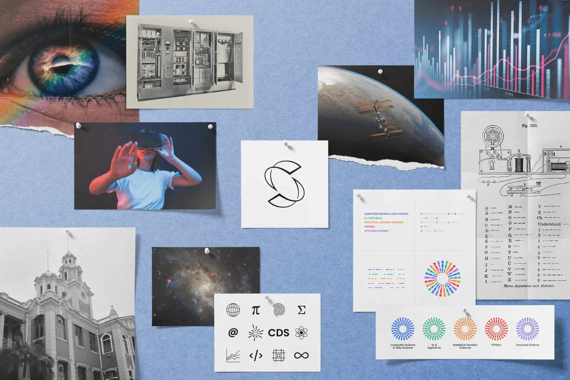


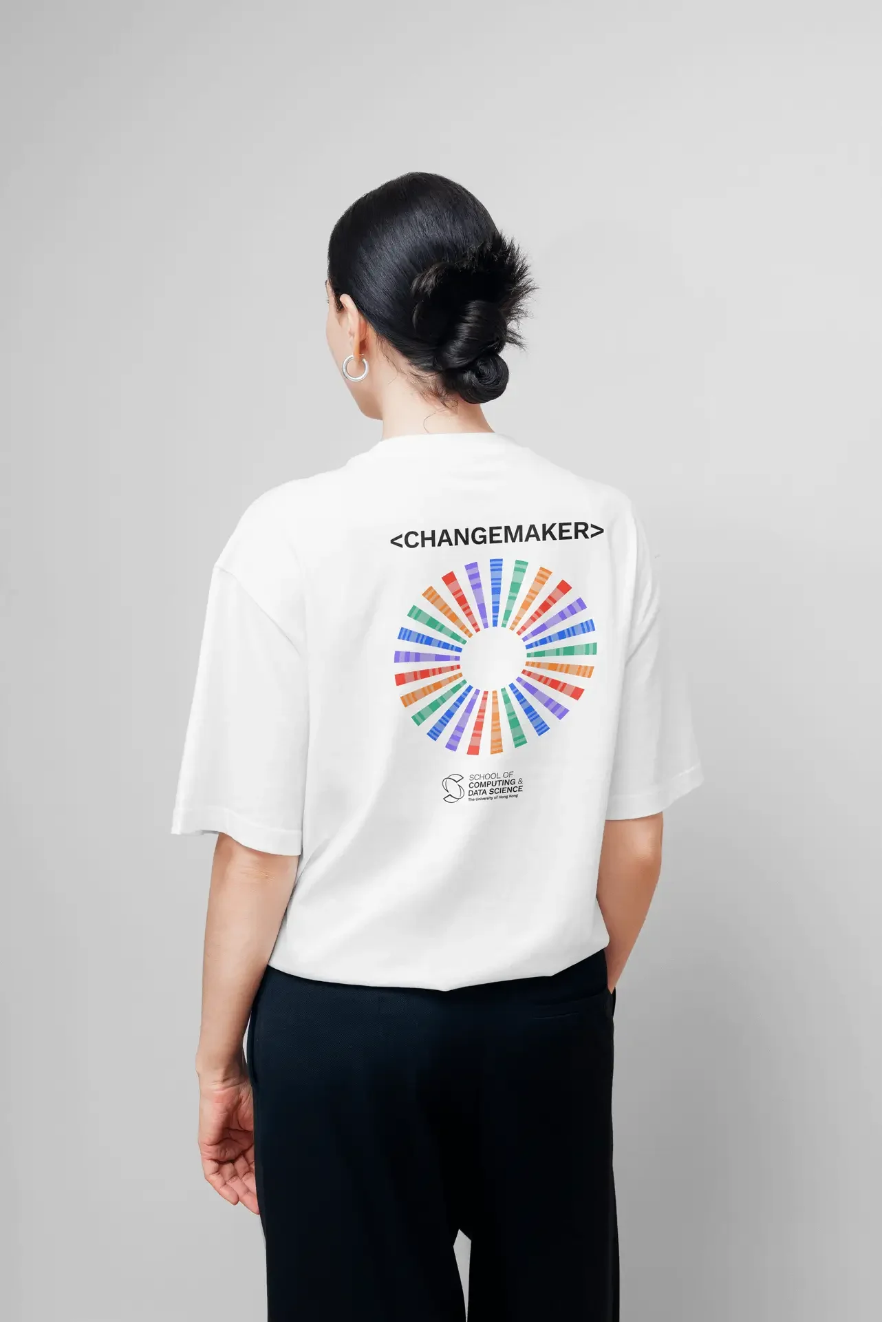
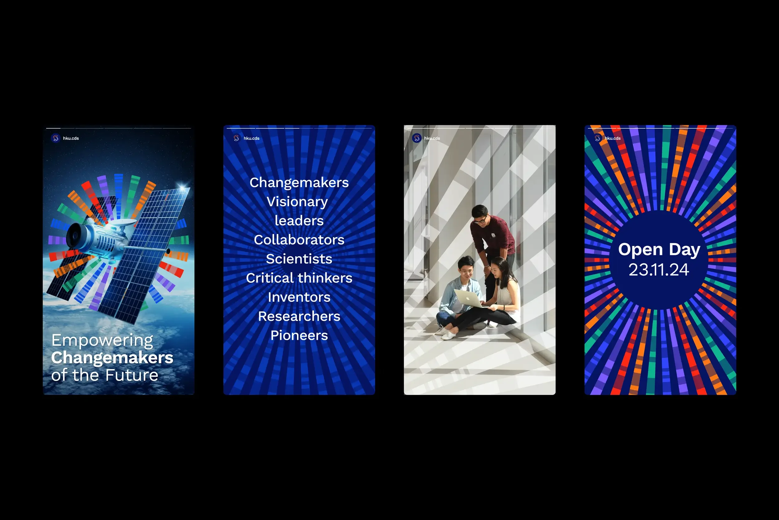
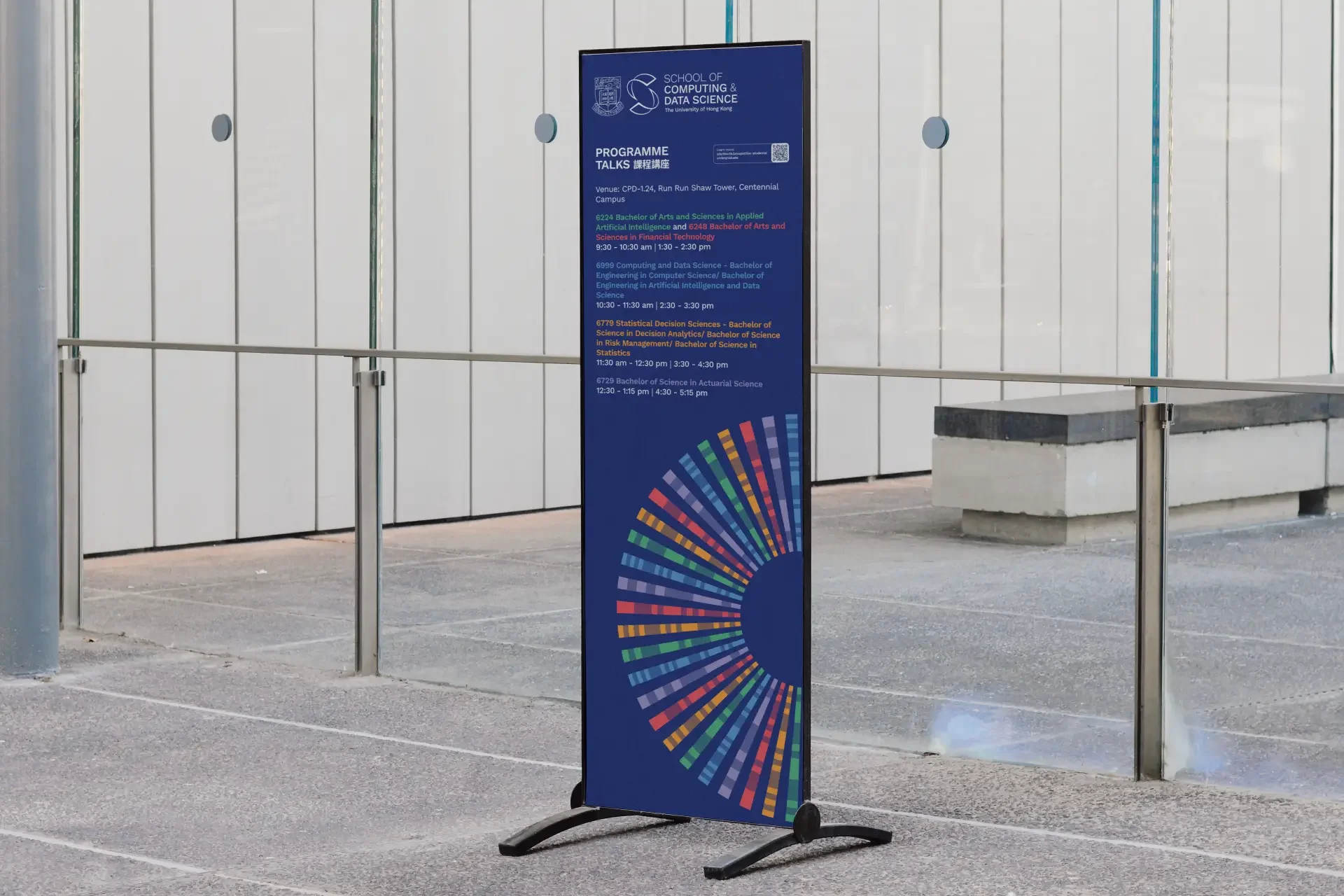
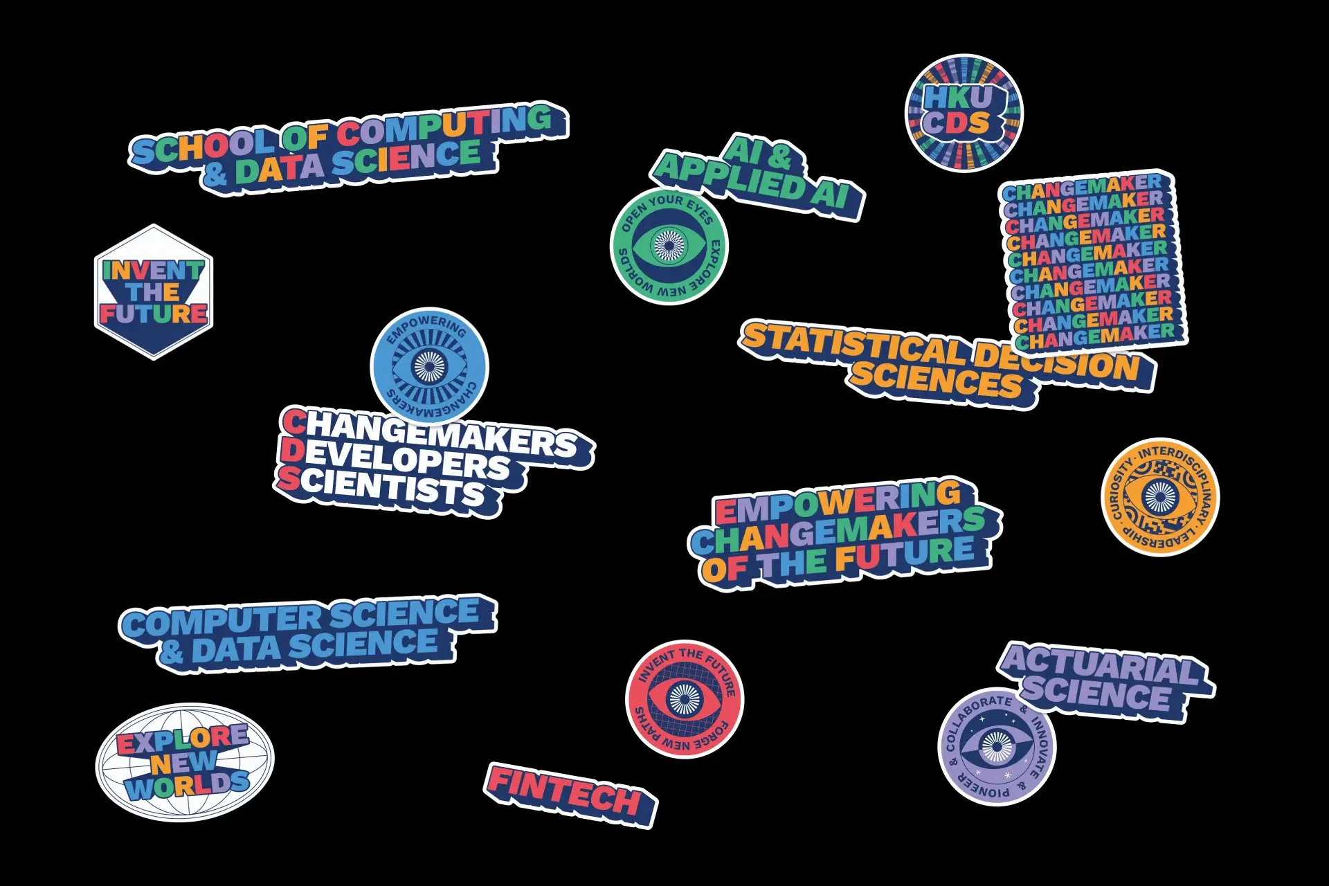
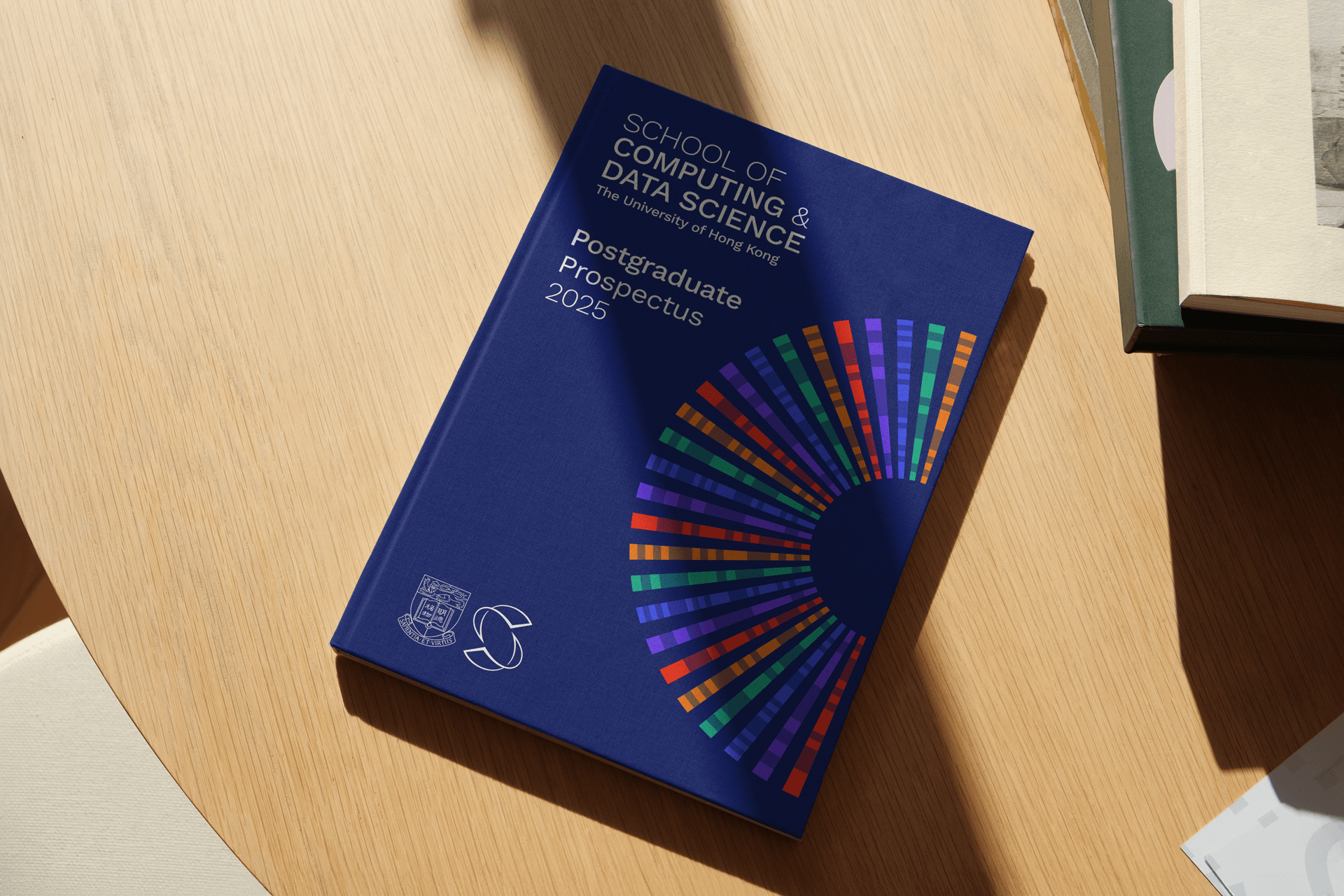
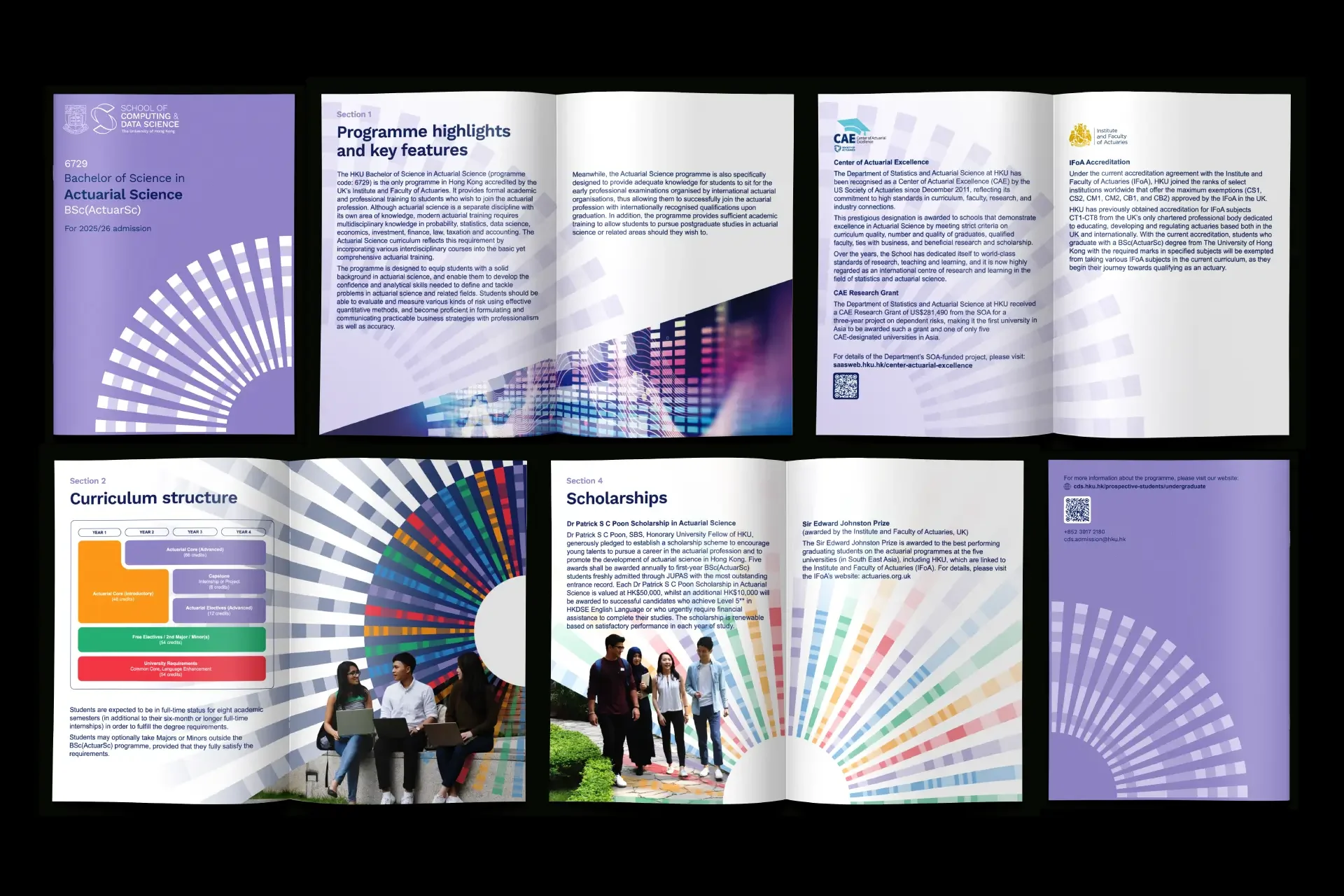
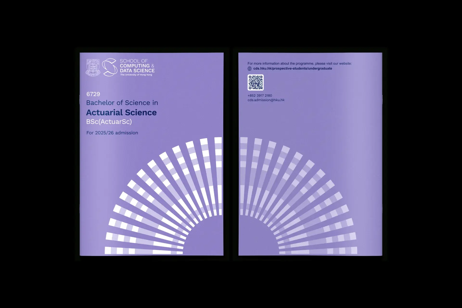
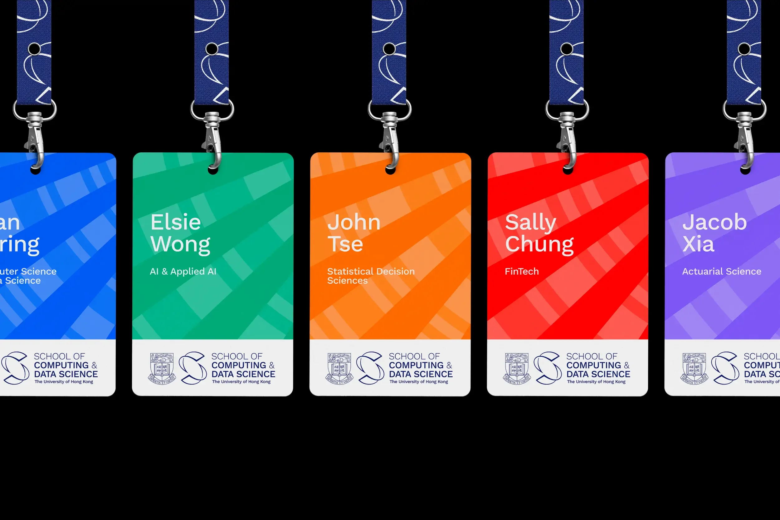
To complement the new logomark, we developed the CDS iris, a graphical system used to distinguish the five core fields of study and throughout the brand communications.
The iris is a central form of the new identity. We were initially inspired by the form of a ‘technological eye’, an iris or lens that connects the past and the future. The iris is constructed from the Morse code translation of the five core fields of study under CDS.


— Fields of study
— Initials


— Morse code
— CDS Iris


We chose Work Sans for the wordmark and primary typefaces for the CDS brand identity. Work Sans is a grotesque style, with a functional, no-nonsense, factual expression.


The colour palette was built from the five core fields of study, enabling flexibility in the visual identity, and allowing for variation and depth in the brands’ presentation.
Expression


impact
After just one year after launch, the school had climbed from 25th to 18th globally in Data Science & AI, and from 52nd to 21st in Computer Science & Information Systems in the QS World University rankings — a real-world testament to growing visibility and renewed academic momentum.
Team
Thank you to the HKU CDS team and the professors for their engagement through the process. Thanks to Jordan Scott for bringing the logo to life through motion, and to Laura Cooper for her beautifully crafted 3D visualisations.
Next project