Case Study
HKU School of Computing and Data Science
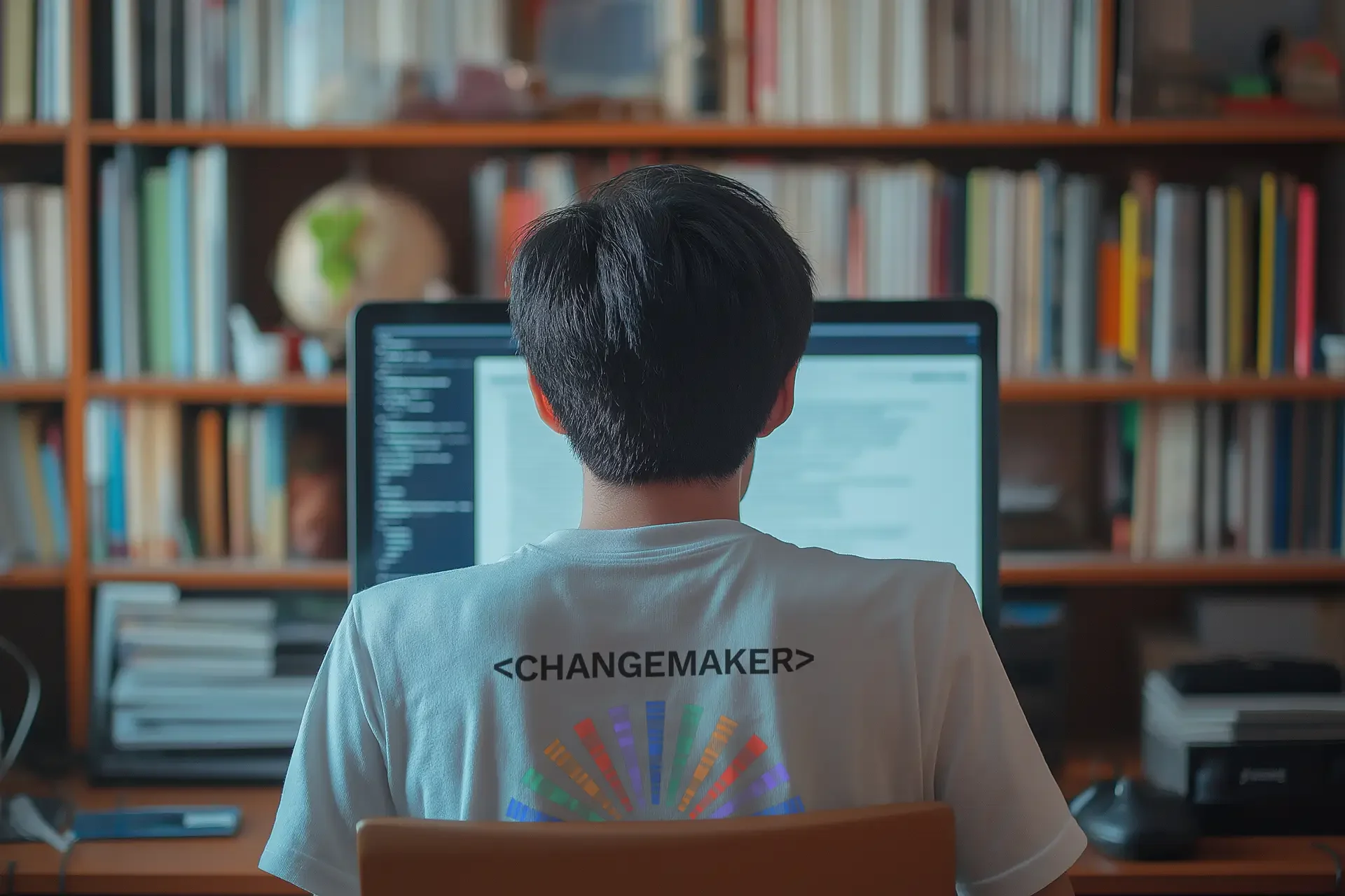
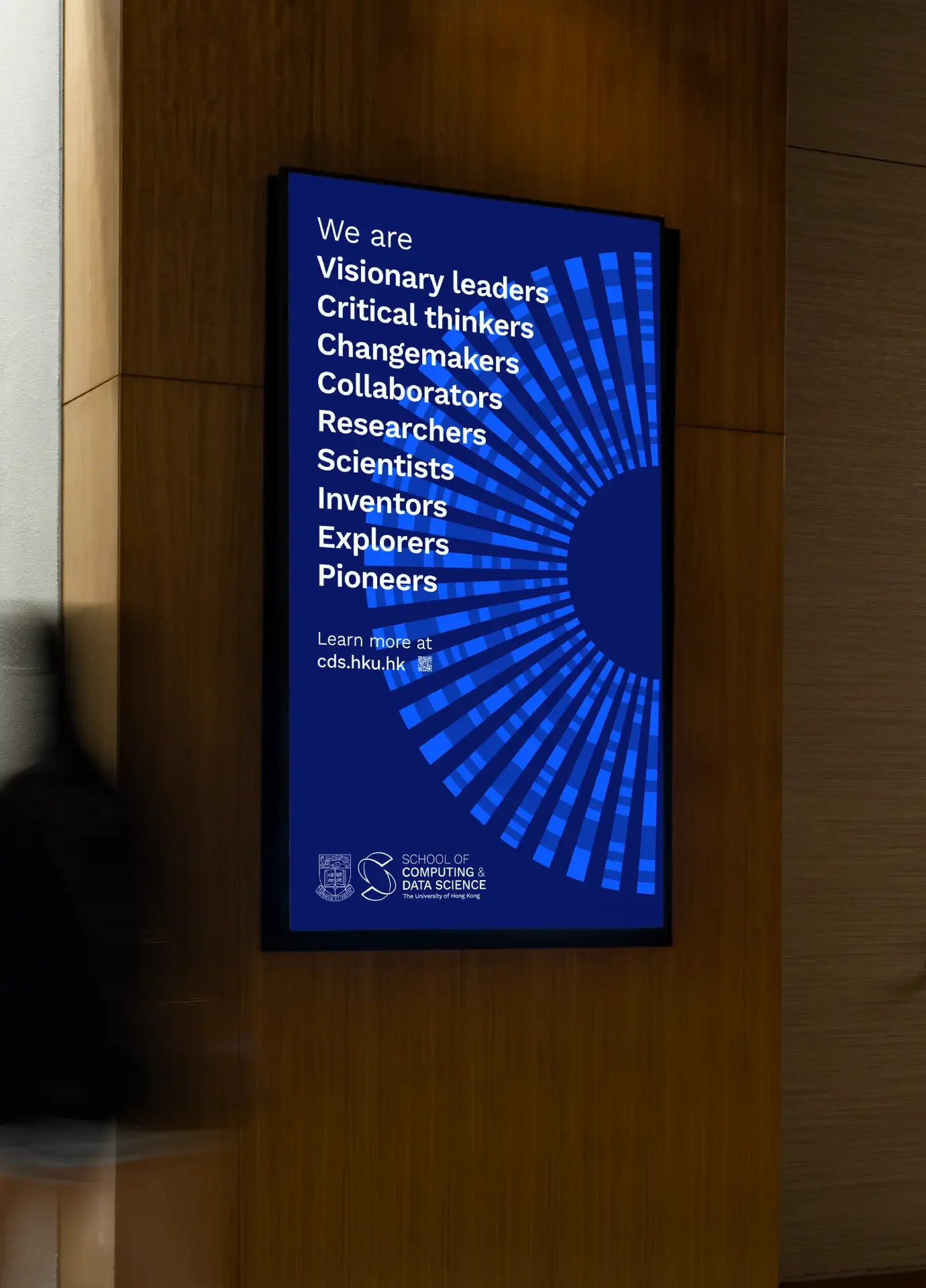
Empowering changemakers
BrandCraft developed the brand strategy and visual identity for the University of Hong Kong’s new School of Computing and Data Science, uniting two departments around a shared purpose.
HKU’s new school brought together the Department of Computer Science and the Department of Statistics and Actuarial Science. It needed a shared identity to express its interdisciplinary ambition.
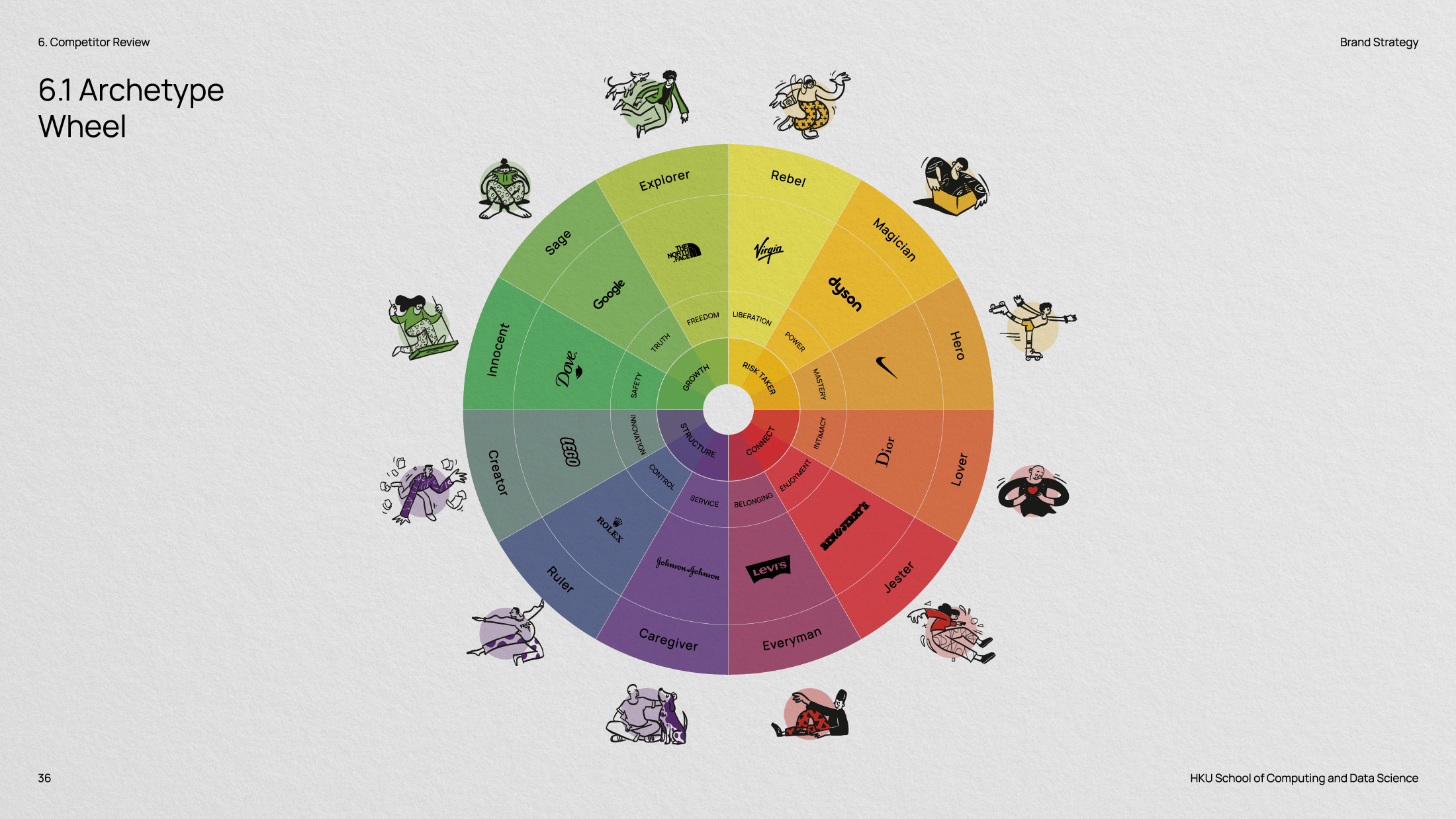
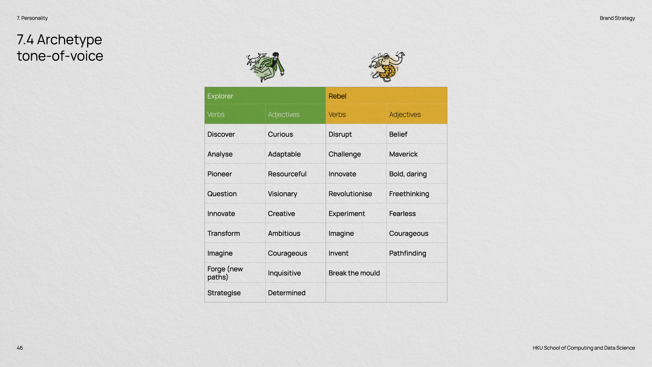
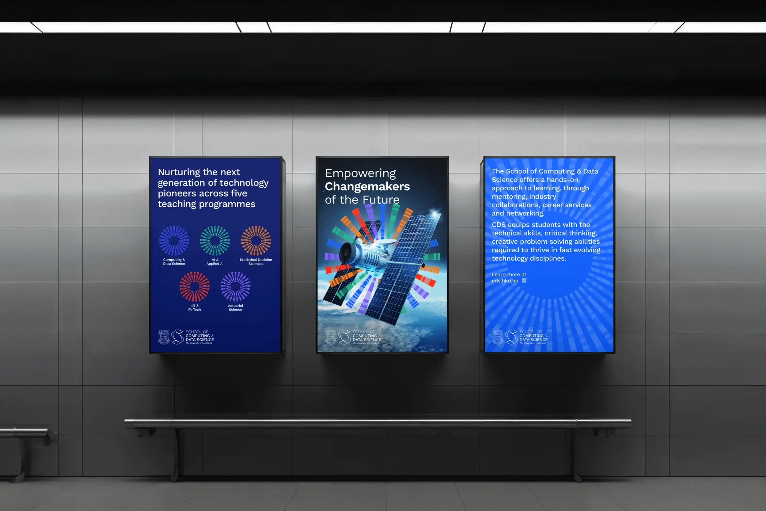
Through workshops with professors and stakeholders, we defined a positioning, personality and purpose rooted in leadership, innovation and curiosity: “Empowering Changemakers”.
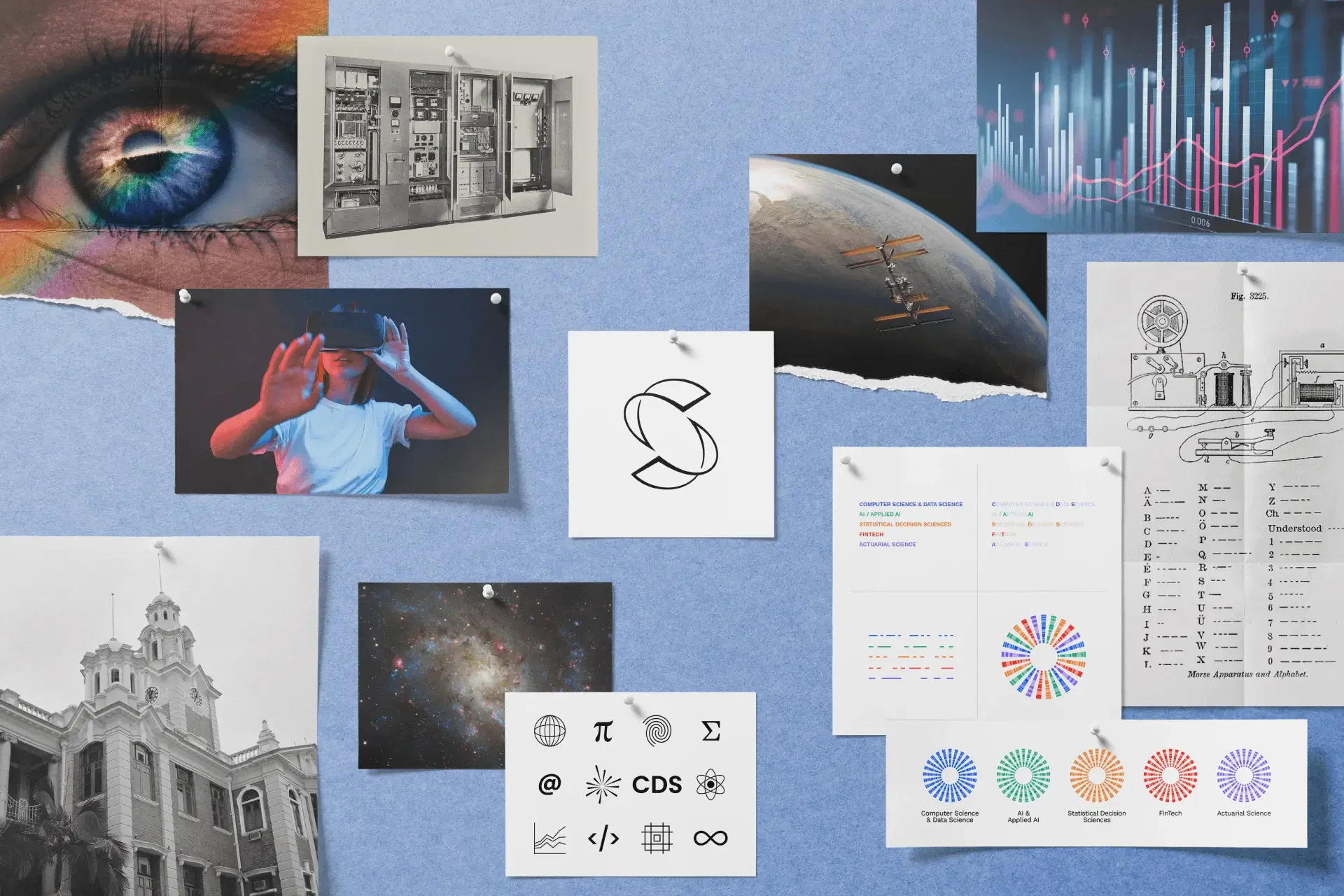
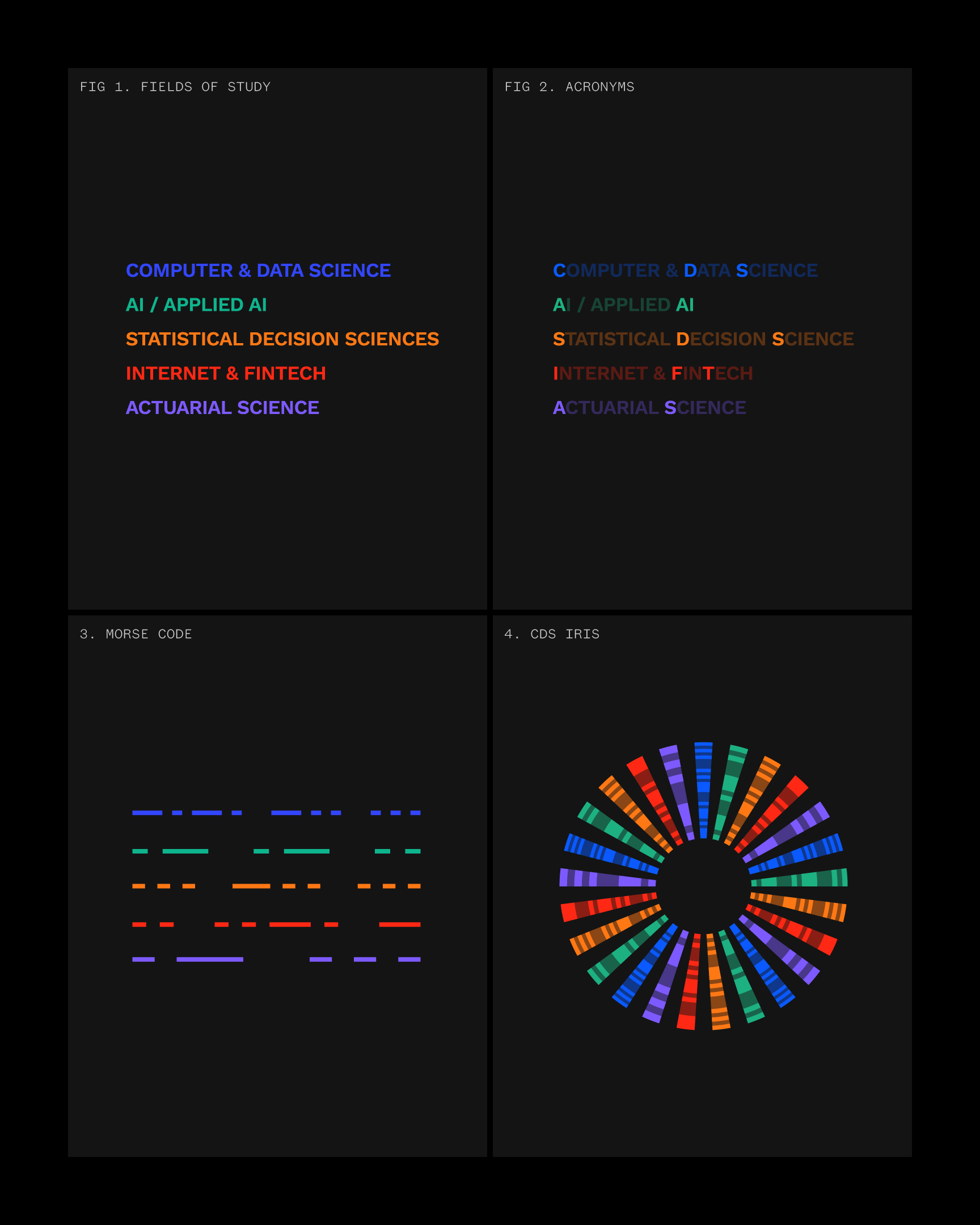
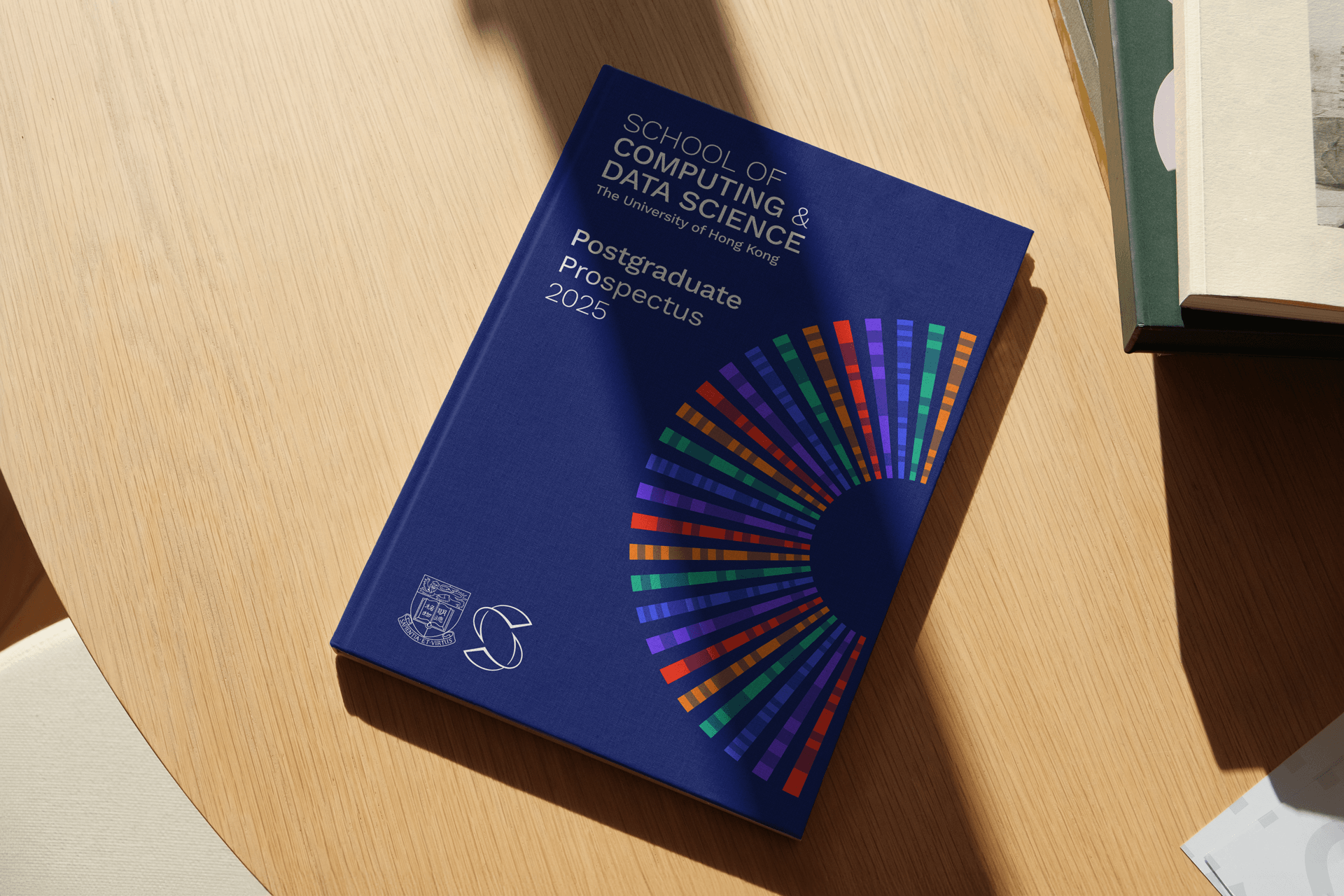
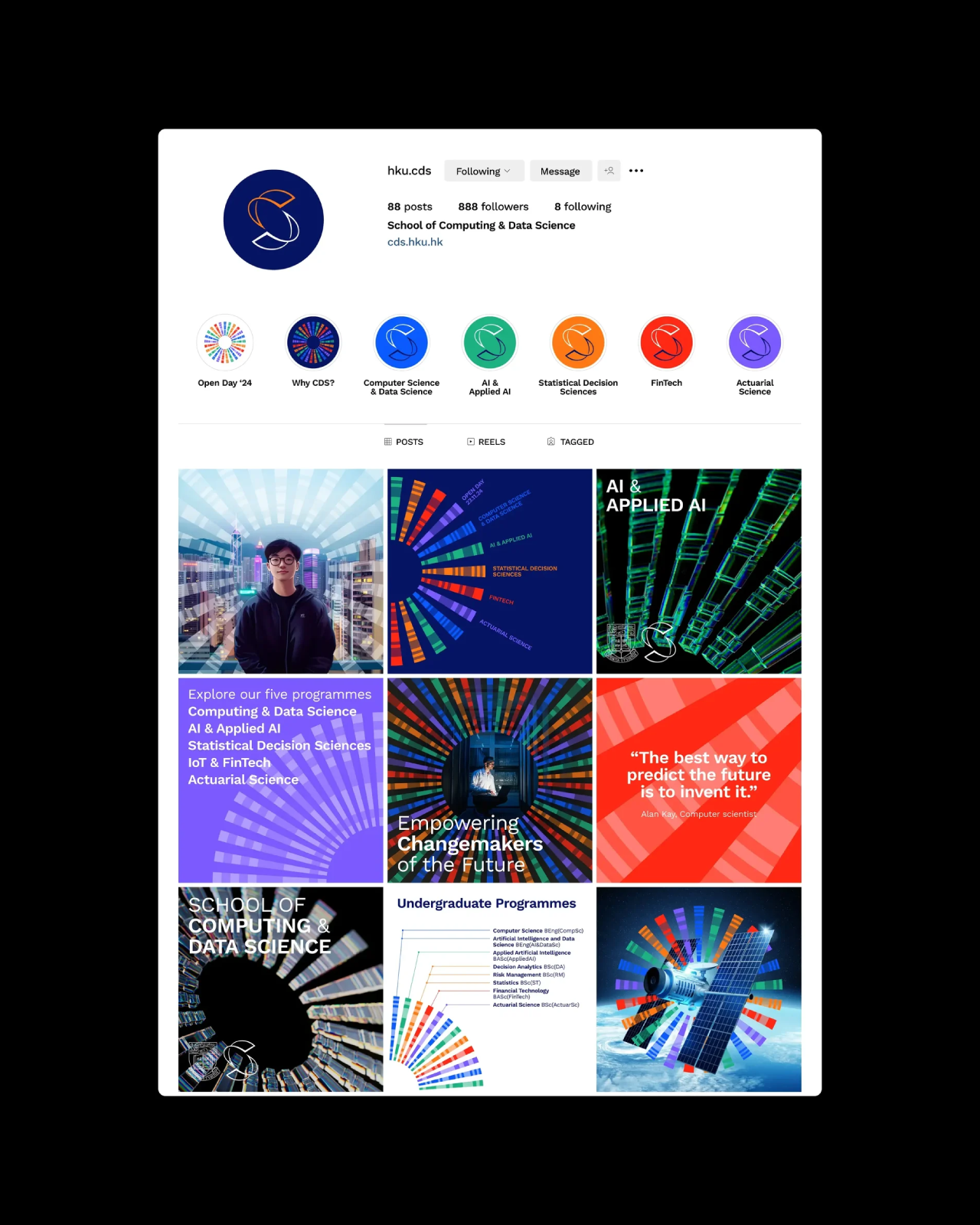
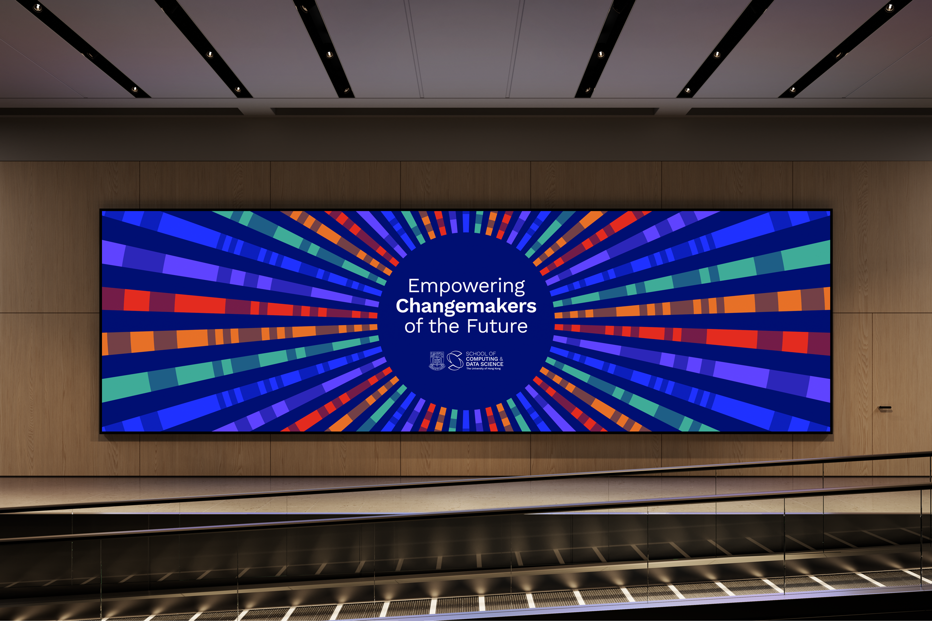
The identity brings that purpose to life through a CDS monogram, a Morse code-inspired graphic system and a colour palette representing five core fields of study.
Challenge
Bringing two departments together as one school.
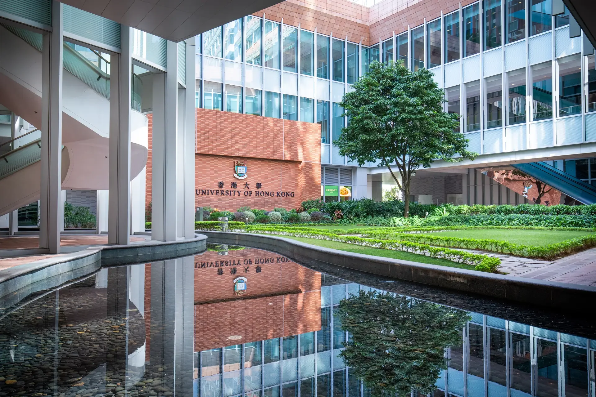
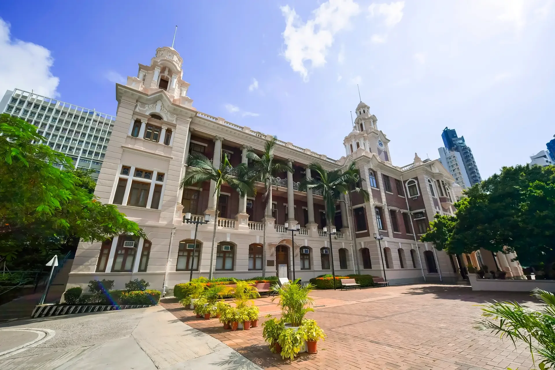
In 2024, the University of Hong Kong approached BrandCraft to create the brand identity for its new School of Computing and Data Science, combining the Department of Computer Science and the Department of Statistics and Actuarial Science.
The challenge was to establish a shared identity for a school uniting AI, computer science and statistics, expressing both its interdisciplinary character and its ambitions in technology education.
Approach
Defining what would unite the school.
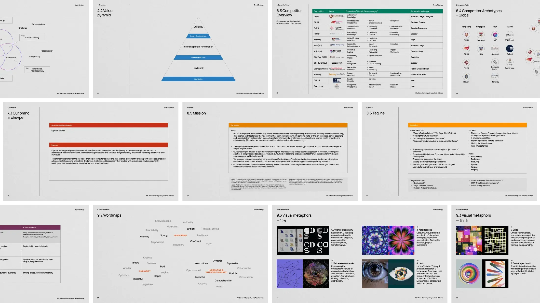
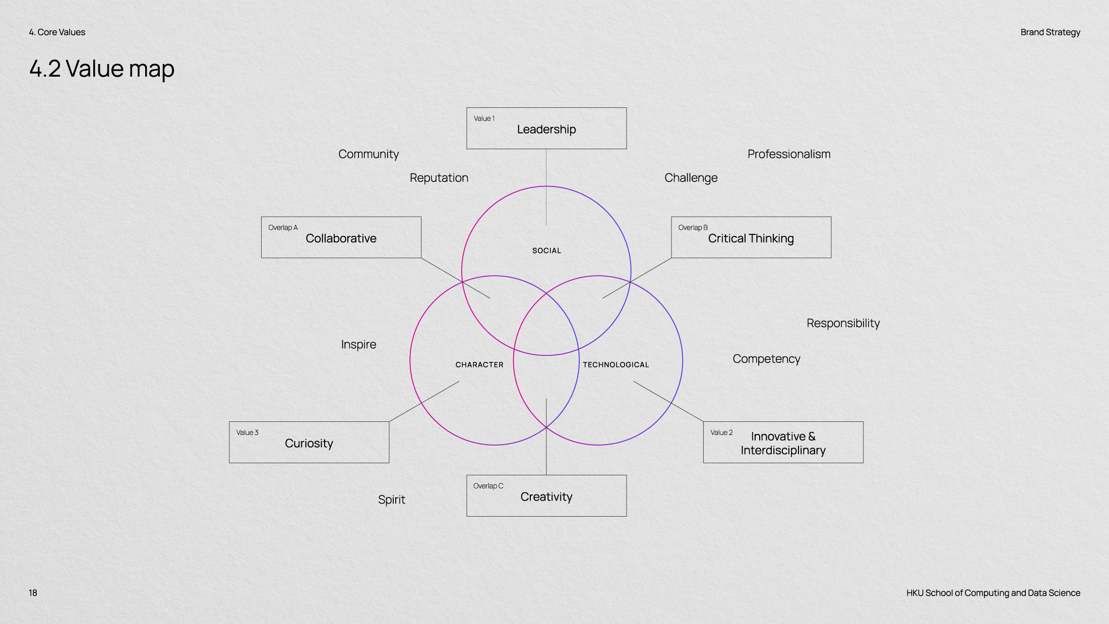
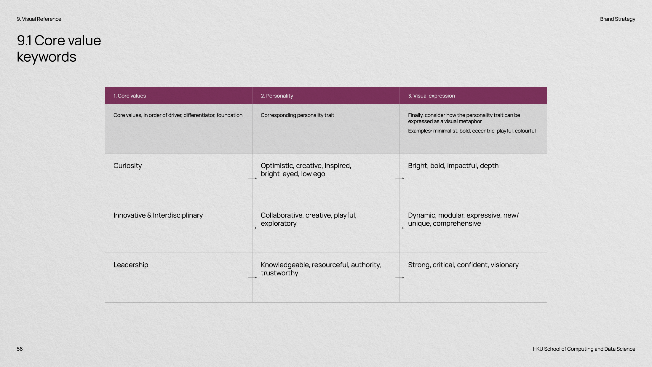
Through brand strategy workshops, we worked closely with professors and stakeholders to uncover the school’s core values: leadership, interdisciplinary innovation and curiosity.
We developed these into a distinctive personality, positioning and purpose, unified by the mission “Empowering Changemakers”. This strategic foundation guided the identity’s development through an iterative, collaborative design process.
Solution
A shared identity with room for difference.
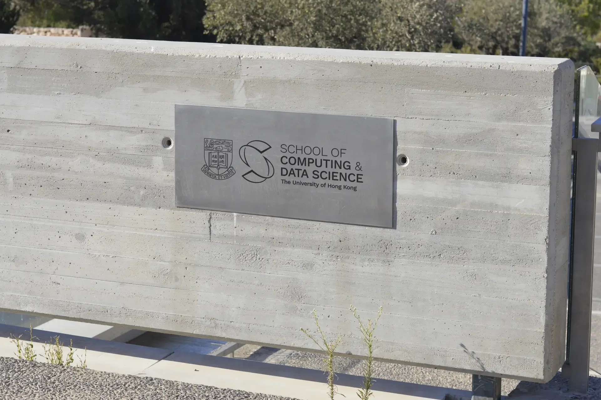
The CDS monogram brings together the “C” of Computing and “D” of Data Science within an overall “S” form representing the School. Its visual language draws inspiration from early computing, codification and the speed of technological evolution.
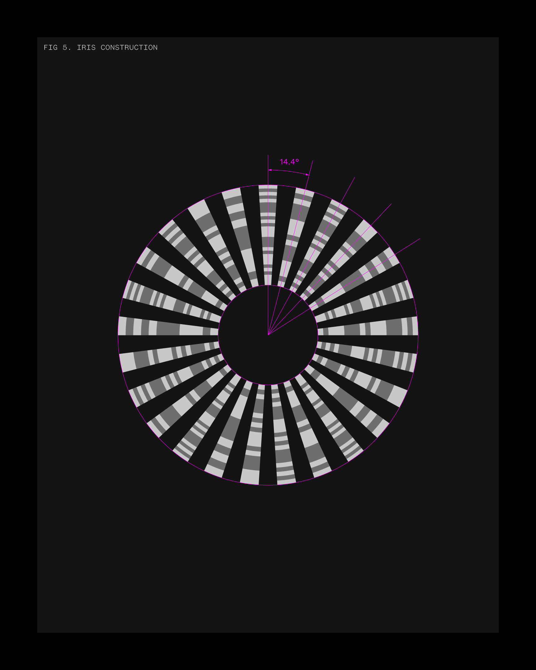
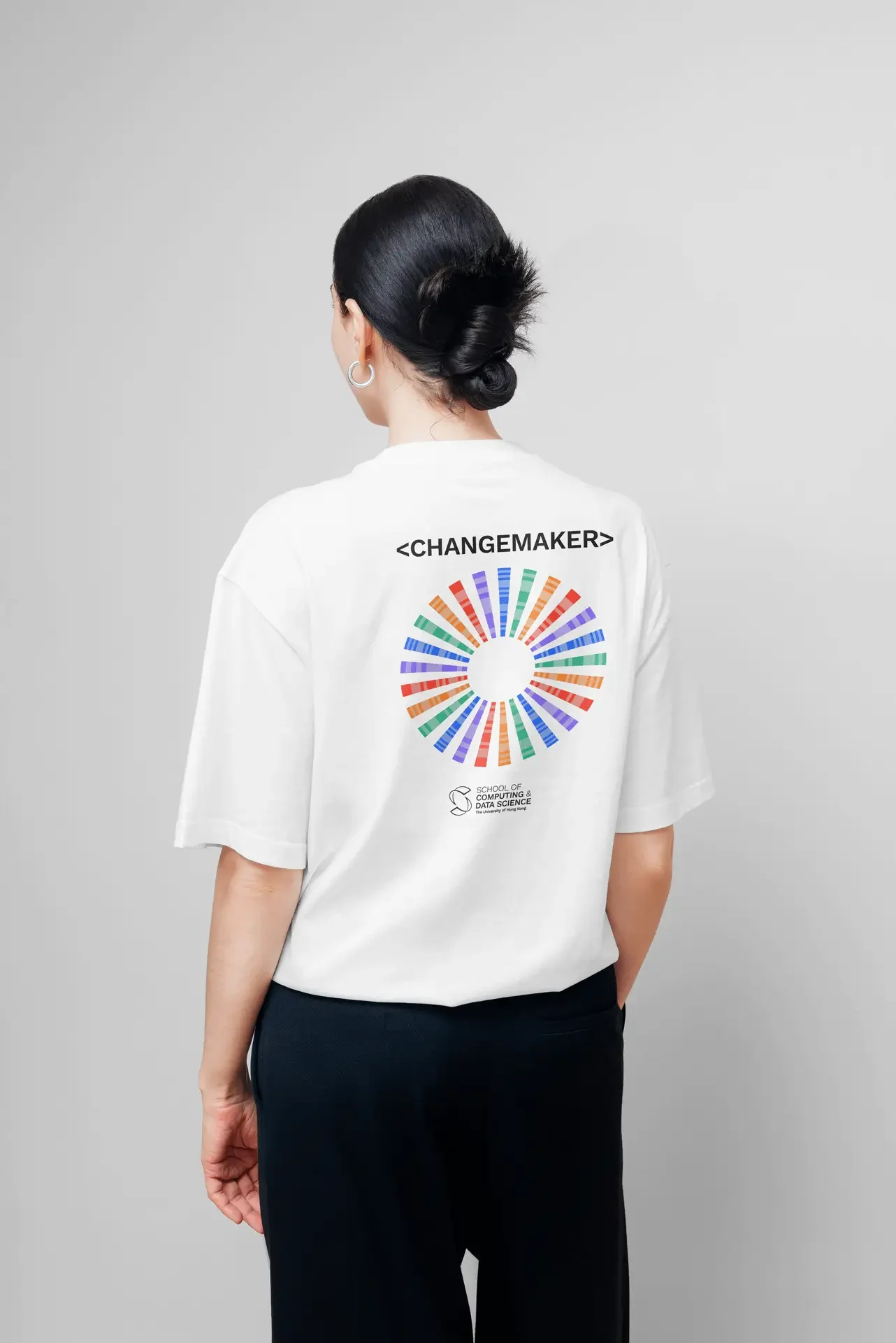
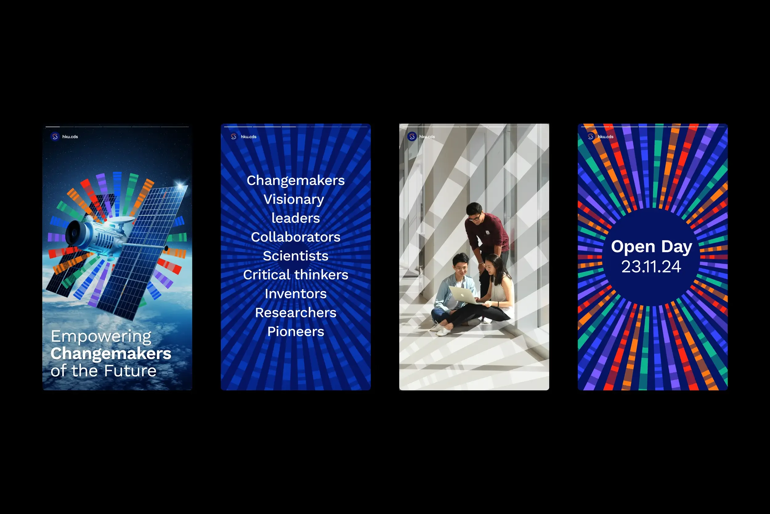
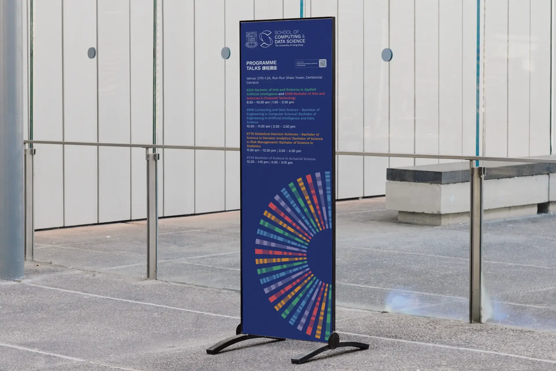
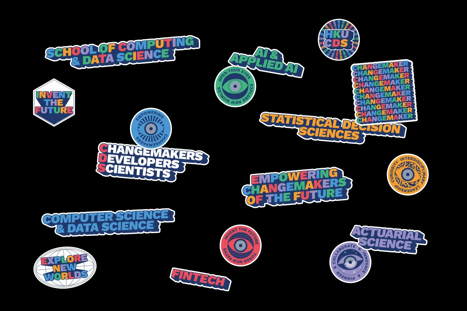
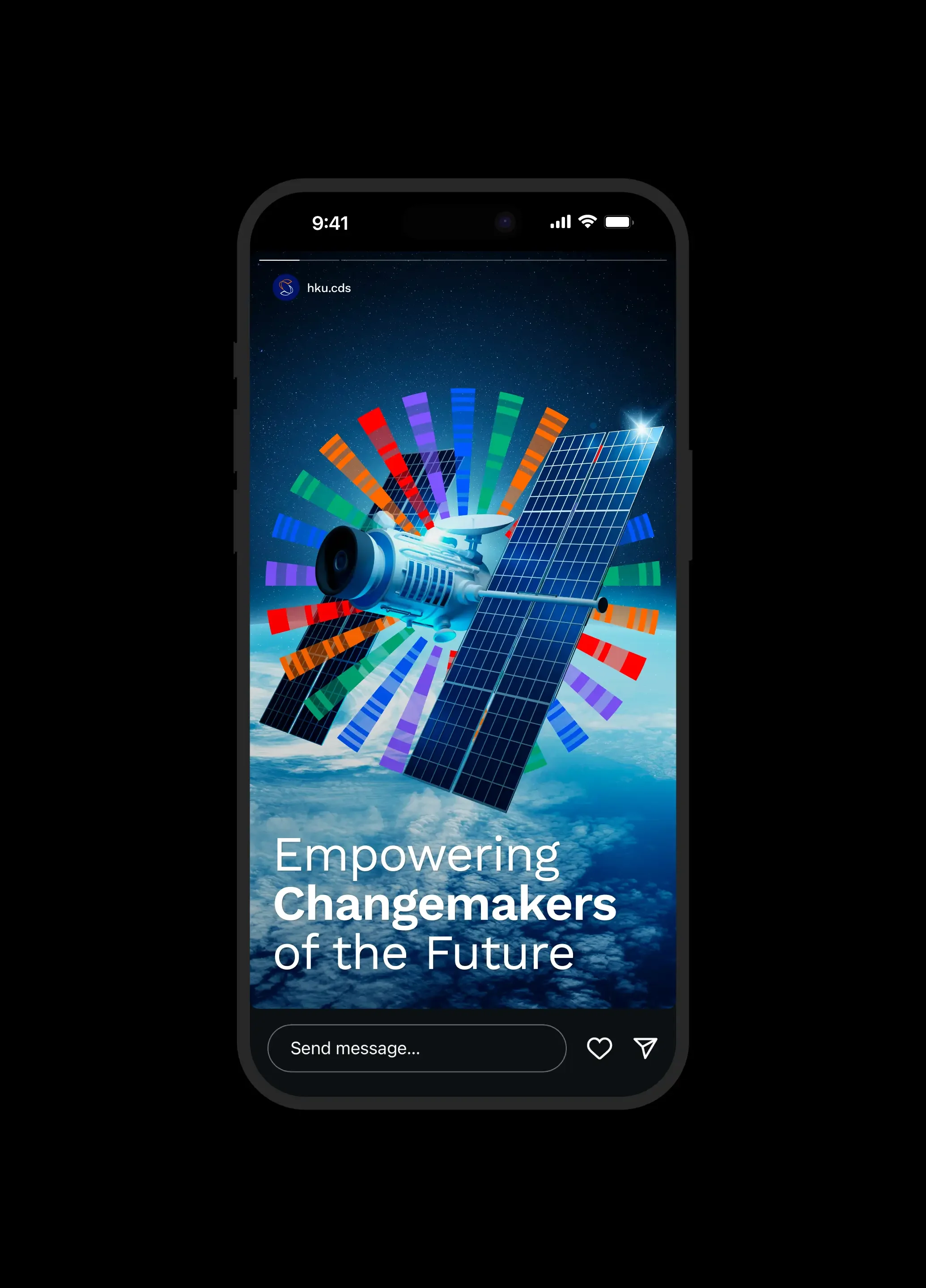
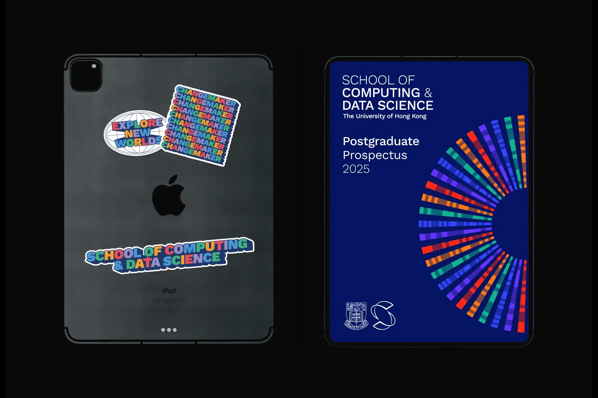
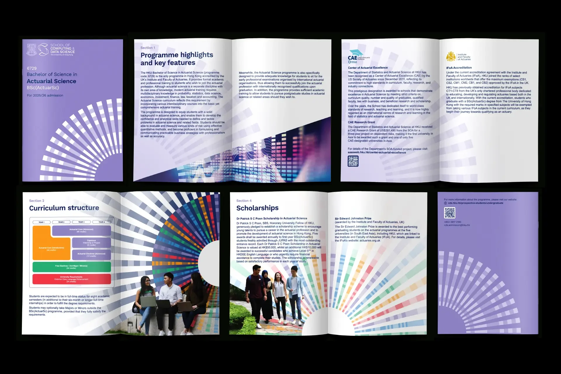
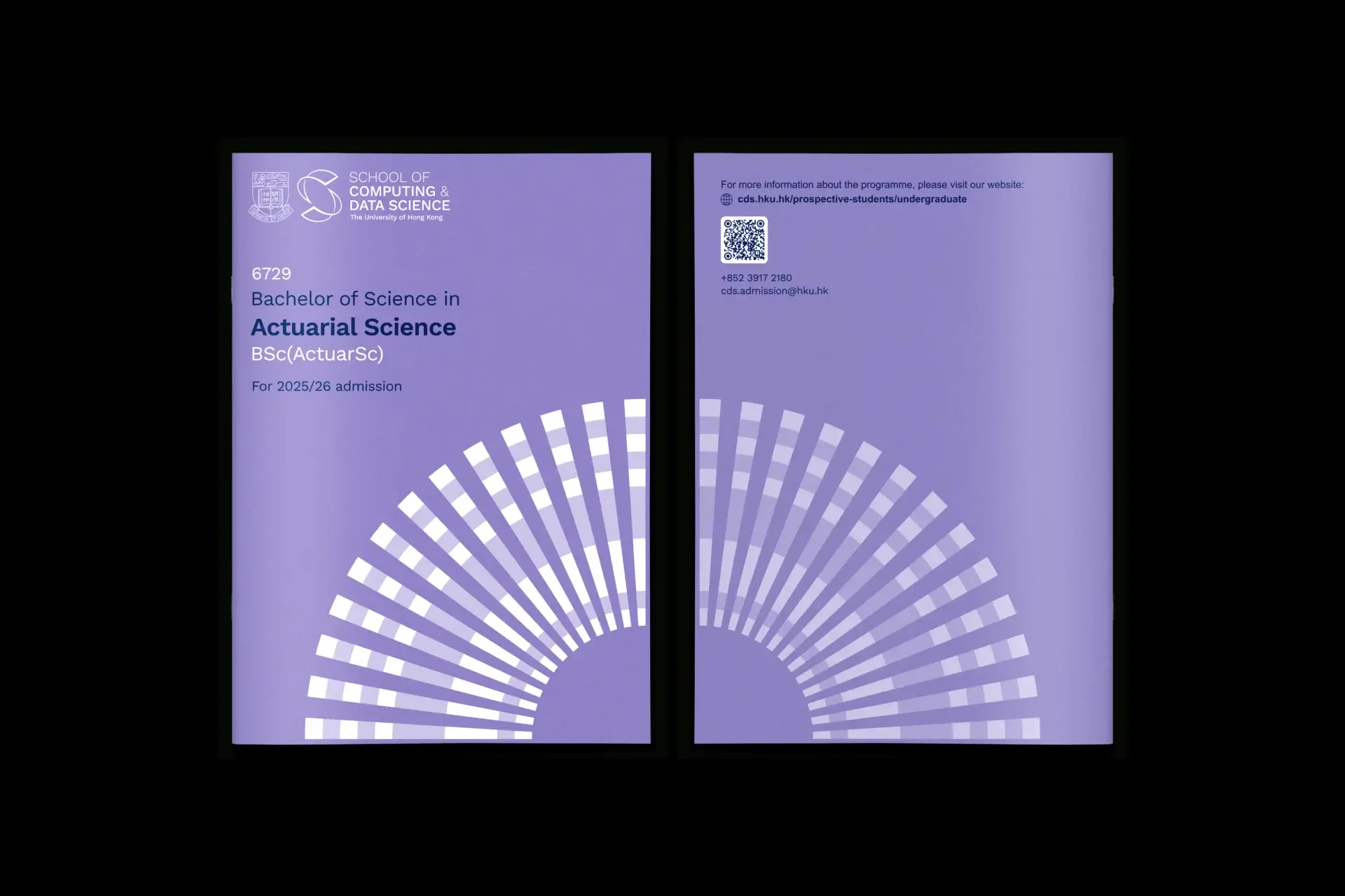
Alongside the monogram, we developed the CDS iris: a graphic system constructed from Morse code translations of the school’s five core fields of study. Inspired by a technological eye or lens, it connects past and future while giving each field a distinct expression.
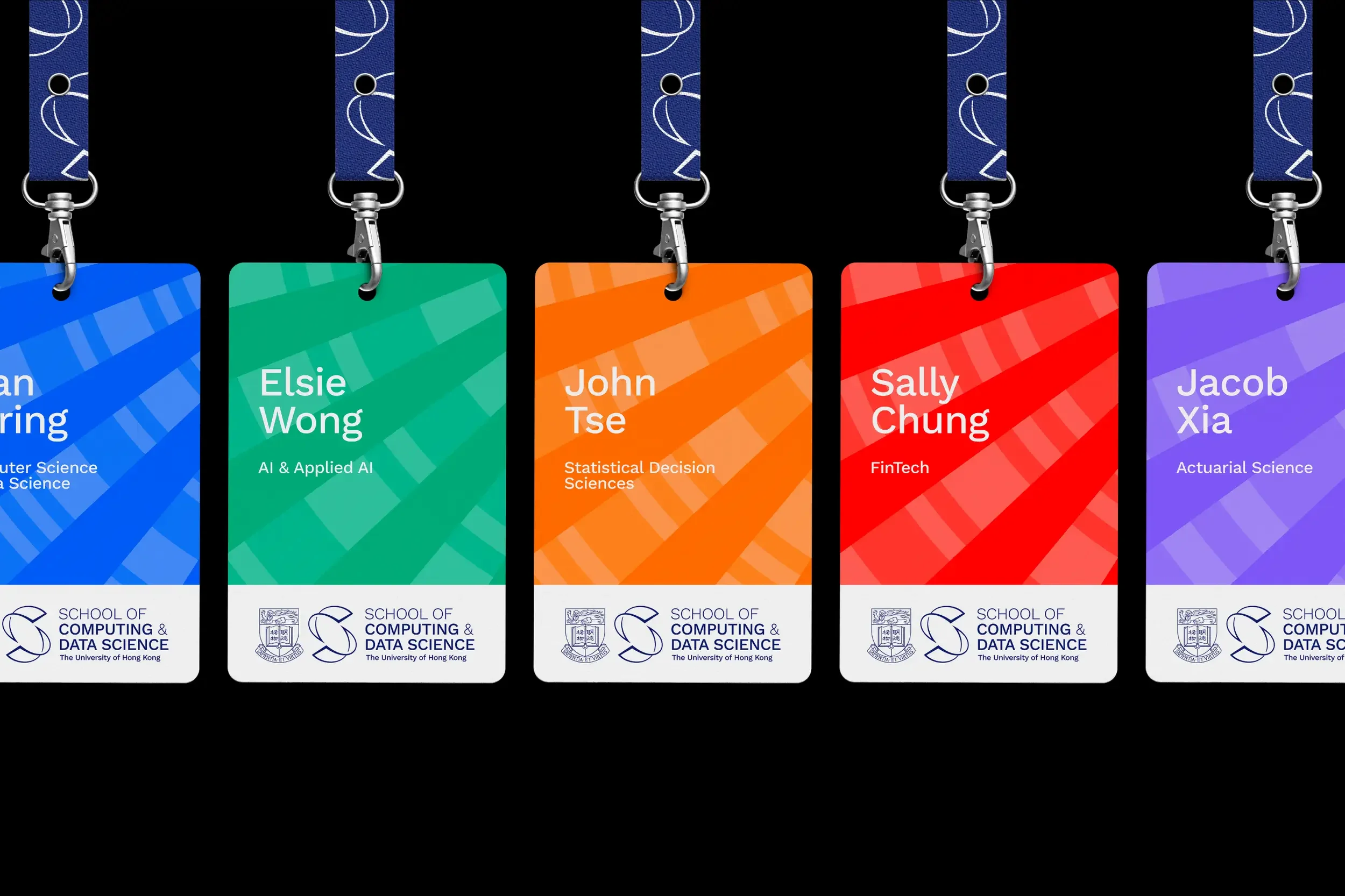
A colour palette built around the five fields adds flexibility and variation, while Work Sans brings a functional, factual character to the typography. Together, these elements form a unified system for the school’s brand communications.







Project Outcome
A shared identity for HKU’s new School of Computing and Data Science, bringing two departments together under one name and giving each of the school’s five fields of study its own visual expression.
Project Timeline
16 Weeks
From strategy workshops with faculty and stakeholders to the development of the visual identity and brand guidelines.
Collaboration
Thank you to the HKU CDS team and faculty for their collaboration throughout the project, to Jordan Scott for bringing the identity to life in motion, and to Laura Cooper for the 3D visualisations.