
Branding Process — HKU, School of Computing & Data Science
This project was one of our most enjoyable, challenging, and rewarding engagements. I wanted to document our process thoroughly and showcase what we created at each stage, sharing our approach with greater depth and transparency than a case study allows.
This long-form post offers an in-depth exploration of our approach and process for creating the visual identity for the HKU School of Computing & Data Science.
By Adam Charlton · 6 March 2025
Posted in Insight
The University of Hong Kong is the region’s most established higher education institution, with a rich legacy spanning over a century. When HKU approached us to create a brand identity for their new school—a powerful fusion of the Department of Computer Science and the Department of Statistics and Actuarial Science, this was an opportunity to create something significant to represent the convergence of these two academic powerhouses.
With its storied history of academic excellence, HKU sought our expertise in developing a brand identity that would effectively communicate the vision and purpose of its new Computing & Data Science School. This merger represented not just an administrative change but a strategic move to address the evolving landscape of technology and data in our increasingly digital world.
Our challenge was to create a visual identity that honours the university’s prestigious heritage while embracing the future of computing and data science education. The brand must resonate with students, faculty, industry partners, and the broader academic community.
Brand Strategy — Empowering Changemakers
We began with a comprehensive brand strategy workshop to create an authentic and meaningful brand. Working closely with the department’s professors and key stakeholders, we facilitated two brand strategy workshops to uncover the core values defining this new academic entity.
— Brand strategy deck overview
Through these collaborative sessions, three fundamental core values emerged:
Leadership — Representing the school’s commitment to pioneering research and education in computing and data science.
Interdisciplinary Innovation — Highlighting the cross-pollination of ideas between computing and statistical disciplines.
Curiosity — Embodying the exploratory mindset essential for advancement in these rapidly evolving fields.
These core values evolved into the school’s distinctive personality, positioning, and purpose. These elements were unified under the powerful ‘Empowering Changemakers’ purpose, reflecting the school’s commitment to developing professionals who would transform industries through computing and data science innovations.


Moodboarding
With our strategic foundation firmly established, we began the creative exploration through curated moodboards. Futuristic typography became our initial source of inspiration as we sought dynamic, future-focused typefaces that could visually represent the school's forward-thinking approach.
This exploration quickly expanded to include iterative typography—designs that evolve and transform, much like code. We were particularly drawn to the relationship between human language and programming languages such as Morse code and sought ways to express this connection visually.
We further explored the ‘iris’ concept—a visual element that could serve as a technological eye connecting past accomplishments with future potential. We experimented with various colour expressions, including kaleidoscopic arrangements, gradients, and colour depth.
Our exploration extended to grids, networks, and abstract collages that could visually represent the complex interconnections in computing and data science.
Within our final brand strategy presentation, we presented six key visual metaphors:
Dynamic Typography — Typography that shifts and adapts, representing the fluidity of digital environments
Kaleidoscopes — Complex patterns that transform, symbolising data visualisation
Pathways & Networks — Visual representations of connections and data flows
Digital Lens — Representations of how computing changes our view of the world
Grids & Frameworks — Structured systems that support complex information
Colour Spectrums — Gradients and colour transitions representing subject diversity
— Six areas of visual exploration
— Iterative typography, 2D>3D transitions and codification
— Digital lens, kaleidoscopes, diverse colours
— Grids, structures and networks
Concept ideation
Our concept creation began with sketching, as all design should! We embraced the incredible ugliness of early-stage ideation, which involves scribbles and experiments on paper. This approach is fundamental to our process because sketching allows exploration without pressure.
— Initial concept sketches overview
For this project, we dedicated a couple of days to initial sketching. This gave us the mental space to fully digest the reference materials and create those ‘happy accidents’ that often lead to the most innovative andunique solutions.
Visual identity presentation
Our first creative delivery to the client was the concept presentation that offered multiple brand futures for discussion. This involved evaluating our sketches, carefully curating the ideas to select only the most compelling and unique ones, and then transforming them into polished vector graphics.
— Concept deck overview
During this proof-of-concept phase, we further refined the ideas based on crucial criteria: uniqueness, functionality, legibility, and memorability. Once satisfied with the concepts, we visualised them across various touchpoints, discussing the merits of each before finalising them in our presentation deck.
Let’s explore the four concepts we presented:
Concept 1 — ‘A Common Language’
Our first concept represented what might be considered the safest, most expected approach. However, even within this conservative framework, we discovered something special.
During our initial sketching, we experienced one of those ‘happy accidents’ when we noticed the visual connection between coding language characters ‘</>’ and the letters ‘CDS’ (Computing & Data Science). This unexpected relationship became the foundation of the concept.
We iterated on this discovery, seeking the perfect visual balance between the programming syntax ‘</>’ and the initials ‘CDS’. After achieving a satisfying lockup, we developed a key visual element to complement the logomark on various brand touchpoints.
This led us to the cube concept—a visual metaphor inspired by the idea that programming code is the foundational building block for the future. These modular cubes could represent the various aspects of the school, creating a cohesive yet flexible visual system.
— Concept 1 logo lockup
Once we were relatively happy with this lockup, we developed a key visual to work with the logomark on brand touchpoints. Again, I am looking to find an aesthetic balance to present a complete visual identity concept.
— Concept 1 visual language development
The cubes are inspired by the notion that programming code and language are foundational elements for the future. These small cubes are modular blocks, used to represent various aspects of the school.
— Concept 1 visual language
This idea was then furthered into a visual identity system to visualise the brand concept.


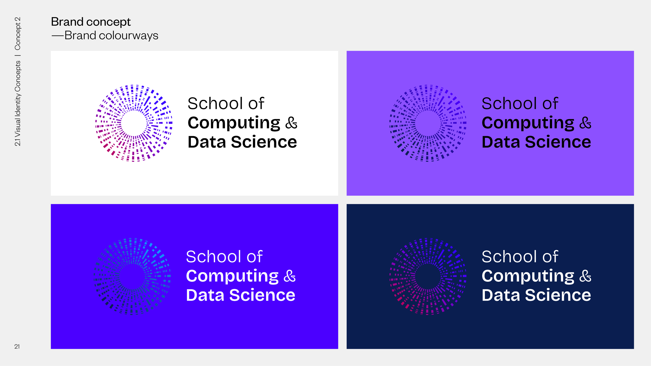
Concept 2 — ‘Encoded Brand Identity’
Our second concept drew inspiration from codification, particularly Morse code. We aimed to create a logomark that encoded the meaning of HKU CDS within its visual structure.
We extended some of our more complex, unused logo explorations into a comprehensive visual language, including backgrounds and patterns that reflected computer science’s encoding/decoding nature.
This concept also introduced the CDS iris, a key visual that distinguishes the school’s fields of study. The iris form was inspired by the idea of a ‘technological eye,’ a kind of fictional lens that connects past achievements with future possibilities.
We translated the acronyms for each field of study into their Morse code representations, then arranged these patterns radially around a central point and revolved them to create the distinctive iris-like circular design.
— Concept 2 logo lockup
We used some of the more complicated unused ideas and extended and turned them into visual language, backgrounds and patterns.
— Concept 2 visual language


Concept 3 — ‘Future Hieroglyphs’
Our third concept embraced simplicity, using a system of iconic forms arranged on a grid. This approach offered a modern, clean aesthetic that could be easily understood across cultural boundaries, much like hieroglyphs communicated across language barriers in ancient times.
— Concept 3 logo lockup
— Concept 3 visual language


Concept 4 — ‘The Most Abstract Form’
Our final concept pushed the boundaries of abstraction with an expressive, dynamic design resembling a conceptual firework burst. This approach emphasised energy and transformation, qualities inherent to computing and data science.
— Concept 4 logo lockup
— Concept 4 visual language


Initial client feedback
The initial feedback from the client was encouragingly positive. Most workshop participants were drawn to the cube key visuals from Concept 1 and the logomark from Concept 2. This feedback provided clear direction for our next phase of development.
Revision 1
Based on the client’s feedback, we pursued two distinct directions since the favoured elements—the structured cube visuals and the abstract circular iris—represented quite different aesthetic approaches.
— Revision 1 deck overview
Option 1
We further developed the ‘</>’ idea from Concept 1, evolving it into a more flowing, curved aesthetic. From our original sketches, we explored a new logomark where the ‘S’ of School was constructed from a ‘C’ for Computing and a ‘D’ for Data Science.
— Revision 1, option 1 logo meaning
— Revision 1, option 1 logo lockup
— Revision 1, option 1 visual language


Option 2
The second option further refined the iris concept, maintaining its abstract circular form while enhancing its connection to the five fields of study through colour and composition.
— Revision 1, option 2 logo lockup
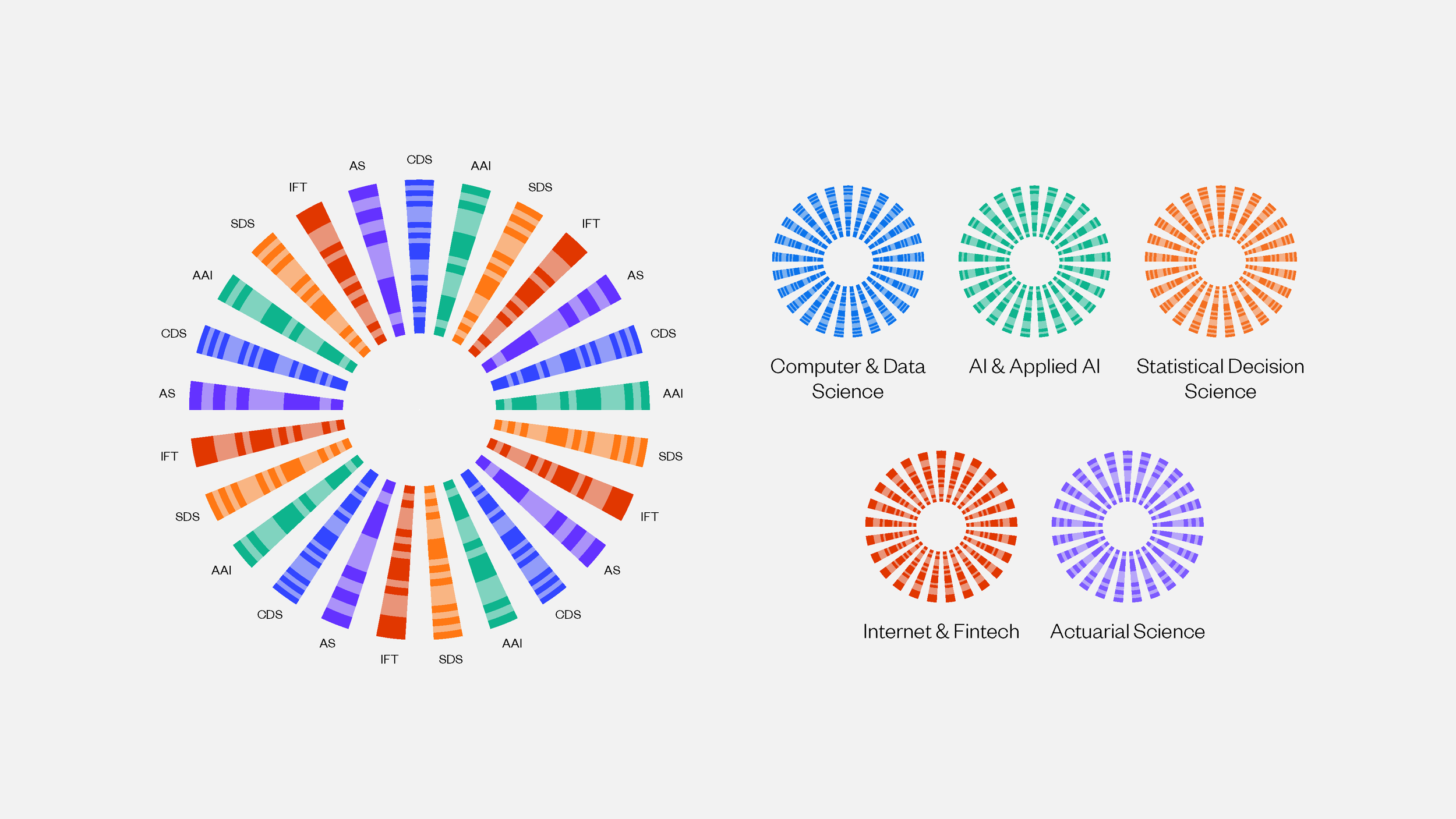
— Master CDS iris with an iris for each of the five core areas of practice


Revision 2
— Revision 2 deck overview
Our second round of revisions continued to refine these two directions:
Option 1
This iteration combined the ‘S’ logo construction with elements of the CDS iris concept, creating a harmonious blend of the two previously separate approaches.
— Revision 2, option 1 logo development
— Revision 2, option 1 logo lockup


Option 2
— Revision 2, option 2 logo lockup


Revision 3
The final logo beautifully highlights the coming together of the two departments: the ‘C’ of ‘Computing’ and the ‘D’ of ‘Data Science’ combine to form an ‘S’ for ‘School.’ This elegant solution visually represents the merger of the departments while creating a distinctive, memorable mark.
In developing this identity, we drew inspiration from early computing devices and the essence of primitive codification systems. For the wordmark and primary typeface, we selected Work Sans. This font communicates a functional, no-nonsense approach appropriate for an academic institution focused on factual, data-driven disciplines.
— Revision 3 deck overview
— Revision 3, logo development
— Revision 3, logo lockup
Brand guidelines — Formalising the new CDS brand
After finalising the brand identity, we developed a thorough set of brand guidelines to ensure consistent implementation across all touchpoints. These guidelines served as both a practical toolkit and a strategic document that would help the school maintain brand integrity as they grew.
— Brand guidelines overview


The brand guidelines we created encompassed several key components:
Visual Identity System — We documented all visual elements with precise specifications for the logo, including clear space requirements, minimum size restrictions, and appropriate colour variations. The guidelines included detailed instructions for using the CDS iris across different applications and established a comprehensive grid system to maintain visual harmony throughout all communications.
Colour Palette — We expanded the core colours into a robust palette with primary, secondary, and accent colours. Each colour was defined with precise values for print (CMYK, Pantone) and digital (RGB, HEX) applications and guidance on colour combinations that would maintain accessibility standards.
Typography Hierarchy — The guidelines established a transparent typographic system using Work Sans as the primary typeface, with detailed specifications for headings, subheadings, body copy, and captions. We included spacing recommendations, line height standards, and example layouts to demonstrate proper typographic hierarchy.
Asset Library — We developed a comprehensive collection of graphical elements, patterns, and iconography derived from the core brand concepts. These assets were designed to be flexible enough for various applications while maintaining a cohesive visual language.
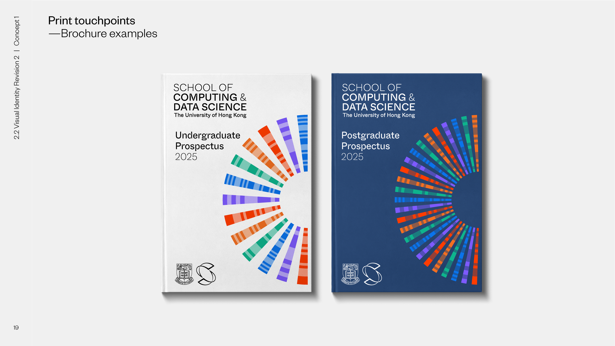
Application Examples — To demonstrate the brand in action, we created a series of mockups showing the identity applied across various touchpoints, including:
Digital platforms (website, social media, presentations)
Print materials (business cards, letterheads, brochures)
Environmental applications (signage, event backdrops)
Promotional items (apparel, merchandise)
Brand Voice & Messaging — Beyond visual elements, we established guidelines for the brand's verbal expression. These included tone of voice principles, messaging frameworks, and example copy that reflected the school's positioning and values.
Bringing the brand to life
We extended the brand identity with motion design and a bespoke animated identity to capture the new school’s dynamic and forward-thinking nature. The motion ident became a crucial component of the brand’s digital presence, creating memorable moments of brand recognition across video content, presentations, digital displays, and the school’s website.
The motion ident’s concept was rooted in the core brand strategy of ‘Empowering Changemakers.’ We wanted to visualise the transformative journey of data and computation—from raw information to meaningful insights that drive change.
Several key principles guided our animation approach:
Data Flow – We created visual representations of data travelling through systems, showing transformation and refinement
Algorithmic Movement – The animation follows mathematical patterns, subtly reinforcing the computational foundation of the school
Transitional States – The ident showcases multiple transformations, symbolising the evolution of information through analysis
Dimensional Shifts – Moving between 2D and 3D space represents the multifaceted perspectives gained through data science
By extending the brand into motion, we gave HKU CDS a dynamic tool for engaging with audiences in digital environments. The motion ident captures attention in ways that static elements cannot, creating memorable brand moments that reinforce the school's innovative positioning and forward-thinking approach.
This motion identity system has become integral to the school’s communication of its mission. It helps distinguish HKU CDS in a competitive educational landscape and creates a contemporary brand presence that resonates with digitally native audiences.
What we learnt through this project
Creating the brand identity for HKU’s new School of Computing & Data Science was a discovery, collaboration, and creative problem-solving journey. Communicating so much within the visual identity was a huge challenge! Beginning with a solid strategic foundation and moving through a methodical, iterative design process, we delivered a brand identity that authentically represents the school's mission of ‘Empowering Changemakers.’
The resulting visual system distinguishes the school within the competitive landscape of higher education. It provides a flexible framework that can evolve alongside the rapidly advancing fields of computing and data science. Most importantly, it creates a visual language that resonates with students, faculty, and industry partners—inspiring the next generation of innovation in these critical disciplines.
Great branding begins with understanding the essence of the organisation, it’s values, and vision and then translating this information into a meaningful visual expression.
The HKU CDS brand identity embodies this philosophy, a distinctive presence for a school that will shape the future of computing and data science education in Hong Kong and beyond.
Final note
Documenting this project in a longer format than our typical case study has been genuinely rewarding. Collecting and presenting all of the work was a project in itself – this is by far the longest post on this blog!
Looking back, I’m struck by the sheer volume of work we produced throughout this project, considering it was just a three-month project. However, what I’ve shared here really only scratches the surface. The depth of exploration and number of revisions were truly intensive, with numerous promising concepts ultimately left on the cutting room floor.
This highlights an essential truth about design: designers must develop the ability to be ruthlessly critical of their work. The branding design process generates abundant creative output - this is the easy part – the real skill lies in discerning which elements are most essential and having the discipline to eliminate everything else, no matter how compelling it might be in isolation.
I don’t think we will go on to document every project in this way as it is time-consuming, but I hope this has been a valuable look into our process. If you have any questions about how we work, please email me – adam@brandcraft.hk.
Back to the Blog

About the author —
Adam moved to Hong Kong in 2012 and founded the branding agency BrandCraft. Adam has built brands for companies at every growth stage and has consulted for some of the world’s most recognised companies.