
Index > Travous
Group Travel Made Easy
Context
Travous is a travel app that aims to help make the mammoth task of organising a group holiday a seamless and pain-free experience. Travous allows multiple users to manage the trip, acting as a single solution that combines calendars, itineraries, task management, and even the difficult task of polling activity preferences!
We were approached by the founder to help create the visual identity.
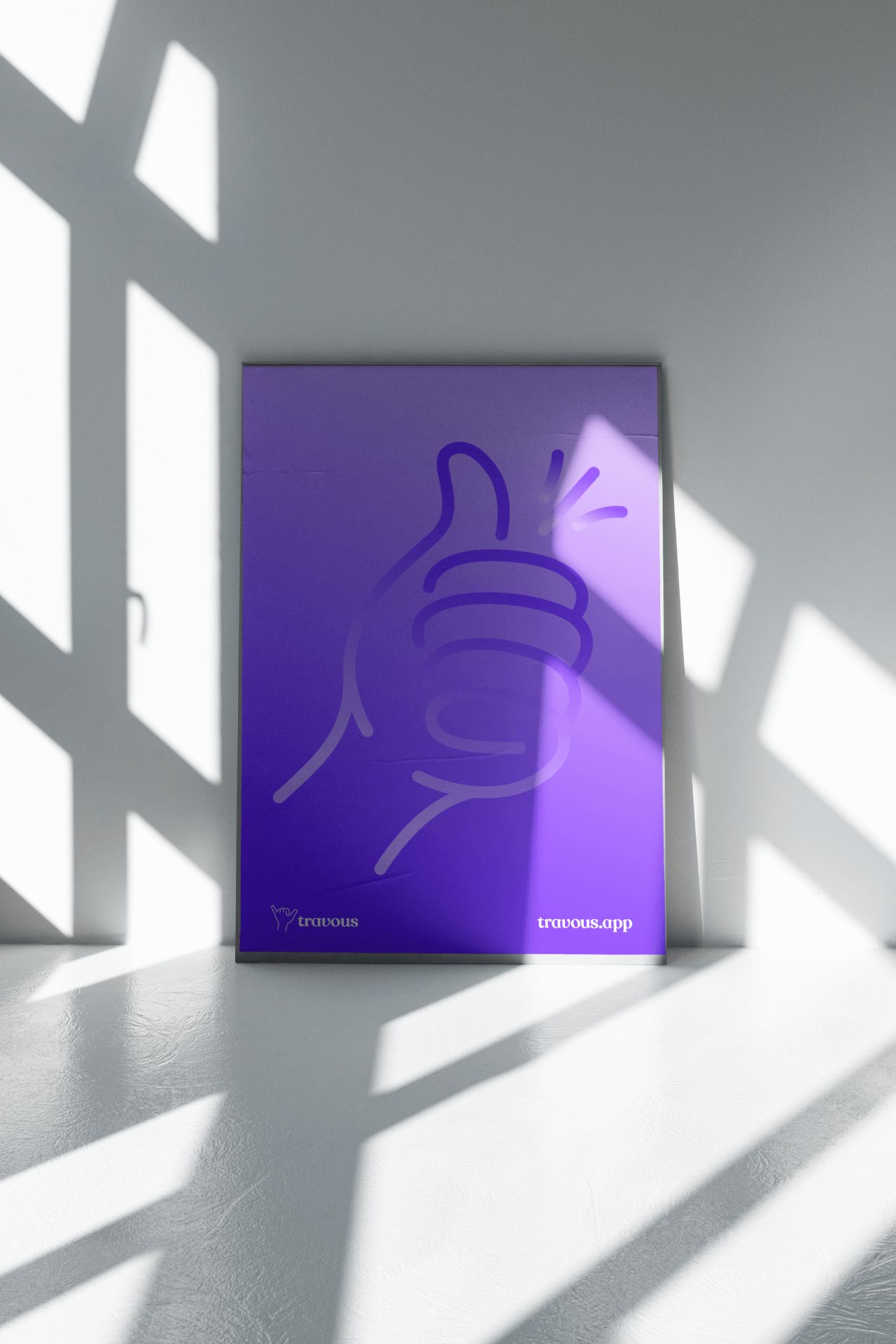
Direction
In our discovery phase, we spent time with the founder to understand their vision for Travous, and the features and benefits it brings the users. During the concept phase, we uncovered the idea of the ‘shaka’ hand sign, which is used to express friendship, gratitude and unity. We adopted the ‘shaka’ to express Travous’ playful, expressive tone, and the foundational value of friendship and a shared journey.
We explored diverse expressions of the ‘shaka’ sign, with every combination of loop and line, aiming to find a logo that balanced the visual line weight, to the modern asethetic, without loosing legibility.


We paired the logomark with the expressive and individual Recoleta Alt type family, and specifically the Medium and Regular weights.


“Working with the team at BrandCraft has been great. They took the time to truly understand my brand and vision, then brought it to life in a way that has resonated so strongly with my target audience. I couldn't be happier with the results and highly recommend BrandCraft.”
Michelle Tsoi
Founder, Travous

Next project
