Index > Carnot Innovations
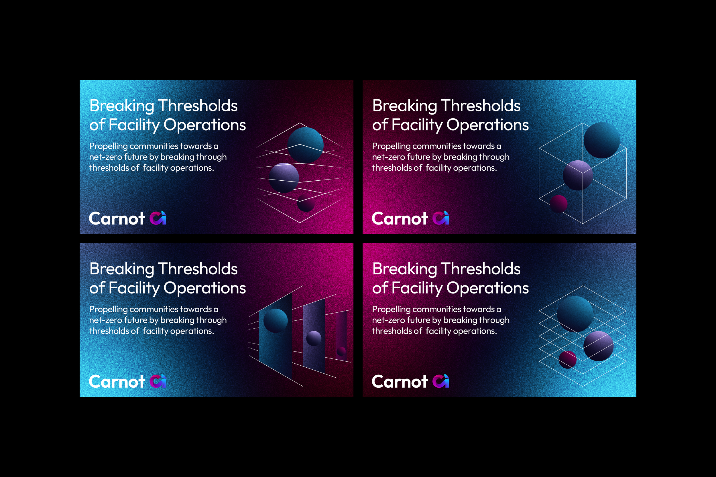
Breaking thresholds of facility operations
Carnot Innovations is a data-driven energy management software pioneer, focused on helping their clients maximise efficiency, cost savings and environmental credentials.
We worked with the leadership to clarify their messaging, distilling their market proposition into two critical core values.
We refocused Carnot’s key messaging and renewed their brand purpose, to revolutionise, and propel:
Carnot Innovations exists to:
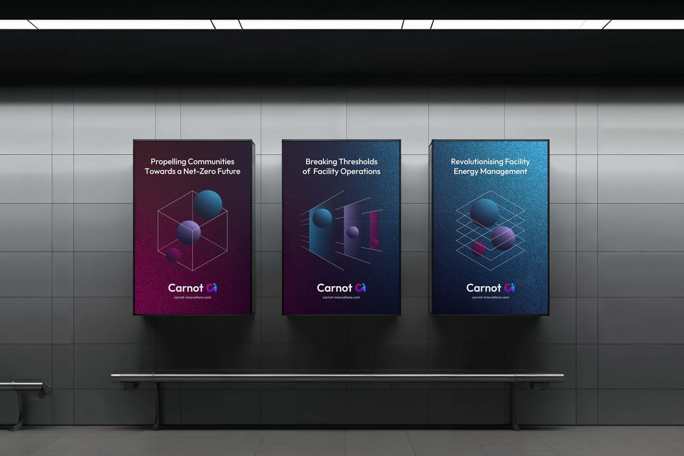
propel communities toward a net-zero future
pioneer the advancement of operational efficiency
revolutionise facility energy management
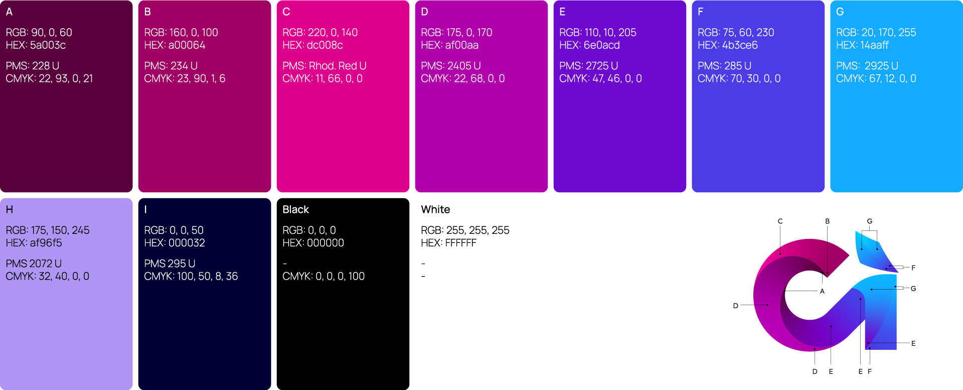
The identity is based around the Carnot Cycle, a theoretical model devised by Sadi Carnot, that sets the benchmark for the maximum efficiency of a heat engine operating between two temperature extremes. The Carnot Cycle was used as a central device when exploring logomark options.


An open source font was chosen for the identity because of it’s flexibility and ease-of-use. The Outfit type family reflects the modernity and technological focus of Carnot.

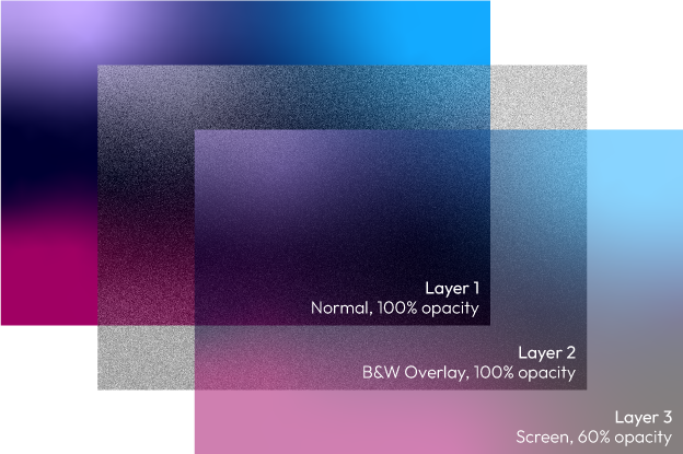
Colour is an integral part of the Carnot identity and is extended from the logo, through gradients and iconography to build the brand system.


Next project