
Index > Yun Ya
Unisex body wash
Yun Ya is a Chinese-inspired unisex body wash positioned in the UK. The client wanted an authentic logo at the heart of the brand thus we set about designing an identity that would capture it's cross-cultural history and framing.

— Toko Shinoda
The identity was inspired by Chinese calligraphy and the Japanese artist Toko Shinoda's sumi ink paintings.
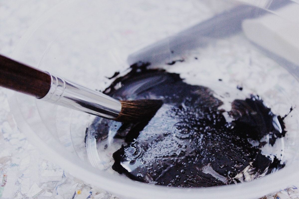
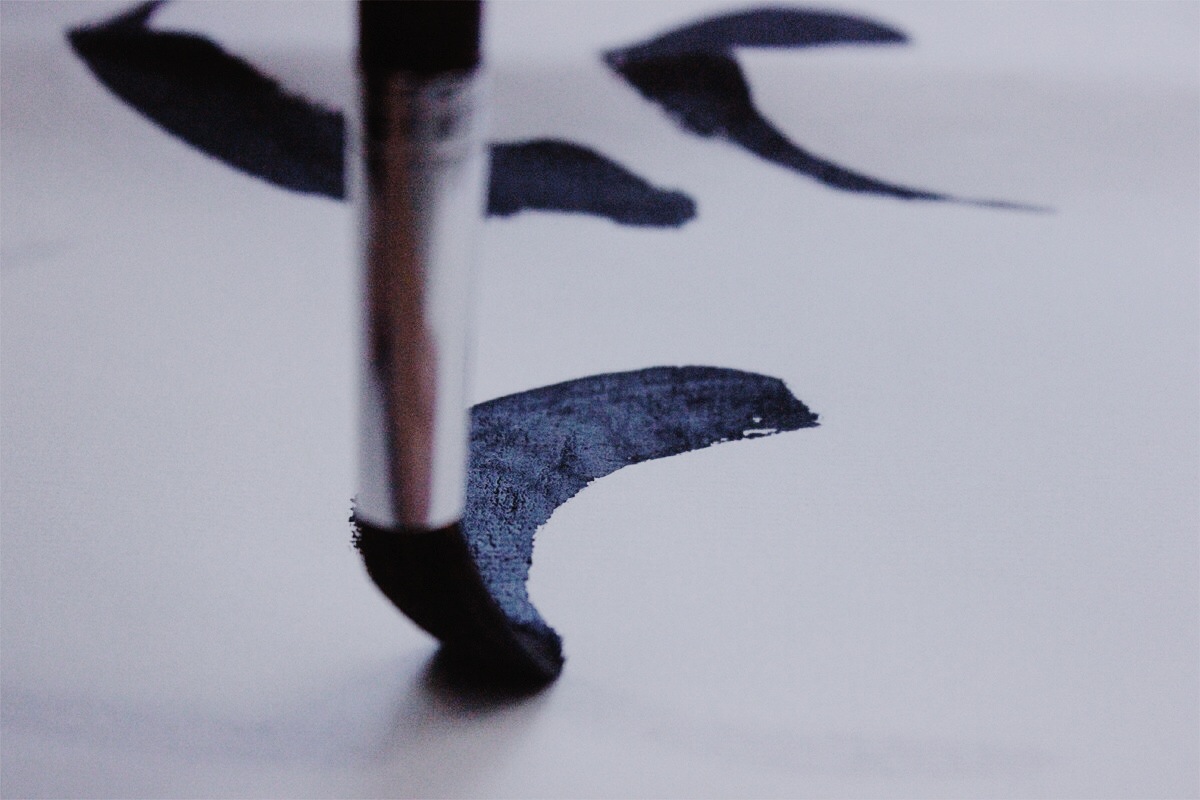
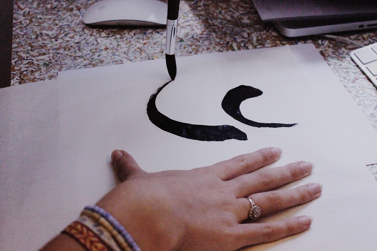
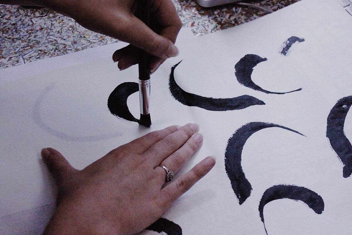
Capturing the motion shown in the paintings by Toko Shinoda, we created a ‘Y’ character logomark with two brush strokes, representing the yin and yang balance of the unisex brand.
The logo is formed of two abstract brush strokes to represent the idea of balance and the company’s initial.


