theOrigo — PROFESSIONAL SERVICES

Simplicity by design

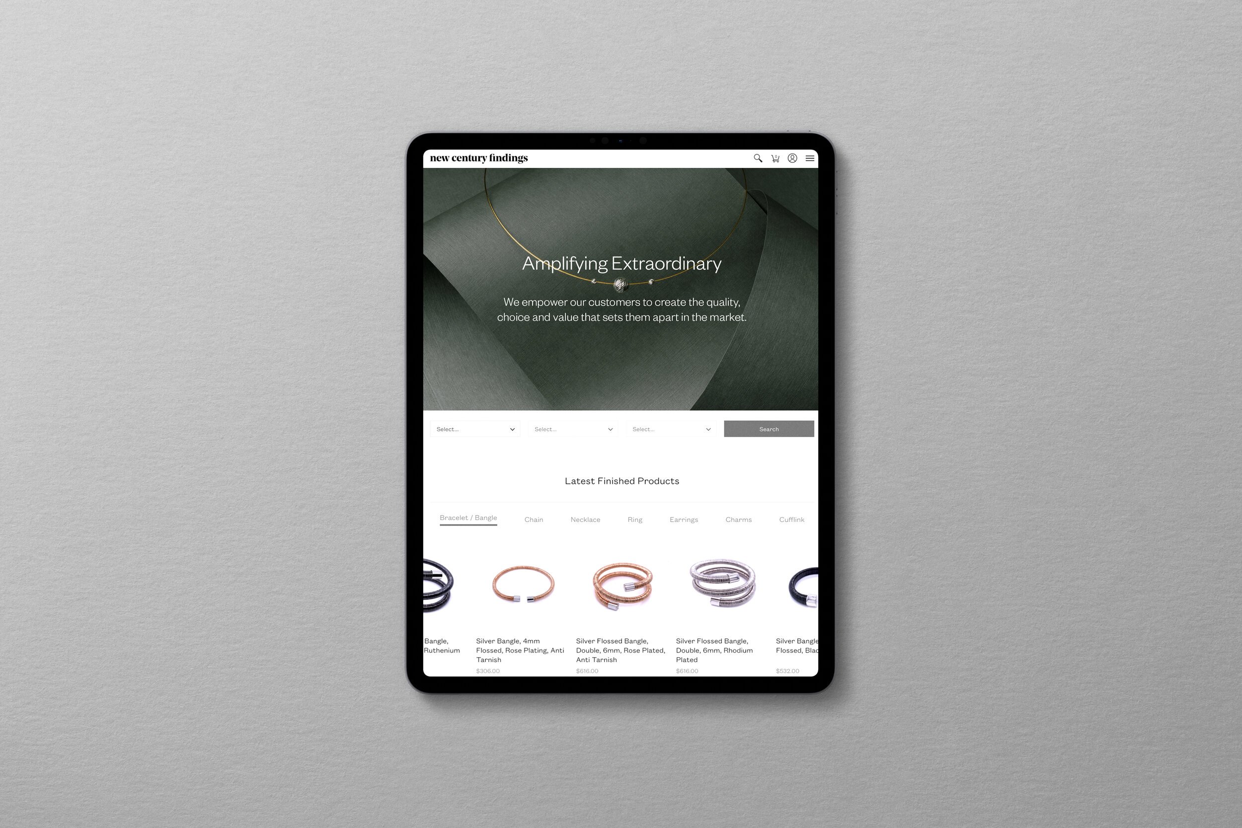
theOrigo provides web design and development services for large corporate and educational organisations in Hong Kong. With a focus on simplifying complex, multi-layered user journeys, the Origo are experts in their field. With a team of over 50 individuals, across front-end and UX designers, developers and project managers, theOrigo puts equal focus on aesthetic value and functionality.

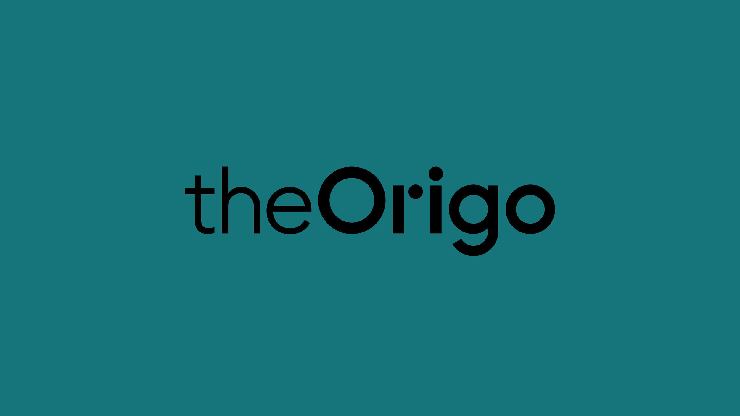
Our custom logotype for theOrigo aims to communicate both the creative and technical capabilities fo the team. Created from geometric forms with emphasis on the circular structures, the mark is a strong, unified logomark.

Building from the custom logotype we created a visual language for theOrigo. The grid represents structure and theOrigo’s pragmatic approach to their work. The archs have infinite possibility for combination, illustrating the creativity behind each project.

Various geometric line patterns on a black background arranged in a grid.
Various business cards for 'The Origo' company displayed on a black background. Cards include designations like Technical Lead and Design Director, with contact information and the company logo in different colors including red, green, and purple.
Business stationery set with a dark green folder, white letterhead, and white envelope featuring the "theOrigo" logo.
Brand stationery set featuring business card, letterhead, and folders with minimalist design and dot patterns, labeled 'theOrigo.'
Four colorful tote bags with abstract line designs displayed against a black background.
A smartphone displaying an Instagram profile grid with various images and text blocks. The text includes phrases like "Humanising digital experiences," "Empathise, ideate, prototype," "Create meaningful change," and "Simplifying complicated user journeys." The images show people working, writing, and collaborating, alongside abstract design elements.
Three Instagram-style images. Left: Two people wearing sunglasses looking at a laptop. Center: Graphic with the text 'Humanising digital experiences.' Right: Person in a sweater typing on a laptop.
Brand guideline presentation with sections on purpose, logotype, color, typography, applications, and social media. Includes layout examples, typography specifications, and visual branding elements for "theOrigo." Each section is numbered from 0 to 6 in large overlayed numerals.

Next project