
Index > Fair Trade Hong Kong
Future-proofing the Hong Kong NGO. A refreshed identity for Fair Trade Hong Kong, rooted in purpose and built for impact.


overview
Fair Trade Hong Kong is a not-for-profit organisation championing ethical trade, sustainability, and social equity across Southeast Asia. They approached us to modernise their visual identity and strengthen their relevance in today’s fast-evolving social and environmental landscape.
The refreshed identity brings clarity, cohesion, and renewed energy to Fair Trade’s mission, while preserving the integrity of its roots.
Brand Core
Our strategy process began with a collaborative workshop involving the Fair Trade Hong Kong board of directors.
Together, we clarified the organisation’s role within the wider sustainability movement and built out a focused set of core values.
These values became the foundation for a revitalised brand—one that honours Fair Trade’s legacy while preparing it to connect with a younger, more socially conscious generation.

Creative
We set out to create a design system that could express both the seriousness of Fair Trade’s mission and the optimism of its vision. The tone of voice was updated to be clearer, more inclusive, and action-oriented—helping Fair Trade speak confidently to partners, educators, and the public alike.

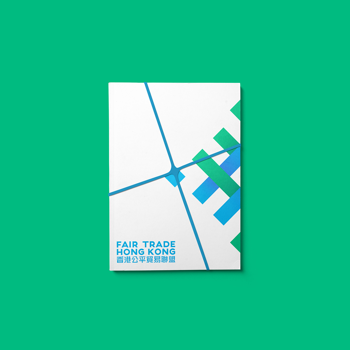
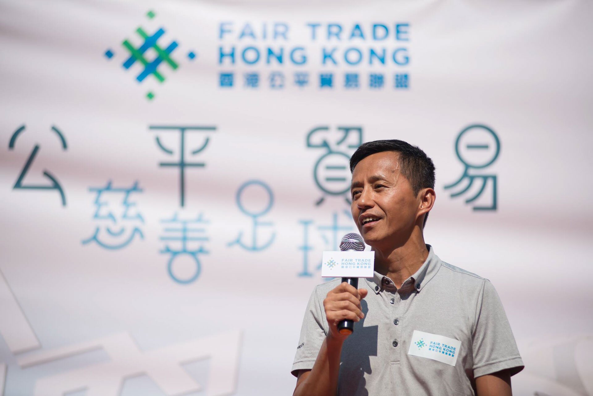
Logo
The new logomark brings the organisation’s four core values together into a single, unified symbol. Each quadrant represents one of the values, forming a balanced composition that reflects connection, equity, and shared progress. Designed for flexibility and recognition across formats, the logo serves as both a visual anchor and a storytelling device—linking past and future, tradition and innovation.
The refreshed identity balances boldness with approachability, using clean typography, vibrant accents, and a modular visual language inspired by networks and interconnection.


The open-source type family, Montserrat was chosen for the brand for its authority and functionality.


Next project
